Spellbinding Cosmic Beauty: Why Astronomy Images Matter

We all know that pictures are worth a thousand words, but does that maxim also apply to the world of astronomy?
A team based at the Harvard-Smithsonian Center for Astrophysics in Cambridge, Mass., has been trying to find out the answer with a years-long review of the lure of cosmic photos. The project, known as "Aesthetics & Astronomy," consists of astronomy outreach coordinators, science writers and astrophysicists, as well as education professors who specialize in aesthetics.
Since 2008, the group has been conducting experiments to determine how much the images produced by orbiting space telescopes, faraway Mars rovers and other interplanetary spacecraft are understood by professional scientists and the public alike.
Aesthetics & Astronomy was born 10 years ago in the backyard of a home in Ohio. Lisa and Jeffrey Smith, the team's two education professionals (and currently professors at the University of Otago, New Zealand) found themselves talking to Jeffrey's nephew about astronomy and reality. Were the vibrant colors and swirling shapes in popular astronomy images real? After all, weren't the images constructed by scientists from data, and weren't the colors in the pictures assigned arbitrarily by astrophysicists? [Amazing Space Photos by Chandra and Hubble Telescopes]
They soon realized that the astronomical community could best serve the public if astronomers explained how each color was chosen and why it was assigned a particular wavelength of light.
In Cambridge, the Smiths teamed with Megan Watzke, a science writer associated with the Chandra X-ray Observatory, and Kimberly Kowal, the visualization and media production coordinator for the Chandra team. Collaborating with Chandra astrophysicists Jay Bookbinder and Randall Smith, the growing team devised questions that could gauge the effectiveness of astronomical images.
For instance, what happens to the understanding of an image if the colors are altered, or if the scale is changed? What about captions — do they help, and if so, what kinds of captions are the most helpful? Do astrophysicists and the public approach the images differently, and if so, what is that difference? What are some of the public's misconceptions about astronomy and astronomical images?
"Even after many years of working in science communication, I was surprised to hear in a focus group that someone felt 'tricked' when they learned that the colors in these astronomical images are applied," Kowal told SPACE.com in an email interview. "That is, if you were able to zoom across the galaxy in a spacecraft, stars and nebulae would not appear as the images show because of the way the human eye works." [How Chandra Observatory X-Rays the Sky (Video)]
"As a result, we at the Chandra X-ray Center have tried to be more proactive in our communications and more transparent in what we do with our images," Kowal said.
The team's first experiment was carried out in 2008. It consisted of both online questionnaires and in-person meetings; in all, 8,000 people completed the questionnaire.
One of the primary results is also not especially surprising. Laypeople found themselves drawn to the image's beauty and the awe it inspired. Professional astrophysicists, on the other hand, were more interested in how an image was created and what it was meant to convey. Laypeople liked longer, more narrative captions; professionals liked captions that were short and pithy. And both groups thought that having a sense of scale was helpful.
Based on the study's results, the Chandra communications team made immediate changes to the images they had posted online. They began including basic information in a sidebar, explaining the size of the object in the image, how far away the object is, where the data came from and what the colors mean. They even included roll-over information that popped up as the computer cursor passed over the image.
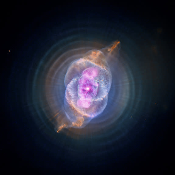
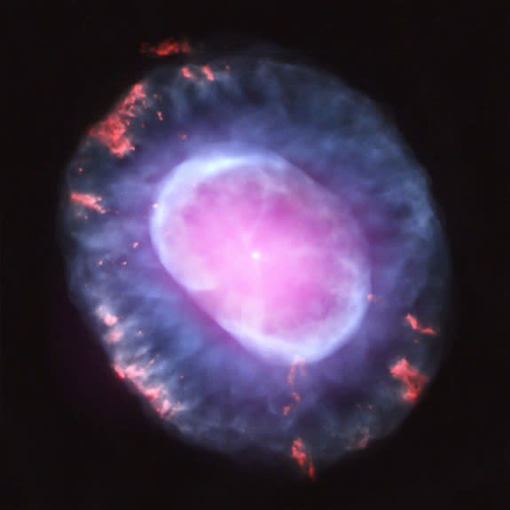
Color in astronomical images is crucial.
"For example, for the nonexpert, the color red tends to represent heat, while the color blue plays that role for the scientist," Kowal said. "So, if you are coloring an image of a super-hot cloud of gas, do you use red or blue? Contextually, it makes sense to be aware of the differences in color perception so the writer can account for that in the captions."
The Aesthetics & Astronomy team recently conducted another study, this time examining whether viewing astronomical images on mobile devices affects the understanding of those images. The study, which was developed with funding from the Smithsonian Scholarly Studies Program, examined the perception of images shown on small mobile devices (like cellphones), iPads and overhead projection screens. Additional funding was provided by the Hinode X-ray Telescope, performed under NASA contract NNM07AB07C, with in-kind contributions from the Education and Outreach group for NASA's Chandra X-ray Observatory, operated by SAO under NASA Contract NAS8-03060.
The results, which have not yet been published, indicated that the bigger the size, the better, unless the viewer wasn't able to compare image sizes. In that case, the viewer adapted, the team members said.
Kowal noted that studying how images affect understanding can apply to other science disciplines, like public health and chemistry. Clearly, the field is ripe for more study, she said.
You can see many examples of imagery from the Chandra X-Ray Observatory at the Chandra mission website here.
Follow us @Spacedotcom, Facebook or Google+. Original article on SPACE.com.
Celestial Photos: Hubble Space Telescope's Latest Cosmic Views
Our X-Ray Universe: Amazing Photos by NASA's Chandra X-Ray Observatory
Copyright 2013 SPACE.com, a TechMediaNetwork company. All rights reserved. This material may not be published, broadcast, rewritten or redistributed.