Space Force Doesn't Want Anyone to See Its Secret Logo Mockups
It’s been four years since the U.S. Space Force unveiled its all-too-familiar logo, establishing itself as the youngest military branch, but with clear signs of an identity issue. If you’ve ever wondered about the other logo designs that were considered, the Space Force clearly doesn’t want you to know what made them go with the Trekkie emblem.
The Air Force recently released records that included draft designs of the Space Force logo, uniforms, and seal in response to a Freedom of Information Act (FOIA) request submitted by Reason in 2020. In its tardy response, the Air Force redacted all images of alternate logo designs that didn’t make the cut, according to the magazine.
The released 122 pages included communication between the Space Force and public servants working on the designs. All images, except for the winning logo, were marked by a black square. The Air Force cited Exemption (b)(5) of the FOIA, or the deliberative process exemption, which allows agencies to withhold memorandums, letters, and other communications created during any decision making process.
Those types of exemptions are only meant to be used to avoid any type of harm, but it’s not clear what kind of damage the Air Force was anticipating regarding the release of unused logos.
The Space Force was established by an act of Congress and signed into law by former President Donald Trump on December 20, 2019. The military branch is responsible for protecting U.S. interests in space, developing “Guardians” (its term for Space Force personnel), acquiring military space assets, and carrying out space-based operations.
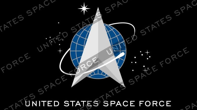
In January 2020, Trump revealed Space Force’s logo, which many pointed out resembled the logo of Star Trek’s Star Fleet Command. It’s kind of uncanny, with the silver arrow, a starry background, and a signature swirl pointing upwards.
The new Space Force logo is pretty much a straight up ripoff of the Starfleet Command logo. https://t.co/kONtG3GDbt pic.twitter.com/TuFcV3MSbJ
— Josh Rogin (@joshrogin) January 24, 2020
Since its inception, Space Force has struggled to establish itself as a real military branch, but has repeatedly been perceived as a joke. In September 2022, Space Force released a theme song called “Semper Supra,” which is Latin for “always above,” describing itself as the “mighty watchful eye” and an “invisible front line.” A year later, the military branch rewrote its mission statement to a cryptic one line that read, “Secure our nation’s interests in, from, and to space.” Shortly afterwards, the Space Force had an official painting of a U.S. spaceplane intercepting an “adversary” satellite to stop it from disabling a “friendly” satellite.
All of that terrible branding makes it hard to take the Space Force seriously. Perhaps that’s why images of the unused logos were kept a secret to avoid any further humiliation by the public. Although it’s hard to believe that any other logo designs could be worse than one that offended the most dedicated group of fans that have ever existed.
For more spaceflight in your life, follow us on X (formerly Twitter) and bookmark Gizmodo’s dedicated Spaceflight page.

