Relative Strength Improvement Underway in Emerging Markets. Time to Buy?
Undoubtedly, throughout 2017 US investors have noticed the stellar performance of US-based stock indexes.
A trader’s willingness to invest only in local markets is a phenomenon studied in behavioral finance. Specifically, this is categorized as “home country bias” which describes an investor’s preference to follow and invest in what is familiar. In this case, US investors usually trade US stocks and indexes since information is more readily available and easier to understand.
However, outside of the US there are attractive investment opportunities developing on a relative basis.
Emerging Markets
For example, Emerging Markets (EEM) are beginning to display exceptional relative strength versus the US market, represented by the S&P 500 (SPY).
Relative Strength (RS) is simply a ratio analysis portrayed by a line chart in this case. In other words, with EEM in the numerator and SPY in the denominator a falling line implies that SPY’s relative price strength is increasing compared to EEM and a rising RS line implies the converse.
In the monthly chart below we can see that the relative strength of EEM to SPY recently broke out above prior resistance as well as its previous downtrend line.
Furthermore, the chart exhibits positive divergence in both its Relative Strength Index (RSI) and Moving Average Convergence Divergence (MACD) indicator. Both divergences are indicative of positive price improvements that have been developing for months.
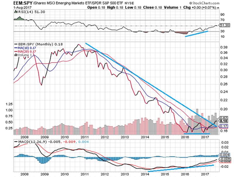
The weekly chart below provides a clearer look at the RSI and MACD divergences as well as the RS line’s recent uptrend from lows.
Additionally, there is some improvement in the Average Directional Index (ADX) as the ADX line, which represents trend strength independent of direction, has improved to a value of nearly 20. Traders will typically use either 20 or 25 as the starting point to identify a trending market. Intuitively, as ADX increases it represents improving strength in the trend.
Moreover, with +DI over –DI directional movement has an upward bias. Coupling this fact with an ADX at 20 would imply that a long-term uptrend may be emerging.

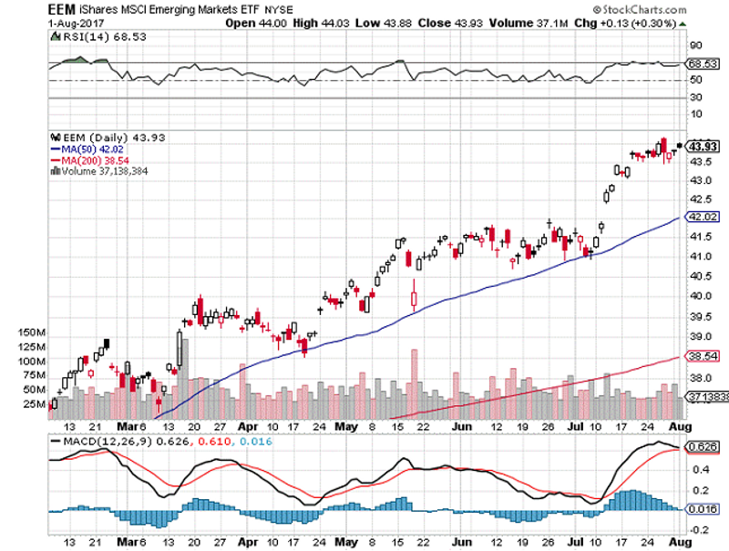
The daily chart of EEM displays a steady trend of higher highs and higher lows in price action.
During the beginning of July, EEM built a swift uptrend which is now consolidating through time. Additionally, both featured moving averages, RSI, and MACD on the daily chart below confirm the uptrend.
Each of the aforementioned observations adds further credibility to being long EEM outright and on a relative basis.
Below is an examination of some of the underlying emerging markets which are helping EEM sustain its strength.
China
On the monthly relative strength chart of the Hong Kong Hang Seng Index (HSI) versus SPY there are similar developments to those observed with EEM:SPY. For instance, HSI:SPY has now cleared monthly resistance around 110 which coincides with new price highs on the daily timeframe.
Furthermore, RSI and MACD are exhibiting positive divergence over the same time frame while HSI also formed a base of support.
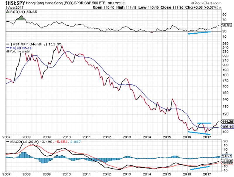
From the daily perspective price has shown its strength by reaching an overbought level three times during the uptrend over the past six months. Moreover, price has shown resiliency as it has found support at its 50-day Simple Moving Average (50SMA) during each pullback within this uptrend which is indicative of sustained institutional buying demand.

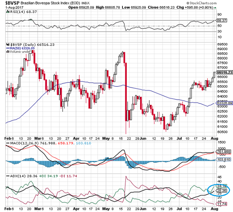
Brazil
Brazil’s Bovespa Index (BVSP) is approaching multi-year resistance on the monthly chart and may have limited upside to 70,000 considering that after BVSP’s relative strength advanced in 2016 it has since waned into range-bound action this year.
However, an ADX measurement at 30 and +DI over –DI is indicative of a strong uptrend which could imply that price has the momentum needed to carry BVSP to new highs.
Likewise, the RS line comparing BVSP:SPY displays positive divergence that turned into confirmation from RSI and MACD adding further credibility to the uptrend.
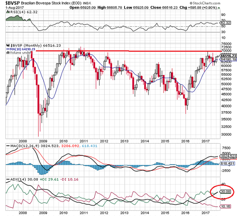
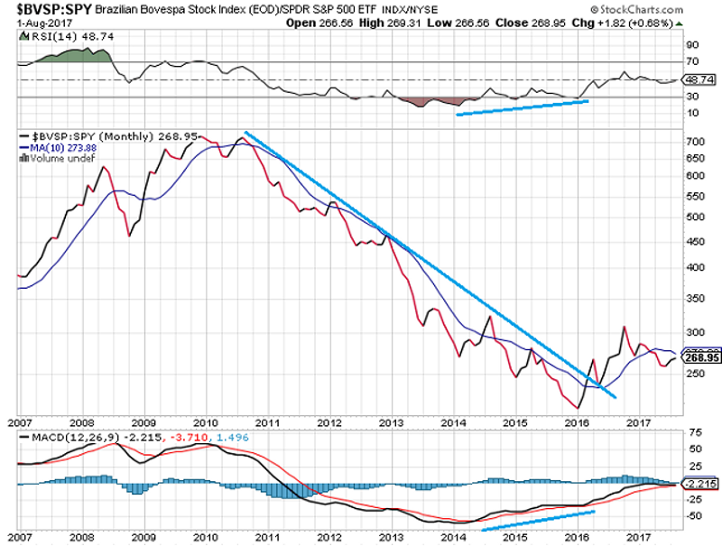
While the daily chart is showing some underlying price strength as measured by ADX around 27 and a positive MACD, from a strategic trend perspective BVSP has yet to give a long-term buy signal. After all, the price is still recovering from its large one-day drop in May 2017.
Summary
Despite the dominant, prolonged uptrend in US equities, investment opportunities may be emerging elsewhere around the globe.
As long as traders have created a system that displays robustness in returns across multiple markets, they should be aware of and mitigate behavioral biases that may be limiting their investable universe.
Taking an objective look at other opportunities by using Relative Strength has uncovered investable markets like EEM, HSI, and BVSP which could enhance portfolio returns.
John DiRico is a trading and investment professional focused on technical analysis as well as alternative investment strategies. Additionally, he is the founder of the blog “A Discounted View” where he offers his observations on markets based on industry experience and topics covered in the Chartered Market Technician (CMT) curriculum. Please feel free to connect.
This article was originally posted on FX Empire
