Pretty City Images Reveal How People Move
A new set of city maps reveals a constellation of human motion in San Francisco, Chicago, Los Angeles and New York City.
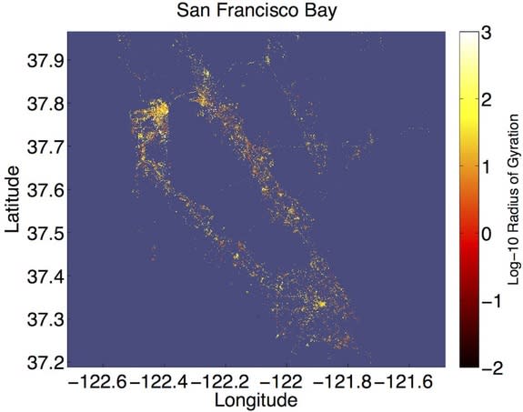
The research, not yet published in a peer-reviewed journal but submitted to the paper pre-print website arXiv.org on April 4, uses colorful dots to show how people move on a daily basis over the course of a year. Each dot represents a frequent Twitter user who has enabled geotagging so the location of their Tweets is easily pinpointed. The lighter the color of the dot, the farther that person travelled in 2011, according to his or her Twitter feed.
In each city, downtown is brighter yellow than the reddish, stay-close-to-home suburbs, said Christopher Danforth, a mathematician at the University of Vermont. [See Images of the Movement Maps]
"The downtown areas of big cities have people who are moving around a lot," Danforth told LiveScience. "These are people who either commute from far away to get there, or they're visiting."
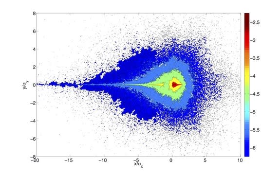
Danforth and his colleagues used 37 million tweets from 180,000 people to create the maps. The researchers also aggregated the data to reveal daily travels. Most people, it turns out, have a stable routine: They spend most of their time on an axis from home to another location, presumably work.
"People are very predictable, much more than you would think," Danforth said.
The Tweet data matches what's seen from mobile phone records, the researchers wrote on their blog onehappybird.com; but it's more precise, because mobile phone calls are pinged through the nearest tower while Twitter uses GPS to pinpoint location more precisely. Unsurprisingly, the researchers found, people tweet from home most in the morning and the evening, when they're not at work.
As of December 2012, Twitter claimed more than 200 million active monthly users. The cacophony of 140-character thoughts broadcast by these users has proven useful to researchers looking for large-scale trends. Researchers have used Twitter to measure happiness, revealing that Saturdays are happy, that people really do hate Mondays, and that Twitterers loved the royal wedding of Prince William and Catherine Middleton.
Other online sources provide a similar wealth of information. Google Trends, which records Google searches, can capture nervousness among investors, predicting stock market declines, according to research published April 25 in the journal Scientific Reports. Google Trends has also been used to help forecast flu outbreaks in particular cities.
The movement data could be used to figure out if a particular lifestyle leads people to become happier, Danforth said. Perhaps someone who walks to work or takes a bike might have a sunnier disposition than a car commuter, for example.
"If we could quantify the amount of happiness that is drained from you by driving an hour each way to work, that would be an important thing," Danforth said.
Follow Stephanie Pappas on Twitter and Google+. Follow us @livescience, Facebook & Google+. Original article on LiveScience.com.
Copyright 2013 LiveScience, a TechMediaNetwork company. All rights reserved. This material may not be published, broadcast, rewritten or redistributed.
