Physicist explaining climate change to a denier on TV is grim viewing
It was like watching an internet forum argument, but on national television — as one tweeter put it.
British physicist Professor Brian Cox tried his best to explain human-induced climate change to avowed climate denier Malcolm Roberts, a newly-appointed senator of the far-right One Nation party in Australia.
SEE ALSO: Earth's hottest month on record was July 2016: NASA
The duo went head-to-head on TV program Q&A on Monday night, where Roberts claimed that there has been a pause in global warming for two decades.
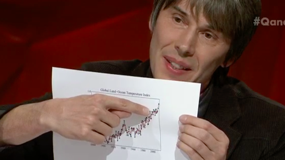
"We've had a pause in this so-called warming for now 21 years, depends how you measure it, 21 years," Roberts claimed. That's when Cox pulled out the The Global Land-Ocean Temperature Index, a graph to illustrate how wrong that claim was.
Cox explained that it was easy for deniers to draw a "straighter line" between certain years on the graph, to try back up the pause claim, ignoring the fact that 2015 was the hottest year on record and that 2016 looks likely to beat it. Or even the clear rise in temperature stemming all the way from 1880.
Then Cox pulled out a graph showing a rapid increase of carbon dioxide in the air, which is currently at its highest levels in 650,000 years.
"So the question essentially, first of all, are those two things correlated, and secondly, do we understand the physical mechanisms — and we've understood those since the 19th century," Cox said.
That wasn't good enough for Roberts, who wanted to focus on the spike in temperatures during the mid-1930s to 1940s. "Yeah, the 1930s and '40s were warmer than the current decades," he claimed.
Except they aren't, as illustrated by Cox's finger-pointing.

Image: ABC Q&A
So then Roberts took aim at the source of the data on the graph: NASA. "The data has been corrupted, and we know the 1930s were warmer than today," Roberts said.
"What do you mean by corrupted? Corrupted," Cox shot back.
"It's been manipulated," Roberts claimed.
"By who?" Cox asked.
"...by NASA," Roberts said, to the crowd's hilarious exasperation.
"NASA?" a vexed Cox responded. Roberts continued his claim that data was manipulated by agencies to make global temperatures look worse than they actually are.
"Can I just check one thing: NASA? The people who landed men on the moon," Cox asked. "The accusation that NASA, the Met Office in UK, everybody has collaborated to manipulate global temperature data is quite ... [so] they've all manipulated it in the same way and accidentally got to the same answer, is that what you're saying?"
It was unfortunately one of those situations where it doesn't matter how much data or facts one's armed themselves with, there's no convincing someone. And thus the conversation ended.
The director of NASA's Goddard Institute for Space Studies (GISS), Gavin Schmidt, was "flummoxed" by claims of manipulated data following the Q&A episode. NASA's GISS is the source of the graphs which Cox used to illustrate his point on TV.
Schmidt took to Twitter to leave his thoughts on "climate deniers" who accused his team of fraud.
It's all a bit much, isn't it. But hey, at least Cox enjoys Australia's wine.
UPDATE: Aug. 16, 2016, 2:23 p.m. AEST Added tweets from NASA GISS director Gavin Schmidt.
