This is what iOS 7 looks like

If half a dozen reports from several well-sourced reporters are to be believed, Apple has a huge redesign coming in iOS 7. Gone are the textures that have characterized iOS for six years now, replaced by a flatter user interface that will still maintain the overall feel of the operating system. While much remains a mystery, we already know what several redesigned elements in iOS 7 look like — not from a leak or a bunch of rumors, but because Apple has already shown them to us.
[More from BGR: Completely redesigned iPad to launch in Q3, Retina iPad mini reportedly postponed]
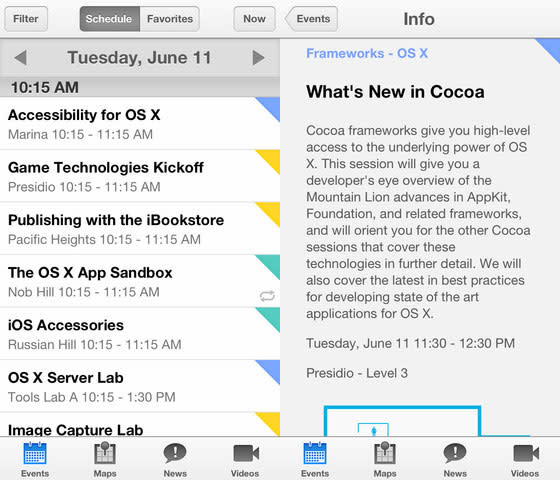
Apple device users should look no further than Apple’s official WWDC 2013 app for iOS if they are interested in getting a sneak peek at some of the new design elements coming to iOS 7. While things like app icons remain a mystery, the new color scheme and design identity are beyond apparent in Apple’s new app:
[More from BGR: Obama hopes to put an end to patent trolls with new executive orders]
The general layout and button shapes are the same to ensure that Apple avoids the shock of a drastic visual overhaul — Microsoft’s Windows 8 has shown us what can happen when visual changes are too severe — but the flatter, more minimal graphics are a fresh new look for iOS.
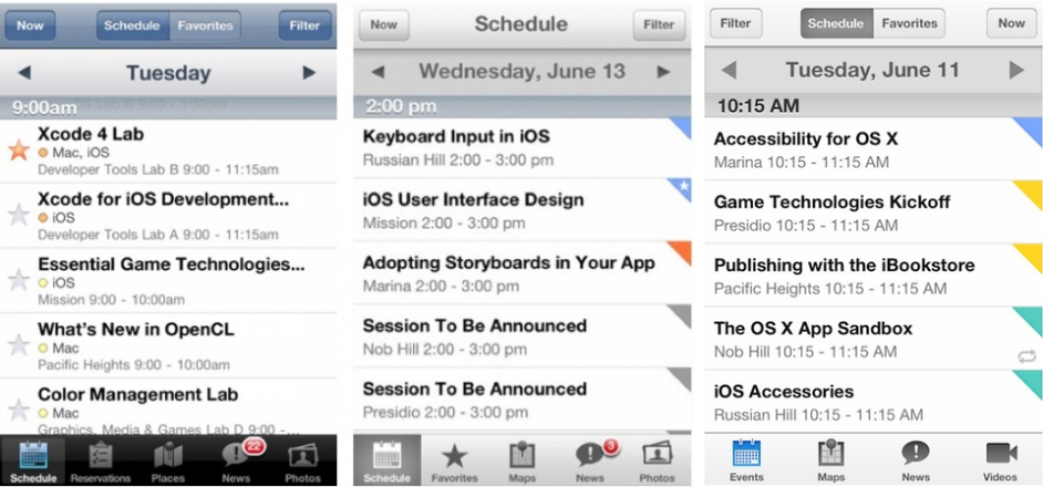
Here is a comparison shot assembled by Twitter user “@yuize” that shows the new look of iOS 7 in the official WWDC 2013 app alongside last year’s WWDC app and the WWDC 2011 app:
The layout is cleaner, the look is more minimal and the colors certainly seem to pop a bit more, but longtime iOS users likely won’t find the new look terribly jarring, which is a fear any company has when refreshing a user interface.
Apple’s annual WWDC show kicks off on Monday and iOS 7 is expected to debut during the opening keynote, which starts at 1:00 p.m. EDT, 10:00 a.m. PDT.
This article was originally published on BGR.com


