Hands-on with Windows 10 Preview build 9879
It looks like Microsoft is serious about this new rapid update cadence for the Windows 10 Technical Preview.
The first release of the Technical Preview was delivered on October 1. It was followed three weeks later by a major update, build 9860.
And now, three weeks later, comes build 9879, delivered automatically to any member of the Windows Insiders program who selected the Fast channel in the Preview Builds section of PC Settings.
Like its predecessors, this is a slightly ragged release, but it's packed with enough new features to be worth exploring.
Some of the new additions don't lend themselves to depiction in a gallery of screenshots. This build offers some refinements in the animations that accompany windows opening and closing, for example, and it introduces new three-finger gestures for precision touchpads such as those found on the Surface Pro. It also adds support for MKV video files, a format that has never previously been officially supported in Windows.
In the remainder of this gallery, I call out some of the changes you'll see if you install this build for yourself.
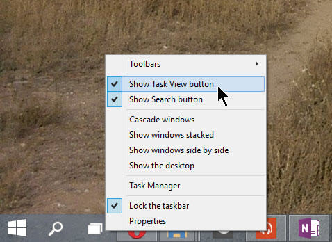
The single most popular complaint about earlier preview builds was from users who didn't appreciate the two new icons appearing to the right of the Start button. In this build, you can right-click and choose to show or hide the Search and Task View buttons, restoring the taskbar to its classic configuration.
Not yet available is any option to configure how Search works, including replacing Bing with Google or another alternative search engine, or to hide the "Trending Now" column.
One well-hidden feature that appears to be new in this build is the System Compression option shown here. You get to it by running the Disk Cleanup utility as an administrator.
There's no documentation for the feature, except for the sparse description in the bottom of this dialog box: "Compress windows binaries and program files." (And yes, the developer in charge of this feature is likely to get a stern email from Microsoft's legal department noting that Windows is a trademark and is always capitalized.)
When I ran this option on a Surface Pro 3, I ended up with about 2.5 GB of additional free space after the operation completed. With many modern devices shipping with flash storage allotments as low as 32 GB, that's nothing to sneeze at.
As with the two previous builds, Internet Explorer 11 is still a desktop-only app. If the modern, plugin-free app is going to make an appearance, it will be in the future.
Meanwhile, this build gets a smile/frown button in the upper-right corner of the browser window, with the goal of flagging pages that don't render properly. This helpful page appears when you first open Internet Explorer after installing the latest build, to explain how the feedback buttons work.
The changes in OneDrive build 9879 are sweeping and likely to inspire some outcry from testers.
Two big changes are worth calling out. First, all of the controls for managing how files sync from the OneDrive cloud to local storage are now in the OneDrive Sync app. If you've grown accustomed to accessing some of those options (including the Sync command) from File Explorer, you'll need to adjust.
The second change is more significant. Previously, every file and folder in the OneDrive cloud was represented in File Explorer with an icon, even if the file hadn't been synced to local storage. Microsoft called that feature "smart files," even bragging about it in a September 2013 blog post, ahead of the release of Windows 8.1.
In build 9879, only files that have been synced and are available on the local device are shown in File Explorer. To see and open unsynced files, you need to go to a web browser or the OneDrive app.
I expect a vigorous debate over this design, with some significant changes to come in future iterations.
The new Storage Sense option in PC Settings tries to offer both a visual and data-based representation of how much of the available storage on a device is being used, and which parts of the system are using it.
The Storage Overview tab shows a bar graph for each storage device, with color-coded segments that correspond to types of data use. Tapping or clicking the graph for the main system storage displays a detailed list like the one shown here. Expect this interface to undergo significant refinement in the next few months.
File Explorer (formerly known as Windows Explorer) continues to add new visual elements. You'll spot some interesting new icon designs in this build, with more to come later.
The Home tab in File Explorer debuted in the first Technical Preview release. It gets a slightly simpler treatment for this build, with only two sections: Frequent folders at the top, Recent files at the bottom.
The small blue pushpin icons let you pin a local folder (but not a network share) to the File Explorer Home screen. You can use right-click menu options to remove files from the list along the bottom
One of the new features in Windows 10 is a system-wide notifications menu, the Action Center, which pops up from the right side of the taskbar when you click a small envelope icon.
Beginning with this build, the Action Center icon gets a predictable and (for now at least) unchangeable location, just to the left of the clock.
One other change on the right side of the taskbar is worth calling out as well. On portable PCs, the battery icon has a new design, appearing in a horizontal orientation instead of vertical. The icon is also animated when the device is charging.
In Windows 8, apps downloaded from the Windows Store ran only in full screen or in a snapped arrangement. To get to settings for one of those apps, you used the system-wide Settings charm.
Windows 10 adds the capability for those modern apps to run in a window, and it seriously downplays the Charms menu. The solution for accessing app-specific options, including settings, is a small menu available at the left side of the app's title bar.
In earlier builds, this control used an ellipsis to indicate where to click for more options. In build 9879, this option appears as a stack of three lines, a common interface standard affectionately known as a "hamburger."
One of the signature features of the Windows 8 design, which has been carried over to Windows 10, is the ability to back up a slew of personal settings to the cloud. That makes it possible to move between PCs and tablets with things like lock screen photos, passwords, and apps appearing on the new device automatically.
A little-noticed option at the bottom of that window allows you to back up those settings to OneDrive (even if you choose not to sync settings). With a backup available, you can restore a complete system configuration (with only desktop apps missing in action) when setting up a new device. Build 9879 adds the option to back up app data as well, an option that should be handy for fitness apps, among others.
One of the acknowledged missing pieces in build 9860 was a UI design that left out a key piece of networking infrastructure. Microsoft's Gabe Aul acknowledged that that design made it "harder to join a Wi-Fi network."
The network flyout remains unchanged in build 9879, as part of a Manage option under the Networking section of PC Settings. This area is also where you'll find the option to "forget" a saved network. Presumably the promised changes will appear as part of a later build.
