The Framework in This New Zealand Home Is—Wait for It— Upside-Down
Shoko Wanger
Updated
Most homeowners would consider a heap of dirt on the front lawn a nuisance. But Henri Sayes and Nicole Stock—then in the early stages of constructing their first home in Auckland—recognized it as art in the making. Faced with a pile of debris leftover from the excavation phase of the building process, the pair opted to avoid lofty removal costs by getting creative. “We decided to use it to create a sculptural berm,” says Henri, an architect. “We even made a plaster model of exactly how we wanted it. The digger driver made it a work of art, but, amusingly, there was so much rubble in the dirt that we had to bring in even more dirt to make a clean and safe top layer. It wasn’t the clever cost-saver we’d envisioned, but it did create an amazing place to lie in the summer.”
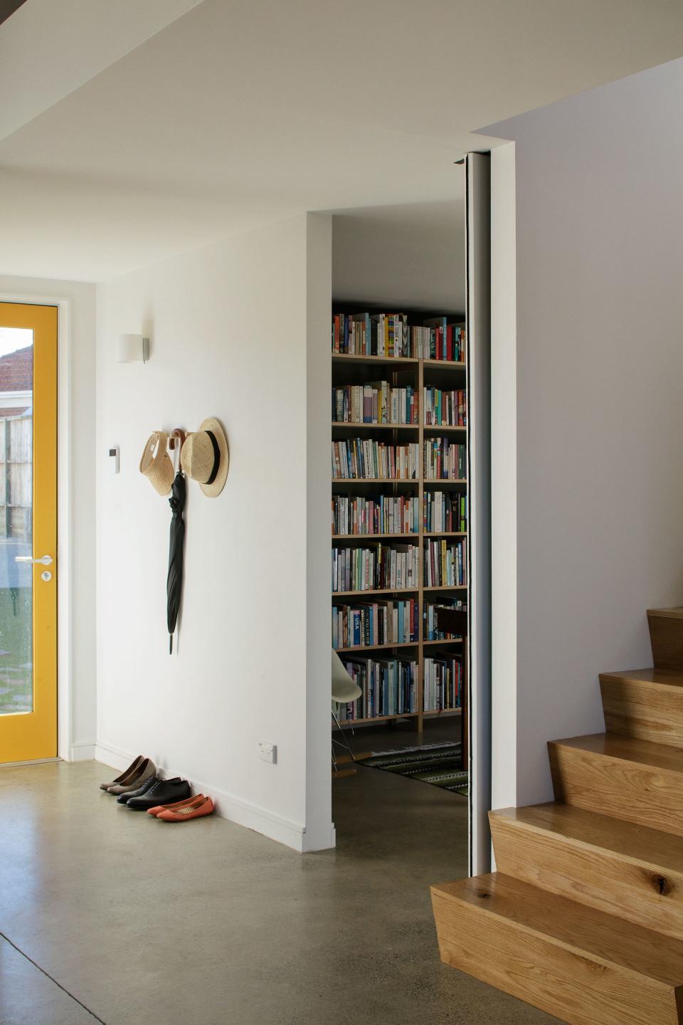
Years later, the couple, now parents, are currently at work on a new home to accommodate their changing needs—but one would be hard-pressed to imagine a better source of inspiration than their inaugural project. Triangular trusses, the kind that typically point up to frame a pitched roof, hover upside-down overhead. And richly colored accents—a canary door, a bedroom ceiling the shade of a watermelon—reveal themselves at every turn.
Inverted trusses add to the jaw-dropping visual impact of the living room's ceilings (and bedroom, open to the room above).
It’s a home built of exceptionally unique details, but most of it came at a down-to-earth cost. “We were able to create an interesting house on a budget by having a very clear idea of what was important and what could slide,” Henri says. “Expensive, bespoke detailing was kept to an absolute minimum—almost every detail in this house is a basic acceptable solution from our building code. There are no bells and whistles, but this isn’t a house about bells and whistles.”
Instead, Henri and Nicole prioritized details that ushered in light and maximized space. And while they allowed themselves the occasional splurge (larger windows, for instance, or custom cabinetry in the kitchen), the couple’s focus remained squarely on creating a home that lent itself to the sort of life they dreamed of living at that particular moment in time.
“Our idea was that if we could create something that was beautiful and functional and a joy to be in, there would always be value in that,” Henri says. Read on for tips and takeaways on building a standout home on a budget.
Don’t shy away from mixing high and low. When it came to furniture, Henri and Nicole mixed cheap finds with designer pieces they’d collected over the years. In the dining area, a $35 paper lamp shade hung above a tabletop on loan from family. In the living room, a Bouroullec Slow Chair neighbored a coffee table built using concrete blocks and a slab of salvaged pink marble Henri purchased online.
PATRICK REYNOLDS
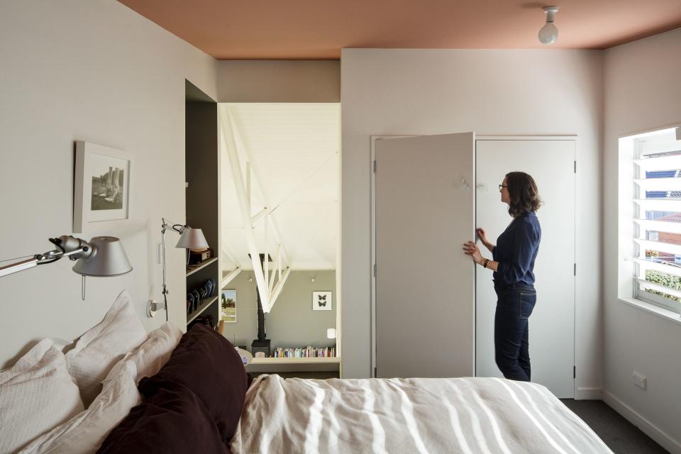
Get creative with an open floor plan. Opting for a layout that included an open master bedroom, and an interconnected kitchen, dining area, and living room meant that Henri and Nicole could spend time together at home without being in the same room. “As for the height,” says Henri of the bedroom that overlooks the living room, “we got used to it very quickly.”
PATRICK REYNOLDS
Henri's’s favorite element of the finished home: “That moment of awe when you walk into this suburban house and the space unfolds in front of you.”
PATRICK REYNOLDS
Have smaller rooms do double duty (discreetly). “Ancillary spaces like laundries are often the hardest ones to squeeze into a house with a small footprint,” says Henri. “We knew the best use of space was to combine the laundry and downstairs toilet into a single room, but we didn’t want the bathroom to feel like a laundry. Being able to close it off completely and seamlessly with peg-board doors was key to making this work.”
PATRICK REYNOLDS
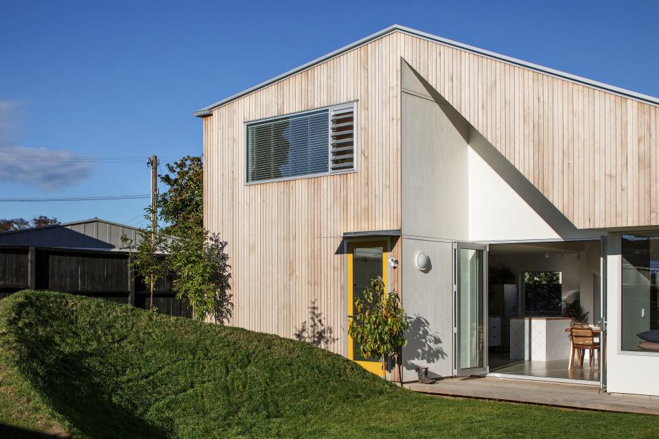
The crest of grass in the couple’s front yard was once referred to as “the Nike swoosh” by a member of the construction crew. “The organic shape provides a nice contrast against the angular façade of the house,” is how Henri puts it.
Use inexpensive materials in unexpected ways. “Our focus for the kitchen was to try to come up with a palette that used simple, inexpensive materials in a clever and eye-catching way,” Henri explains. On the backsplash and island, run-of-the-mill white tiles were laid diagonally in a diamond pattern; over the range, they're rectilinear to create striking contrast.
A sliding peg-board panel was installed to keep the couple’s pantry shelves hidden.
Patrick Reynolds
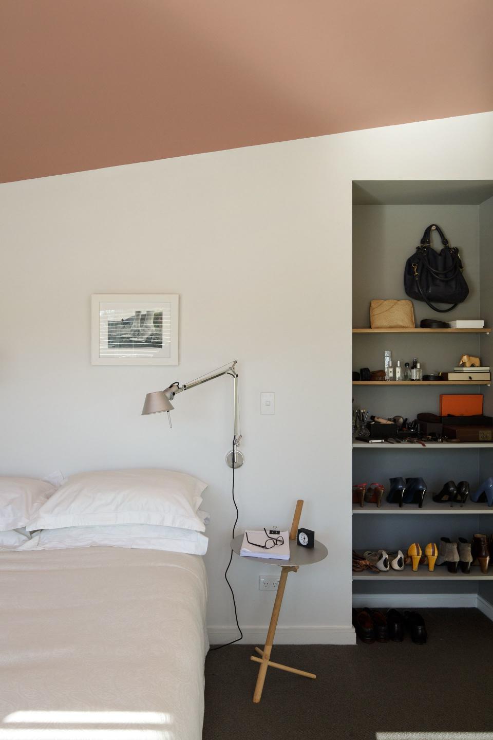
Apply color strategically. “You’re limited with textures and materials when you’re on a budget, so color is a cost-effective and dynamic way to add interest and delineate spaces,” the architect explains. The couple chose a select few areas to highlight throughout their home—some less conventional than others. “When you look into the bedroom from the living room, you see only its salmon-pink ceiling. It’s such an unexpected jolt of color. But when you’re in the bedroom, it’s out of eye-height so it barely registers.”
Dan Wetzel, Ross Dellenger & SI’s Pat Forde react to the huge performance this weekend by Texas QB Arch Manning, Michigan and Notre Dame's spring games, Jaden Rashada entering the transfer portal, and more
Trump is entitled to an additional 36 million shares if the company's share price trades above $17.50 "for twenty out of any thirty trading days" over the next three years.