Coronavirus: Four maps and charts that show how serious the deadly virus is
As coronavirus continues to spread to countries across the globe, health organisations are urging governments to prepare for the worst.
Currently, there are 81,191 confirmed cases of coronavirus and 2,768 people have died from the respiratory virus.
This week, federal health experts have warned America that it is only a matter of time before the country is hit with the virus. "It's not so much a question of if this will happen anymore, but more really a question of when it will happen - and how many people in this country will have severe illness," Dr Nancy Messonnier of the Centres for Disease Control and Prevention (CDC) said.

As of Tuesday, 14 people have been diagnosed in the US, “in addition to 39 cases among repatriated persons from high-risk settings,” bringing the total to 53 cases, according to the CDC.
Although the current risk remains low, Americans have been urged to prepare “with the expectation that this could be bad,” Messonnier said, adding that “disruption to everyday life may be severe”.
To help the public understand the seriousness of coronavirus, health organisations have released graphs that illustrate the global spread of the disease.
Here are four maps and charts that explain how bad coronavirus is:
How is the #coronavirus compare to #H1N1, #MERS, #Ebola and #SARS ? #COVID19
WATCH THIS VIDEO GRAPH:
pic.twitter.com/KsXMW0NoYF— COVID-19 (@COVID_19_News)
This graph, which has gone viral on social media, shows how coronavirus compares to H1N1, MERS, Ebola, and SARS in terms of confirmed cases and numbers of deaths.
In the graph, you can track how coronavirus started off slower than Ebola, before outnumbering all of the other diseases.
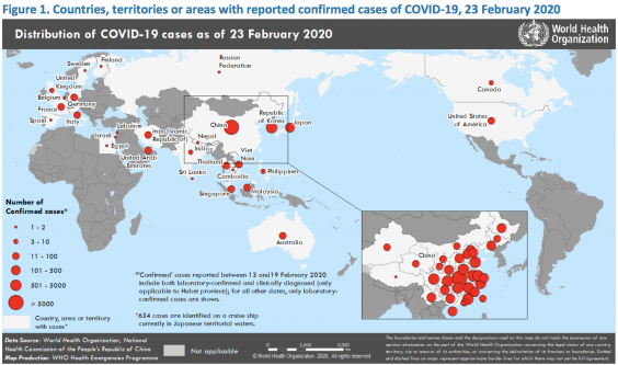
In this map distributed by the World Health Organisation (WHO), confirmed cases of the virus in countries, terroritories or areas as of 23 February are illustrated with red dots of varying sizes.
The graph shows both how the virus has spread to multiple countries, and the number of cases in each country.
#Coronavirus spreads as outbreaks worsen in Europe https://t.co/niIEFdHl3X #COVID19 pic.twitter.com/1KRxs8LtgC
— CGTN (@CGTNOfficial)
This map from the China Global Television Network (CGTN) shows the number of confirmed cases and deaths in Europe as the virus spreads.
Currently, Italy has the most confirmed cases of the virus with 323, followed by Germany with 18.
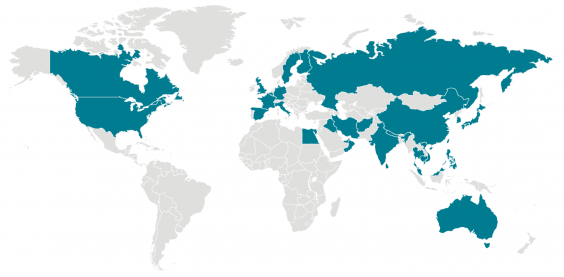
A map from the CDC shows all of the locations around the globe with confirmed cases of coronavirus. So far, the virus as spread throughout China and to 31 other countries.
For a live tracker of the spread of the virus, you can check Johns Hopkins dashboard here, where it displays the number of people infected, the number of deaths, and the number of people recovered from the virus.

