Beautiful Earth Visualization Shows the World's Weather in Motion
A stunning, blue-and-green visualization of the globe allows viewers to see the world's wind and weather patterns as forecast by supercomputers around the world.
The striking animation, called "earth," was designed by computer programmer Cameron Beccario, an engineering manager at the computer coding company Indeed Tokyo in Japan. The interactive graphic allows users to toggle between views that show the flow of wind; the movement of ocean currents and the height of waves; the air temperature; and the circulation of air pollutants around the globe. [101 Stunning Images of Earth from Above]
The visualization of Earth draws from the huge assortment of data from myriad instruments floating in the planet's atmosphere, drifting along ocean currents and sitting in the soil. For instance, the model uses the National Centers for Environmental Prediction's Global Forecast System, which uses supercomputers to run a model that predicts weather four times a day. That model uses dozens of different types of measurements, from soil moisture to precipitation to ozone concentration. Other data, like sea-surface temperature, are gathered and updated every day from an array of instruments, including infrared satellites, moored buoys and ships just passing through a region. Carbon-dioxide measurements track the concentration of the greenhouse gas at the Earth's surface.
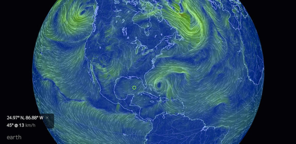
The visualization recently provided a view of Hurricane Matthew's destructive path, while another clip from "earth" revealed the location of monster waves over the course of a year. Yet another slice of the data reveals the path of the air pollutant sulfate as it traveled over the Pacific. Particulates of sulfate can block sunlight, thereby cooling the planet.
But Beccario hopes people explore the site on their own.
"The site is designed to be fairly sparse because I want visitors to discover their own insights. I think this is much more rewarding than being fed a particular narrative," Beccario said.
The graphic was initially inspired by the wind map, a visualization of wind flowing across the United States created by artists Fernanda Viégas and Martin Wattenberg.
"I thought that would be a great project to emulate and expand upon," Beccario told Live Science. "I've always been interested in science and weather, so this project was a great platform to explore those interests as well. I remembered thinking: What do the winds around Antarctica even look like?! I really wanted to see those patterns."
Original article on Live Science.

