Pantone Announces 2016′s Color of the Year — And There’s a Twist!


The color gods at Pantone have spoken, and in an unprecedented twist, 2016’s Color of the Year is actually … two colors.
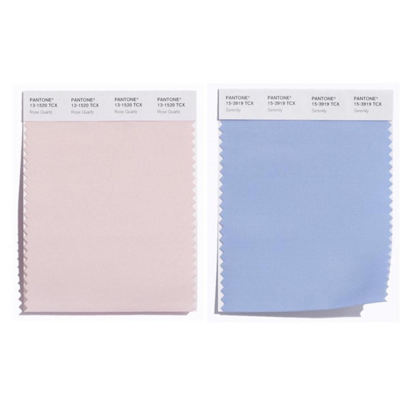
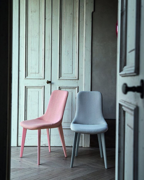
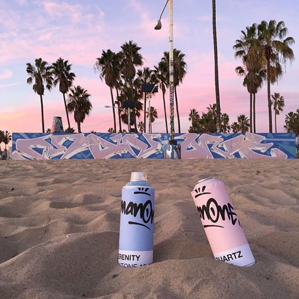
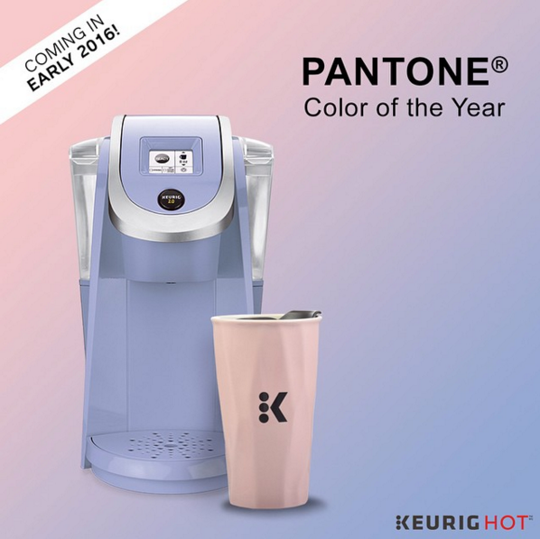
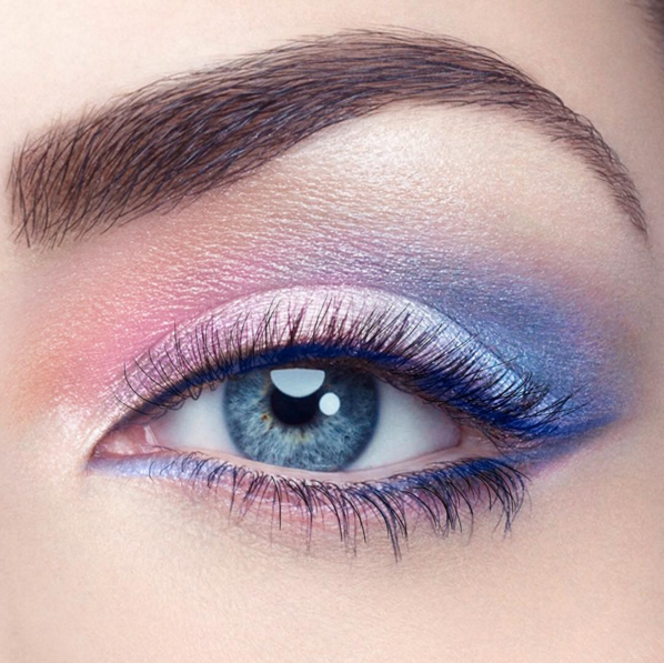
Rose Quartz (a pale, dusty pink) and Serenity (a warm, baby blue) are ready to reign supreme in 2016.
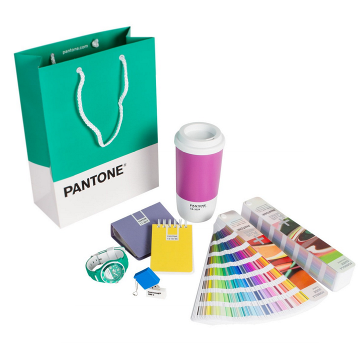
Pantone’s famous system for numbering and identifying specific colors has made it an authority on hot hues. Each specific cocktail of color is translated into a number, so companies working across continents can keep Coca-Cola red (originally Pantone 484) and Starbucks green (Pantone 3298) consistent.
The minimalist design of Pantone’s famous “paint chip,” with its white border and Helvetica caption, has also become a darling of design-lovers everywhere, inspiring everything from underwear to hospital scrubs to boutique hotels.
For the past 15 years, the color experts at the New Jersey-based company have used trends in fashion, design, home decor, the entertainment industry, and culture at large to predict which color will be the coming year’s most influential.
Last year’s color was Marsala (a deep, wine-y orange), 2014 was Radiant Orchid (a vibrant purple), and before that we had Emerald (which was … emerald). Each influenced major designers and amateur design-lovers. But this year marks the first time a color combination has held the coveted title.
Why the change? According to Leatrice Eiseman, Pantone’s executive director, Serenity and Rose Quartz make up “a harmonious pairing of inviting shades that embody a mindset of tranquility and inner peace.
“As consumers seek mindfulness and well-being as an antidote to modern-day stresses, welcoming colors that psychologically fulfill our yearning for reassurance and security are becoming more prominent.”
But Pantone’s selection goes beyond just trying to help you chill out. According to its press release, the company is also responding to what it sees as a blurring of gender norms in fashion, design, and culture at large.
“This more unilateral approach to color is coinciding with societal movements toward gender equality and fluidity, the consumers’ increased comfort with using color as a form of expression which includes a generation that has less concern about being typecast or judged, and an open exchange of digital information that has opened our eyes to different approaches to color usage.”
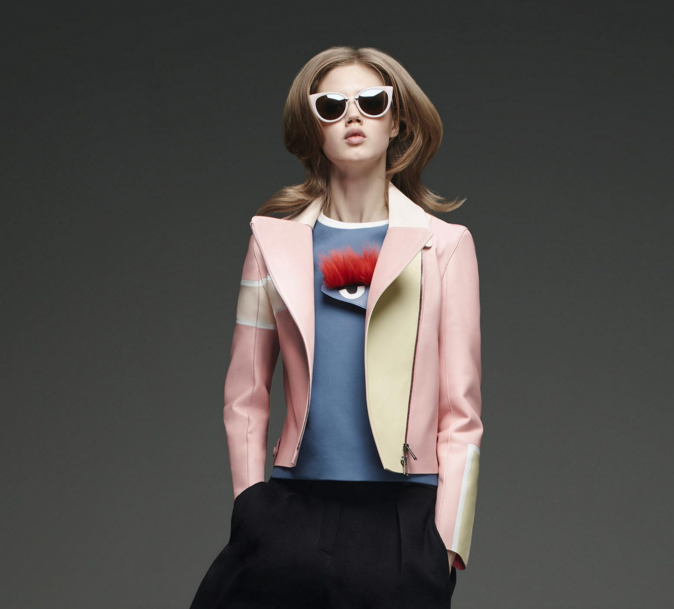
The color combination is already being seen in fall 2015 and spring 2016 collections by Chanel, Prada, and Fendi. And Valentino’s pale pink athletic shoes for men sport a band of serenity blue.
According to Pantone, the color combination will bring “feelings of respite and relaxation even in turbulent times.”
Fingers crossed, Pantone. It is, after all, an election year.
Also on Yahoo Makers:
Pantone’s Color of the Year 2015 and 5 Steps to Picking the Perfect Color for Your Walls
6 Colors and How They Affect the Way You Live
Tips to Use 2015’s Color of the Year in Your Home
Let Yahoo Makers inspire you every day. Join us on Facebook, Twitter, Instagram, and Pinterest.
