Warning: You're Going To Be Obsessed With These Two Color Trends
In just three and a half days, Nancy Fire clocked 40 miles walking through exhibit after exhibit at Paris's Maison & Objet, one of the world's biggest interior design fairs. It's where companies, artisans, and designers of all sizes debut their latest projects, and it's often where you can catch a first glimpse of the looks that are about to be everywhere.
As the design director at HGTV Home and founder of Design Works International, it's Nancy's job to stay ahead of the trends, keeping in tune with what people are craving-and what they don't realize they'll be craving months from now. After logging some serious miles at the show, the designer uncovered a few major recurring themes, and they all have to do with color. If Maison & Objet is any indication, 2019 will be the year people back away from all the delicate pastels and start to warm things up.
Spicier Shades Are Bringing The Heat.
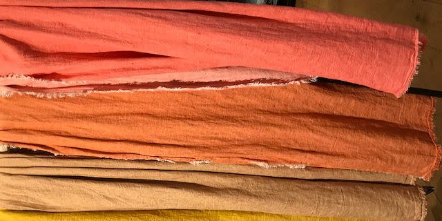
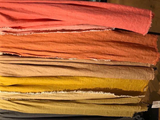
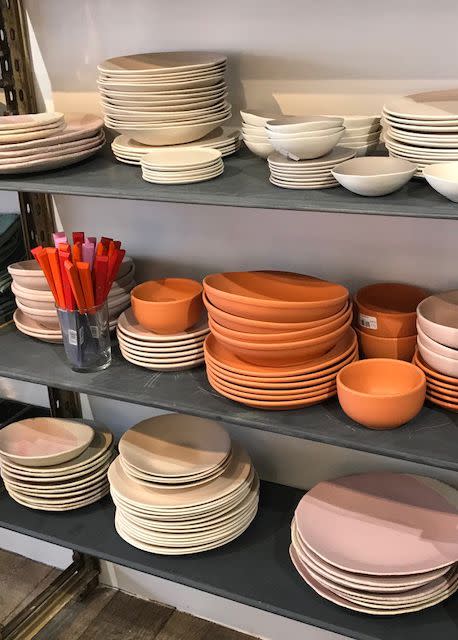
Sherwin-Williams was right on target naming Cavern Clay its 2019 Color Of The Year. Exhibitor after exhibitor showed off collections-as varied as dinner plates and bedding-in shades of yellow, gold, rust, and light brown.
"Everything was very tonal on warm colors," Nancy said. "It reminded you of spices-paprika, tarragon, things like that-and it seems like that trend of warmer colors is shifting from fashion to home."
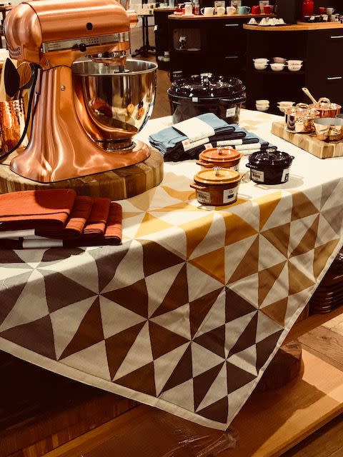
Blues and teals are still selling well, Nancy added, but the rise of blush pink has made people more open to richer colors. Deep plums and reds were popping up everywhere, but they were often layered with other shades of the same color.
Neutrals Are Getting Some Character.
"I'm not talking greige, beige, or taupe-these are beautiful neutrals, like gray-blacks or creamy whites that look a little worn," Nancy explained. "It's paint that's very muddled or looks like it's aged."
Imagine a wall painted decades ago and how it'd naturally wear over time-that neutrals-gone-au-natural vibe is starting to appear everywhere. (Psst...if you're looking to dip a brush into this look, Leanne Ford's go-to shades of white are a perfect fit.)
A post shared by Leanne Ford (@leannefordinteriors) on Aug 29, 2018 at 7:43pm PDT
The trend actually goes hand in hand (er, swatch along swatch?) with the overall move toward sunset hues; the weathered tones are a little warmer, too. The worn look extends beyond color itself. Nancy also spotted it in a lot of the materials used in products on display at Maison, like textured placemats and napkins, and stainless steel that had an almost hammered look to it.
"Think corrosion, but not in a bad way," Nancy added. "There's a relationship to nature with these colors-it's beautiful and ethereal."
Follow House Beautiful on Instagram.
('You Might Also Like',)

