Think Tank: Color in Design Counts More Than Ever
If you search Google images for ath-leisure or workout apparel, some surprising sayings might appear: “no-shower happy hour,” “ride and dine,” “bootcamp and brunch” and “sweat and sip.” Today’s consumers love to work out and seamlessly move to social and personal activities that, if done 10 years ago, would have required “freshening up.”
According to The NPD Group, sport leisure styles increased 17 percent last year, totaling $9.6 billion in sales. However, ath-leisure is not viewed just as transitional pieces, but a style in and of itself. In fact, ath-leisure has become an acceptable replacement for casualwear, with leggings often replacing jeans.
Within the ath-leisure category and beyond, alternative textiles like polyester, poly-blends and other synthetic fabrics have taken over street and runway styles for their versatility and comfort. These styles and fabrics tend to showcase vibrant, highly saturated colors to satisfy our desire to stand out. However, colors with a greater hue intensity are often not achievable on traditional materials such as cotton, creating a new set of color management challenges for designers and manufacturers following the trend of comfort over convention.
Ath-leisure is also progressing beyond apparel and shoes. An NPD study showed that cosmetics that include waterproof makeup geared toward gym-goers is driving beauty sales. For example, Tarte has a line of “ath-leisure essentials” for those who want long-lasting makeup that stays put during an intense sweat session.
Color is the first thing that catches the consumer’s eyes, whether on a garment, sneakers or beauty products and food packaging. However, as trends in materials shift and adapt to fit the ath-leisure lifestyle, designers must ensure that their designs accurately and consistently communicate the intended messages driven by color selection — no matter the fabric or print substrate — which often times is no easy task.
As a designer or manufacturer, how many times have you come across the following problems in recent months?
• High-demand bright and saturated colors aren’t achievable in cotton.
• Requests to see more grays, blues and neutrals in cotton.
• Fewer color offerings in nylon substrates.
• Using garment clippings instead of textile standards for color matching.
• If no accurate color match can be achieved within production timeline, some customers are forced to accept the best option or what they consider “good enough.”
With many of these problems comes additional issues such as product delays (think four to six weeks of additional development times), various rounds of approvals and an ever-growing frustration around inaccurate color or inconsistencies across materials.
Fortunately, advances in technology have enabled the development of textile standards — that, when used in conjunction with digital color management tools — help designers achieve the perfect shade of neon yellow on any substrate — from polyester and mesh leggings to a matching tank top, coordinating tote bag and even packaging on shelves.
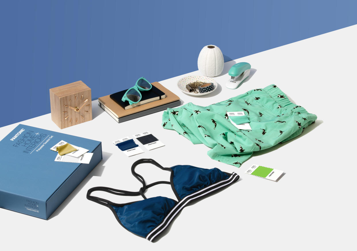
For example, Pantone expanded its textile standard offering to include new polyester standards, ideal for designers working in swimwear, intimates, outerwear and soft goods. These tools allow for the most exacting color specifications, enabling designers to fully achieve the color they intend.
Spectral data can be a lifesaver for designers working with exacting color choices, as those working with non-traditional materials often are. Spectral data allows designers to replicate the color across more than fabrics. Printed paper or plastic packaging, in-store signage and displays, online advertising: all of these can be matched much more easily to spectral data than to a clipping from a piece of fabric, which will change under lighting conditions as well as degrade or change over time and from contact during normal handling. So not only will the ath-leisure merchandise in your shop be matching across materials, but the packaging, signage, hard accessories like water bottles, and online displays will as well.
In addition to physical references, designers and production partners should leverage digital tools and data, such as values found on Pantone Live, to provide a visual reference of a single color dyed onto different textiles and ensure accuracy in production.
Getting color “right” on newer materials can be complex, but designers should look to partners for tools and strategies to help them keep pace when trends like ath-leisure test the limits of production.
Adrián Fernández is the vice president and general manager of Pantone.
More from WWD:
Think Tank: Why the Store Still Matters
What Millennials Want from Retailers
Think Tank: The Inclusion Imperative
Related stories
Supima Names Finalists for Annual Design Competition
Think Tank: The Role of Machine Learning and User-Generated Content
Melania Trump Wears Yellow Gucci Coat in Helsinki
Get more from WWD: Follow us on Twitter, Facebook, Newsletter

