See How These Homeowners Remodeled a Split-Level While Preserving Its Character
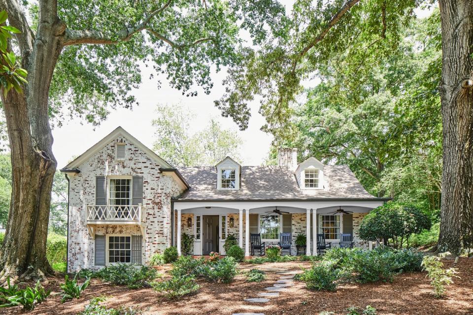
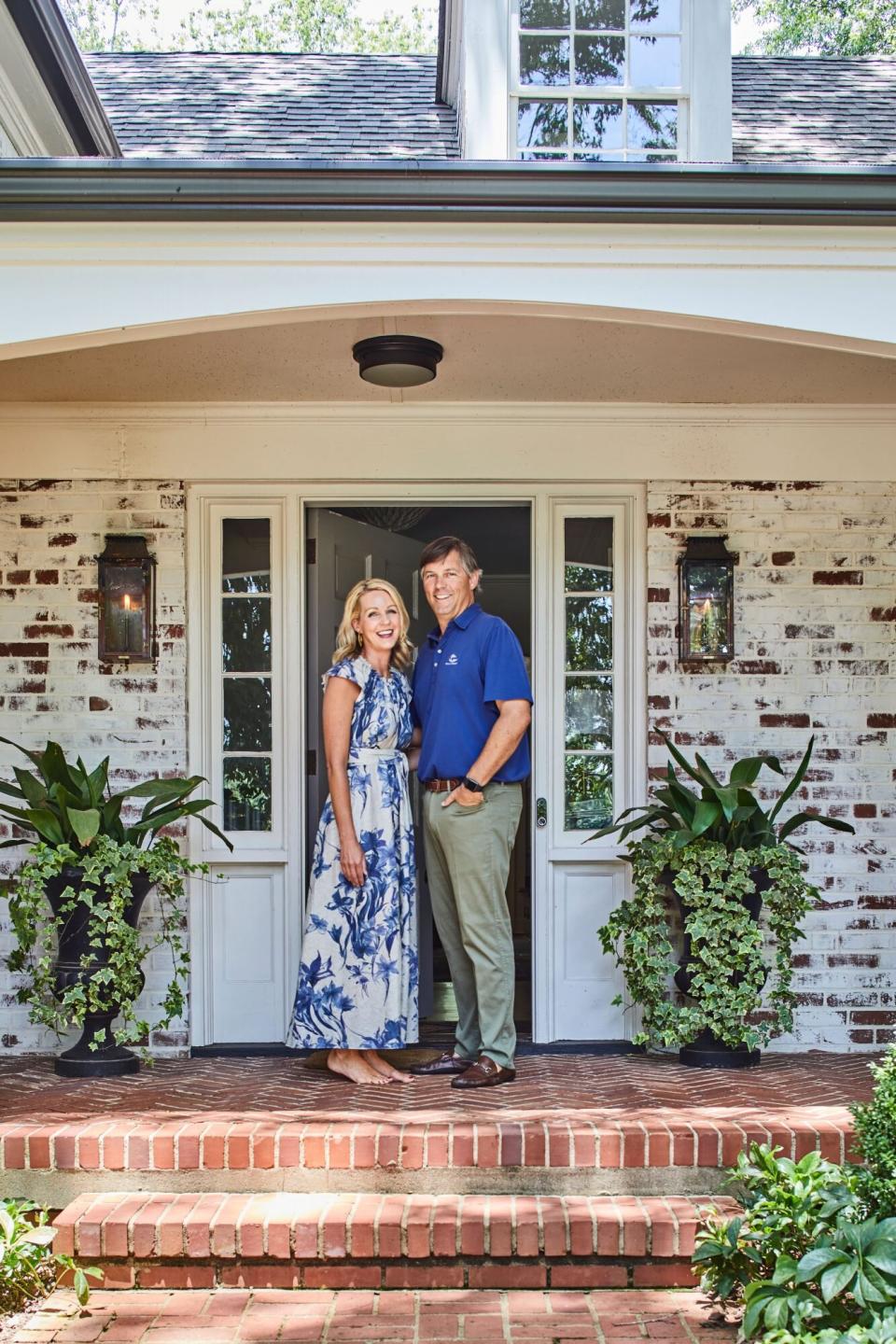
Bethany and Tyler Davis have always had a thing for old homes. So when a friend alerted them to one that was located just over a mile from the University of Georgia campus in Athens, they were all ears. "It just oozed character," says Bethany. "There was no other house like it." Set on nearly 1 ½ acres, the 1940s-built abode was charming and endlessly peaceful—except for the excited rumble that reverberates from Sanford Stadium on game days. The icing on the cake for these UGA grads was its history: It was originally owned by Dr. Omer Clyde Aderhold, who served as the university's president for 17 years starting in 1950.
Laurey W. Glenn; Styling: Shannon Gini
But Tyler, who helms the Athens Building Company, knew well that homes old enough to tell stories don't come without their caveats. The split-level design—built long before that mid-century modern architectural trend took hold—was one of them. A lack of renovations had also left the layout choppy, with small rooms sprinkled throughout five levels (including a basement and an attic). Working with their sister-in-law, Atlanta designer Amy Morris, they devised a plan to bring it up to date for their busy family of four. "The bones were good," says Tyler. "It was just designed for the forties and not for the modern day." Here's how the team reimagined the aging home while preserving its character.
Laurey W. Glenn; Styling: Shannon Gini
Lead with Character
One of the first things that drew the Davises to this redbrick house set deep into a lush, verdant lot was its first impression. "It looks quaint and understated," says Tyler. "We didn't want to be that large, flashy house you see from the street." Plans for a 3,000-square-foot addition could have foiled its curb appeal—so instead, the team opted to tack on space at the back of the home for an unassuming appearance. "From the front, it looks more or less the same way it did in the 1940s," he says. They added a limewash to the exterior to up its historical feel.

Laurey W. Glenn; Styling: Shannon Gini
Balance Simple and Showstopping
While much of the home was a study in working with what's existing, the new living room (part of the addition) was a clean slate. Still, the team was mindful to design a space that wouldn't overpower its historic surroundings. Their grand plan included clean, traditional moldings and a hipped box-beam ceiling set just high enough to wow. Morris accentuated that height with a statement light fixture from Currey & Company and enhanced the room's feeling of openness with a pair of large-scale mirrors to "create a feeling of windows all around," she says.

Laurey W. Glenn; Styling: Shannon Gini
Repeat History
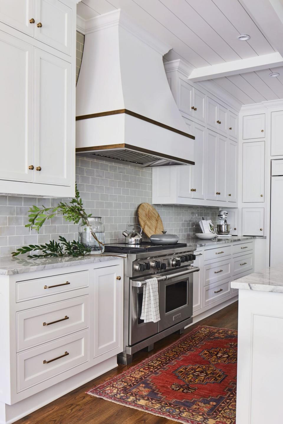
For a family who loves to entertain, the original small, closed-off kitchen wasn't practical. So the first order of business for the Davises was opening up the place, making way for the large, quartz-topped island. But modernization didn't mean completely eliminating its traditional roots: An archway that separates the space from the neighboring living room was directly inspired by a 1940s feature that framed the original foyer. "It was one of my favorite details in the entire home, so we knew we had to replicate it," says Bethany.
Laurey W. Glenn; Styling: Shannon Gini
Look to the Past
Among the items that were preserved in the renovation were all of the home's doors and antique brass-finished hardware. Brass accents repeat throughout the home, including in the kitchen.
Laurey W. Glenn; Styling: Shannon Gini
Fuse Vintage with Modern
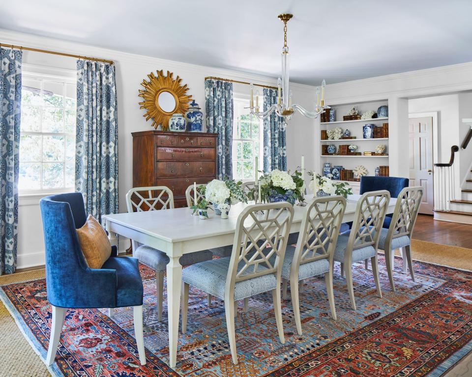
Set just off the entryway, the home's long dining space (originally the living room) immediately establishes the old-meets-new tone. Here, Morris incorporated antiques, like the highboy and a sunburst mirror, with more contemporary pieces such as the 10-seater dining table (from Tritter Feefer) and Woodbridge Furniture side chairs. Sapphire-hued velvet upholstery, printed curtains, and vintage delft-ware scattered throughout satisfied another request from the owners. "Amy knows that blue is one of my favorite colors," says Bethany. "We wanted a palette that felt calm and serene."
Play with Texture
Adding more than 16 feet to the back of the home gave the owners more wiggle room to build an enhanced main suite (which shares a floor with an additional guest suite and bath)—but not too much room. "Other than our bed and side tables, it's pretty minimal," says Tyler. Wrapping the entire space in shiplap gave the modestly sized area a cozy feel while accentuating the room's elevated ceiling. "Sometimes when I lie down at night, I feel like I'm in a boutique hotel," adds Tyler. "It's very peaceful."
Rethink the Expected
In redesigning the expanded main suite, the original idea was to do a side-by-side bath and walk-in closet set off the hallway leading to the bedroom, but then Morris had other plans. "I suggested just having the main bath off the hall (which allowed for a larger space) and adding custom cabinetry in the hallway to serve as the closets," she says. The added square footage in the bath made way for some spalike amenities, including a built-in heated soaking tub and private vanity painted a calming shade of blue (Benjamin Moore Silver Mist, 1619).

