Move Over Neutrals, Color Is Having a Moment
- Oops!Something went wrong.Please try again later.
“Hearst Magazines and Verizon Media may earn commission or revenue on some items through the links below.”
After a long, dark winter—arguably the longest and darkest that many of us have experienced—spring’s beauty is finally here, and a veritable rainbow has descended upon us. The blushing pink of magnolia bushes, the fiery red and sunny yellow of rows of tulips, the crisp pea green of fresh blades of grass.
If all of these bright and hopeful hues have you wanting to take a deeper dive into their scientific, cultural, and decorative underpinnings, you’re in luck. A trio of cultural endeavors—two of which you can enjoy from home—explores the power of color in our daily lives. And who knows? Perhaps they will inspire you to incorporate a bolder palette at home.
“The Nature of Color” at the American Museum of Natural History (AMNH)

Though it first opened over a year ago at New York’s AMNH, this exhibition, like those at so many other museums, was closed for the majority of 2020. It is now enjoying a longer run through August 8, particularly good news for parents looking for an air-conditioned outing this summer. “The Nature of Color” takes a multidisciplinary approach to investigating color and how both animals and humans experience and use it. A color-changing room and light lab demonstrate how white light is composed of different colors, which can influence our moods and behaviors. (Shorter wavelengths, for example, tend to be experienced as “cool” colors and longer ones as “warm” colors, a possible evolutionary development to help animals distinguish the blue light of midday from the red, orange, and yellow light of dawn and dusk. A nature-themed section demonstrates how colors help animals either stand out or camouflage themselves, and a more culture-oriented area points out how one hue can have a panoply of meanings, as in red’s association with various political parties and fashion moments. There is also an installation of photographs by the Brazilian artist Angélica Dass, showcasing humans with a range of skin tones that defy narrow categorization.
Life in Color with David Attenborough on Netflix

This three-part Netflix series narrated by the beloved 94-year-old British naturalist David Attenborough dropped on Earth Day last month and delves into the often undercover world of color within nature. Many of the colors that animals use to communicate are not visible to the human eye. The wings of certain butterfly species, for instance, reflect ultraviolet light as part of mating rituals. Using camera technology specially developed for the program, the show’s creators bring those normally clandestine hues to life for viewers to dazzling effect. Over the course of the three episodes, we also learn about the poison dart frog’s flaming warning colors, the aquatic-blue-striped blenny’s camouflaging array on Australia’s Great Barrier Reef, and the Bengal tiger’s stripes. Those looking for a more sober accounting of nature’s prognosis at the hands of humans can follow up Life in Color with the 2020 Netflix film A Life on Our Planet, which Attenborough produced and in which he gives a “witness statement” of his life-long devotion to the natural world and his fears for its survival.
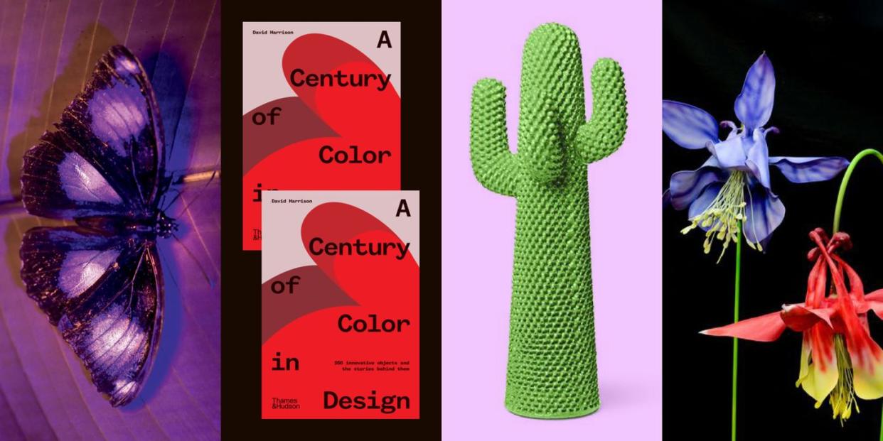
A Century of Color in Design by David Harrison

In this detailed tome from Thames & Hudson, the Australian design journalist and interiors stylist David Harrison explores the advent of bold color in product design beginning in the 1920s through the present day.

Out May 11, the book starts with the impact of the Bauhaus and De Stijl movements on bringing primary colors into the home and highlights the influence of post–World War II industrialization on Italian design, an example of which is Marco Zanuso’s 1948 lipstick red Antropus armchair (relaunched by Cassina in 2015).
Harrison then moves into the zaniness of the 1980s Memphis movement and more contemporary approaches. Throughout, he highlights such iconic pieces as Verner Panton’s vibrant Heart Cone chair (1959), Maija Isola’s poppy Unikko print for Marimekko (1964), Anne Castelli Ferrieri’s candy-hued Componibili storage for Kartell (1967–69), and Patricia Urquiola’s multicolored Tropicalia chair (2008).
In the end, Harrison notes that our century-long obsession with bright hues in furniture and products may eventually reach its “saturation point”—pun intended—leading to more subdued iterations. But as you’ll have learned from the programs above, our natural affinity for a colorful world is likely eternal.
You Might Also Like

