Hundreds of Chanel Projects In, Peter Marino Still Isn’t Tired of Black and White
- Oops!Something went wrong.Please try again later.
- Oops!Something went wrong.Please try again later.

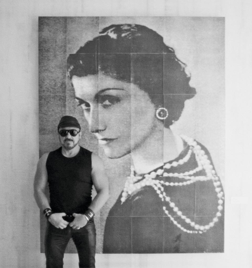
Architect Peter Marino was in a mood to talk in powers of 10.
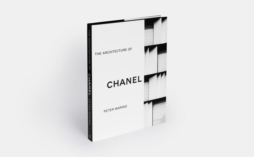
“It’s much easier to work with a limited palette — 10 times easier,” he said, dialing in from his Manhattan-based practice to talk about “The Architecture of Chanel,” a book that features a selection of 16 of the many buildings he designed for Chanel, all in the French brand’s signature black and white.
More from WWD
As effortless as they look — sugar-cube-like shapes for Los Angeles and Miami, an asymmetric stack of black rectangles for Seoul — Marino said “10 times the effort” goes into creating a building versus an interior “because the interior never lasts more than five years.”
The go-to architect for a big swath of luxury’s biggest names — from Dior, Bulgari and Louis Vuitton to Ermenegildo Zegna — Marino has collaborated with Chanel for 25 years and received hundreds of commissions, amassing a collection of buildings and boutiques that are as recognizably Chanel as the packaging for a bottle of No.5.
“Four thin black lines outlining a matte white rectangle: Inherently architectural, modern, timeless, elegant, clean and uncomplicated,” Marino writes in the preface of the 280-page tome, which is published by Phaidon and lavishly illustrated with conceptual drawings and photos galore of exteriors and interiors.
In an interview, the architect noted that “every brand has a color, which is really interesting” and rattled off Dior’s fetish gray and Vuitton’s distinct brown, and mentioning the famous Christian Louboutin lawsuits over its red soles. “Color is really, really, really close to a brand, which is why I could never understand the Valentino stores in the last eight years because they suddenly went to gray terrazzo and I was quite perplexed at that. But then, what do I know?”

Richard Corman
To be sure, Marino has hardly exhausted black and white as he racks up more commissions from Chanel, including “two or three big ones in China,” a “huge” refurbishment project in Nice and the fine jewelry boutique in Place Vendôme. Overall, he has designed over 200 stores for Chanel.
“White and black is a really great color palette to work with. And very, very, very strong. Chanel is lucky that they own that palette, I mean,” he said, retelling the founder’s very formative childhood “growing up in a white stuccoed convent wearing black school clothes.”
At Marino’s New York offices, one large room is dedicated to Chanel, the walls adorned with black-and-white paintings, or gold paintings, with all of the sample materials for the brand kept in cupboards.
He noted this is for the benefit of his younger staffers.
“Not everybody has the luxury of having done this for 42 years,” he deadpanned. “And it’s real good because they’ve been surrounded by the physical images and materials and everything that they can touch, so they get more quickly into the psyche of the brand.”
Marino said Gabrielle Chanel’s house La Pausa in the Roquebrune-Cap-Martin, which he was asked to help refurbish, is a case study in the “tough and severe” architecture she favored — essentially a 1930s version of a convent.
In the book’s introduction, design writer Pilar Viladas sums up Marino’s approach to his buildings and retail designs for the storied brand.
“The Chanel No.5 box; Chanel’s black, beige and white color scheme; her signature tweed and pearls, and her apartment are just a few of the themes that Marino interprets again and again — but never in quite the same way — using luxurious materials and precise detailing,” she writes.
One of Marino’s favorite buildings — on Bağdat Street in Istanbul — boasts a white, marble facade that echoes the pleated silk blouse Chanel wore at her first Communion.

Manolo Yllera
In the book, Marino relates that Chanel’s longtime couturier Karl Lagerfeld would often send him swatches of handwoven tweed and bouclé, though he is careful to avoid obvious product references like quilted leather.
His building designs and store layouts are configured around the space requests for Chanel departments like ready-to-wear, shoes, leather goods and fragrance, but he presents his proposal only to the owners, Gérard and Alain Wertheimer.
“Capital expenditures on architecture are the largest percentage of their capex,” he said. “So the owners need to see what’s being spent and does it represent their brand.”
By all accounts, Marino proposes only the best for Chanel, lining a powder room in the Ginza Namiki store entirely in gray onyx, and lighting other buildings with ornate rock-crystal chandeliers commissioned from jeweler Maison Goossens.
“I’m very proud of the uniqueness of the buildings that I’ve done for Chanel. They don’t look like anything else,” he said. “It’s not easy being nonderivative in today’s fashion world.”
Courtesy
SEE ALSO:
Peter Marino on Rooting for the Ugly Ducklings
Tiffany Taps Architect Peter Marino for Flagship: Sources
Chanel Opens Slender New Flagship in Tokyo’s Ginza District
Sign up for WWD's Newsletter. For the latest news, follow us on Twitter, Facebook, and Instagram.

