Fashion's Current Favorite Color Story Wants to Heal Us
If it feels like calming earth tones are everywhere, that's because they are. And there's a reason for it.
For a solid chunk of 2016, we, collectively, became infatuated with a cloudy shade of salmon. Dubbed "millennial pink," the modish tint had overtaken our consumer lives, splayed across book jackets and vibrator ads and paper takeout bags for fast-casual restaurant chains.
By the following fall, "millennial pink" had moved on to more passé pastures, with no clear successor. The closest, if any, was "blaze orange," which The Paris Review anointed the color of "fear, warnings and the artificial." As noted by writer Katy Kelleher in 2018: "Orange screams at your retinas, spooking them into vigilance." I need not explain why, exactly, such an angry color had come to replace a soft, cooing pink. Because where would I begin?
Three years later, we are, of course, still angry. But that initial orange blaze has tempered, giving way to a new and objectively less arresting palette en vogue: buttery creams, sun-bleached greens and freckled yellows meant to ground us in constant, painful uncertainty. Trend-forecasting agency WGSN aptly calls these shades "nourishing earth tones," already having highlighted them as colors to watch for the Spring 2022 season.
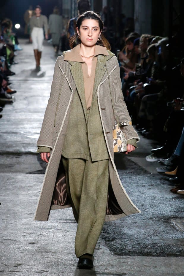
While WGSN may work up to two years ahead, mineral hues like terracotta and honey have already begun cropping up on the runway and at retail. They are on deconstructed trenches and '70s-style suiting at Burberry, on silk shirting and sturdy knitwear at Rejina Pyo, on graceful blazers and patchwork dusters at Tod's. They are so very ahead of schedule because we are so very in need of the kind of nourishing that nature can provide.
"A growing body of research shows that we have a deep-rooted bond with the environment and being outside in nature can have a restorative effect on the body and mind," writes WGSN's Head of Color Jenny Clark, who spearheads research and development of the company's seasonal color palettes, in an email. "Being surrounded by nature-inspired colors will feel more restful and calming to a consumer navigating a challenging world."

WGSN began charting earth tones this past March, when the agency partnered with color system organization Coloro for its seasonal Color Week. Twice a year, the two groups — both under the same London-based parent company, Ascential — analyze months of research to select the most relevant palettes for future seasons. Some editors source inspiration from trade fairs or exhibitions; others bring in physical materials or share dormant social media trends. And this spring, as the coronavirus continued to spread globally, one question underscored all discussions: What is color going to look like in a post-pandemic world?
"With these kinds of topics of conversation, what kept coming up, obviously, was these periods of really long isolation or lockdown, with the main topic of conversation being, 'Oh, I just can't wait to go out in nature,'" says Coloro's Head of Content, Joanne Thomas. "So we decided to strip back our palettes and look for tones we thought would reassure people and comfort them, make them feel warm and rich."
By the end of Color Week, both WGSN and Coloro walked away with five restful, balanced colors to comprise the broader range: an oily olive green that's a noble substitute for the genderless khaki; a burnished orange that's as autumnal as it is sunny; a non-tedious beige, which we can expect to see grace the booming loungewear category; an earthy green that harkens back to leafy moss; and finally, a buttery saffron yellow named "golden harvest" that, as Thomas says, people may need to bolster their frames of mind.
Taken individually, these colors are lush and sensory, harkening back to hazy August days tucked away in the forest or spread out on the sand.
Shivangini Padhiyar co-founded her intentionally small-batch, ethical label The Summer House, based in Bengaluru, India, upon this particular breed of nature-backed nostalgia. Named for her grandmother's summer house, the brand has incorporated a rich spectrum of earth tones since its launch in 2013, with silks, cottons and linens constructed in shades of dusky marigold and pulpy clay.
"My most vivid childhood memories are of that place," says Padhiyar, who pauses to describe the smell of eucalyptus that cloaked the property. "We all want the summer house. We all plan for one we'll escape to. We don't end up doing it, but we try finding bits and pieces of it in our wardrobe or in our homes. But in our head, we always want that house by the beach or in the mountains or in the forest."
View the original article to see embedded media.
In the years since The Summer House's launch, Padhiyar has developed a close dialogue with her consumers, who appreciate the brand for the gap it bridges between traditional, artisanal tailoring with a more contemporary, "Kinfolk-magazine-appropriate" aesthetic. She personally speaks to roughly 50 customers a month to get a more intimate understanding of their stress points so she can then design clothing that helps them feel better, nicer, happier.
"In the current situation," she says of the pandemic, "nobody, at least those we know in our customer base, want to be wearing something too bold. What we want are colors that calm you down and make you feel relaxed because the external stimuli is too much. We try to understand that if it's going to be a stressful season, what would customers want to wear? What would they want to project?"
It's the basis of Color Theory 101 that colors can make or break a mood. An earthy green room creates a much more soothing atmosphere than a deep red one, and that's because nature can actually improve your physical health and cognitive functioning.
Related articles:
How to Make Natural Dyes From Things You Already Have Around Your House
The Next Wave of Sustainable Fashion Is All About Regenerative Farming
Why Does So Much Ethical Fashion Look the Same?
As rates of chronic diseases have skyrocketed in past decades, scientists and healthcare providers alike have increasingly prescribed individuals time outdoors. Take Vermont, a state that consistently ranks as the healthiest in the nation: Its Park Prescription Program enables doctors to distribute free park passes to patients to encourage them to exercise and destress.
With global travel on hold for the foreseeable future, regional vacations are starting to look pretty good. As of May, camping, RV and road-trip essentials were seeing double- and triple-digit growth in sales, according to Kampgrounds of America's 2020 North American Camping Report. The study also found that once travelers feel it's safe to jetset again, leisure travelers will most prioritize spending time outdoors with family.
Thomas, the Coloro specialist, surmises this will directly impact what we wear.
"People are buying a lot more camping equipment," says Thomas. "People are cycling a lot more because they don't feel safe getting on public transport. So this idea that people will be now investing in outdoor-based products speaks naturally to this palette. And the fashion industry is definitely going to be directly influenced by this, as it always is."
It already is, if only in regards to plant-based color processes. At WGSN, Clark has found that the increased use of naturally-derived dyes is leading an industry-wide shift toward less synthetic hues. It is not just crunchy, outdoor-apparel retailers like Patagonia that are now involving plant dyes in their production line: Alejandra Alonso Rojas creates her signature dip-dyed patterns with elements like flower petals and blueberries; The Summer House, too, relies on organic raw materials and low-impact dyes, the combination of which creates those unbleached, natural tones that Padhiyar's customers hold so dear. (Even The Summer House's boldest shades of brick red won't jar your senses, as something like a blaze orange or even a millennial pink are meant to.)
"These palettes feel really timeless," says Thomas. "The post-Covid-19 consumer is going to be thinking about cost-per-wear when buying a garment. Not only have we had feelings of uncertainty and anxiety, but the economy's not going to be the same coming out of this. People aren't going to have as much money to spend. So they're going to look at an item and think, 'How much wear can I get out of this?'"
Padhiyar considers The Summer House's more muted garments to be a strong foundation for any wardrobe. ("You can underplay it or you can really hype it up," she says. "You make it work any which way you want.") Each garment can be worn to many occasions and in many different ways, allowing consumers to have a small, but smart closet.
Earth tones are just one extension of the grounding we so desperately seek. They allow for more navigable, thoughtful wardrobes, sure. But they also allow a brief moment of restoration, either as we cloak ourselves in olive tones or as we look forward to evenings spent with friends around a lulling campfire.
"People keep talking about dressing for success," says Padhiyar. "But I think you should dress for peace. Calming dressing instead of power dressing."
Want more Fashionista? Sign up for our daily newsletter and get us directly in your inbox.
