David Berlow on the future of typography
Known as the godfather of type, David Berlow began his career in 1978 creating letters for the Haas, Mergenthaler, Linotype and Stempel type foundries. In 1989, he founded the The Font Bureau along with designer Roger Black, and created typefaces for big tech brands such as Apple Computer Inc and Google Inc, as well as for editorial heavyweights such as The New York Times Magazine, Rolling Stone, Esquire Magazine and The Wall Street Journal.
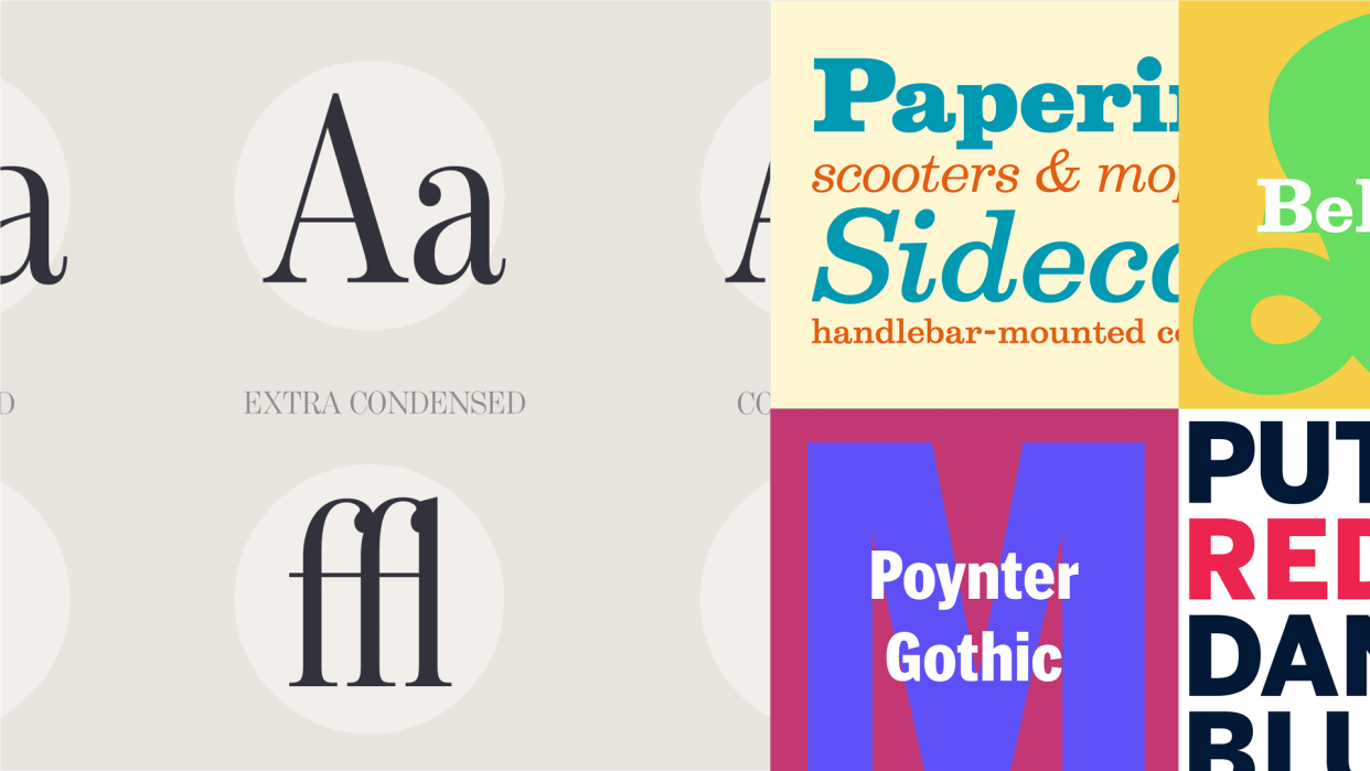
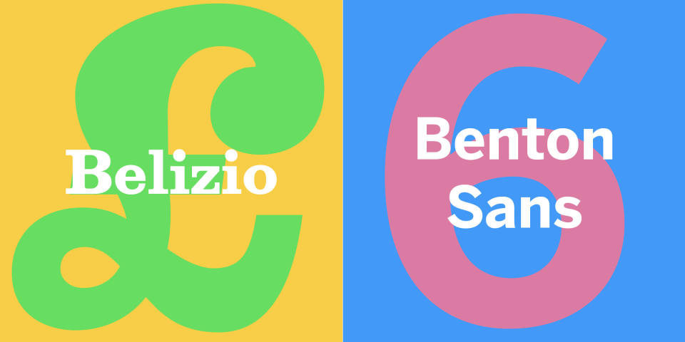
Recently, Monotype acquired 39 type families created by Berlow, including classics such as Belizio, Bureau-Grot and the Poynter series. We caught up with Berlow to find out about the thinking behind this decision, as well as chat with him about the future of fonts, his type heroes and how he created fonts for Apple.
For more on fonts, see our typography tutorials, typography design explainer or our collection of typewriter fonts.

Why did you decide to make some of your classic fonts available via Monotype?
It was a gradual process and one that ultimately made sense. Monotype had previously purchased Linotype and Bitstream, two companies I worked for before founding The Font Bureau in 1989. Some of the typefaces I designed there are part of this acquisition, and others are from my time at The Font Bureau. Ultimately this presented itself as an excellent opportunity to gather many of the key typefaces of my career together and have them in the same place - the Monotype Library! Monotype understands the value of type and is a custodian of historic typefaces.
Why is creative IP important for type designers?
Thinking and educating yourself on creative IP will enable your studio or company to be ‘future-ready’ for any change, whether within your team or the technology you are using. A big part of what made this acquisition happen was my wish to ensure that my typefaces remained relevant once I’d retired and that they could be updated to reflect the latest advances in technology and typographic trends.

Tell us about your process for creating a font
The main thing when designing something is always to trust your instincts. A common challenge over the years has been reinforcing what the client has said and conveying those feelings within the design. It’s about being able to execute this feedback from a client while educating them on how best to express and emphasise feelings through fonts. I’ve been lucky enough to work with many type designers who can do this.

How did you go about designing a font for Apple?
In 1992, I created a series of typefaces for Apple Inc.'s operating system 7 – this was a human interface where fonts we created involved pixel images and typefaces written in sand. Steve Jobs returned to Apple and only wanted to keep one typeface from the set, Charcoal. The other fonts were therefore not publicised, and there’s little information available on them now.
How has the world of type design changed since you started?
The whole process of designing a typeface has speeded up rapidly. We were only designing around four characters a day in the Linotype days. I worked with a box of drawings and would take them to a place in Long Island to get made into letters. This process alone could take up to two months. Thankfully, New York advertising agencies started adapting this. Back then, we would never design in other scripts (today, we’re looking at many!). This was a big change, and to cover those languages, you have to work with other teams, which means a whole different set of thoughts.
Another thing that’s changed the industry is publicity and marketing – you could be successful without attaching your name and brand to the fonts – they were very much seen and valued as their own thing.
I don’t think the design has changed a lot – the readers are still the readers, but we’re experiencing fonts through different platforms and technology, which means we now have to make a lot more fonts available!
How can type designers stay relevant in the digital world?
The application of AI will mean a significant change for the industry, whether we like it or not. It’s about working with partners and clients who are also equipped to deal with these changes.
That said, it’s essential to ensure design and quality are the focus, not the technology. The more type you draw, the more you learn about what you need to do to be a serious contributor.
Which type designers do you admire?
Mike Parker and Matthew Carter, together, represented two very different kinds of heroes for me, through whose work I was able to learn about type, technology and business. And it was my association with them that connected me with many people within the industry. But the heroes just keep on coming.
What challenges is the type industry facing today?
I think one of the main challenges is internationalisation – it’s now common for clients to ask for the same depth of language support that some of the operating systems have. Given that there are so many typefaces available in Latin scripts, looking for places within the design and display faces to add such capabilities can be challenging. Typefaces are also notoriously time-consuming to create, and that in itself can bring about financial challenges.
How do you see the future of fonts?
We’re going to see more fonts that work well with multiple languages and scripts – that’s a no-brainer.
I think we'll see much more personalisation and autonomy from the next generation of users, where people get to choose their own look and feel. This is happening already with colours and backgrounds on mobile phones. I think the large number of individuals who are adapting a typographic look for their brand and social media will move out of the default fonts to those with much more personality.
As for typefaces – these will be easily absorbed in AI systems, where there are lots of opportunities (but also dangers) for automated and default fonts. I’m also confident that through AI applications and hyperautomation, we’ll see products become extremely high-quality.
