Calibri dumped as Microsoft's default font — here's what the new typeface looks like
Calibri, with its subtle round stems and corners, has been the default font for all things Microsoft for 15 years now — since 2007. While we admired its soft and sophisticated characters, Microsoft is ready to replace it with a new typeface.
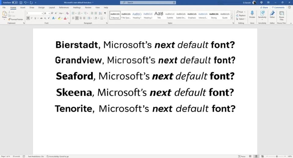
In fact, the Redmond-based tech giant has been itching to get rid of poor Calibri since 2021 when it announced that it was vetting five potential replacements: Tenorite, Bierstadt, Skeena, Seaford and Grandview.
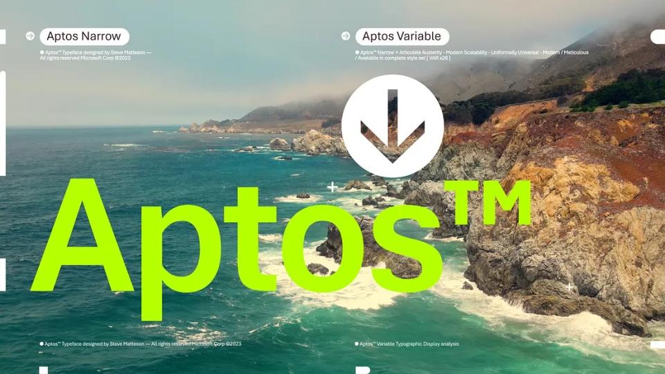
Two years later (hey, picking the right font for us to type with is hard work), Microsoft finally chose Calibri's replacement — and it's called Aptos.
Aptos is the new default font
Calibri has been with us since it stepped in to take over Times New Roman's stiff and stuffy font. Its design had the right balance: a perfect mélange of quiet fun and urbane sophistication. Unfortunately (or fortunately, depending on where you stand with Calibri), it's retiring after a 15-year run.
Who's stepping in to replace Calibri? Meet Aptos.
"What happened to the five new fonts Microsoft commissioned in 2021?" you may be asking. "Why didn't Microsoft choose one of them?" The answer is that it did. Bierstadt ended up being the winner, but Microsoft changed its name to Aptos.

Aptos is described as a "precise, contemporary sans serif typeface inspired by mid-20th-century Swiss typography" with clear-cut stroke endings that emanate a personality of self discipline, poise and willpower, according to Microsoft.
While we all love the whimsical vibes of Papyrus, Comic Sans and Lucida Calligraphy, they have no place in the professional realm of default fonts.
Steve Matteson, the mastermind behind Aptos (who also created Segoe), said he designed the font to have the flair of The Late Show host Stephen Colbert with the universal appeal of late NPR newscaster Carl Kasell.
"It's kind of like listening to a GPS voice versus a human voice. People would rather listen to a human than a robot telling you to turn left," Matteson said. "That's my ethos getting put into the design."
Why did Microsoft dump Calibri?
Microsoft's decision to boot Calibri is the same reason behind why it decided to eliminate Times New Roman, which debuted in Office 2007. Times are a changin', and so are display types, and the company wants to make sure its default font is optimized for the newest, greatest, latest screens.
Calibri got hired to replace Times New Roman due to screens' shift from CRT to LCD. In the same way, as displays advance with new technologies (e.g., QLED, miniLED, OLED, etc.), Microsoft figured that it's high time for a change.
"The [new] font needed to have sharpness, uniformity, and be great for display type," Microsoft said. And that's why it ultimately went with Aptos.
If you're a Microsoft 365 subscriber, you should see the switch to Aptos today. Calibri, and the four other loser contenders (i.e., Tenorite, Skeena, Seaford and Grandview), should be available in Microsoft apps as non-default options.

