25 Cream Paint Colors That Bring ‘Meh’ to a Whole New Level
"Hearst Magazines and Yahoo may earn commission or revenue on some items through these links."
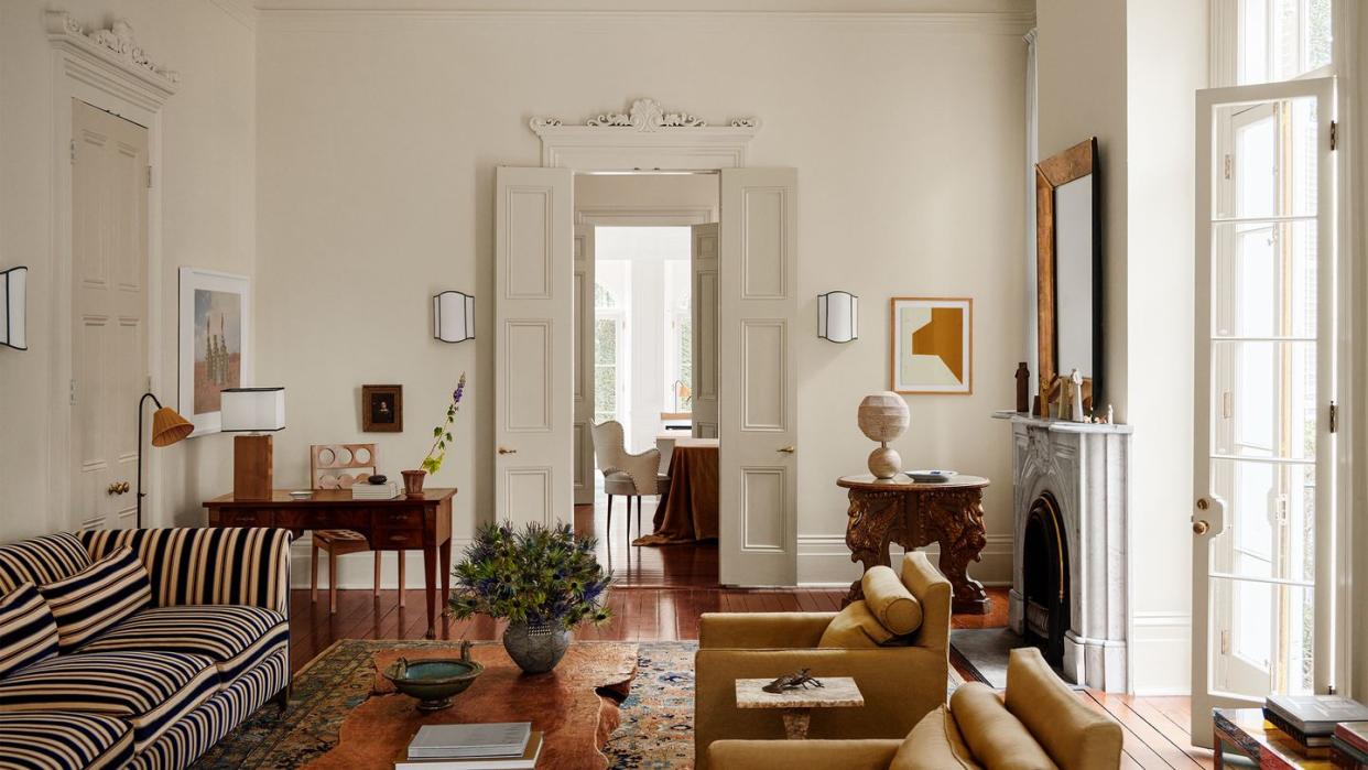
There’s more to the neutral color spectrum than gray, white, and beige. In fact, between these basics lives a whole range of relaxed cream paint colors that are the crème de la crème of wall tints. Maybe it’s a pale, buttery hue like Sherwin-Williamss Alabaster that adds warmth while remaining neutral; a mayonnaise-y hue such as Farrow & Ball’s White Tie that’s as lightweight as an airy linen; or a barely-there rose, like Sherwin-Williams’s Natural Linen, which gives its onlookers a forever-blushing kind of aura. Cream paint lends subtle dimensionality while remaining wonderfully versatile. “For a creamy or neutral paint color, no tricks required, they almost always work,” affirms ELLE DECOR A-List designer Michelle R. Smith. “I have a very long list of favorite not-quite-white paint colors. It’s rare you’ll find me choosing a bold color for the walls. It’s akin to how I dress.”
But which cream paint color is best suited to your space? First, consider the amount of light a room receives, which will alter how saturated the hue appears. Another factor is your room's architecture and context. A house with Nordic elements, for example, might be best suited for a warmer hue with blond wood to complement it. Contemporary decor might sing with the right cool-toned color.
Next, you need to make sure the rest of the room is interesting. "If you are going to work with neutrals you need to incorporate lots of contrast and texture so your space doesn’t fall flat," says ELLE DECOR A-List designer Alyssa Kapito, who suggests a combination of finishes in hardware and furniture. "Bronze and brass patinated metals, rich plaster, linens and boucle wools all build layers of visual interest that are necessary to keeping your neutral space from feeling a bit boring." Of course, textures like velvet, bouclé, and suede can create contrast against the wall’s streamlined finish. And a vibrant painting or bold print against a cream-colored wall can make for an even more memorable pop of color. It also makes for an easy style change if you like to switch things up.
Whether you’ve opted to pair a cream shade with bold hues in a large, airy space or use it all over a neutral room for a background that creates a sophisticated sense of space, there is no wrong way to use the color. To spark your inspiration, we asked some of the top designers to spill their go-to cream shades. Read on for 25 no-fail cream paint colors to consider for your next room makeover.
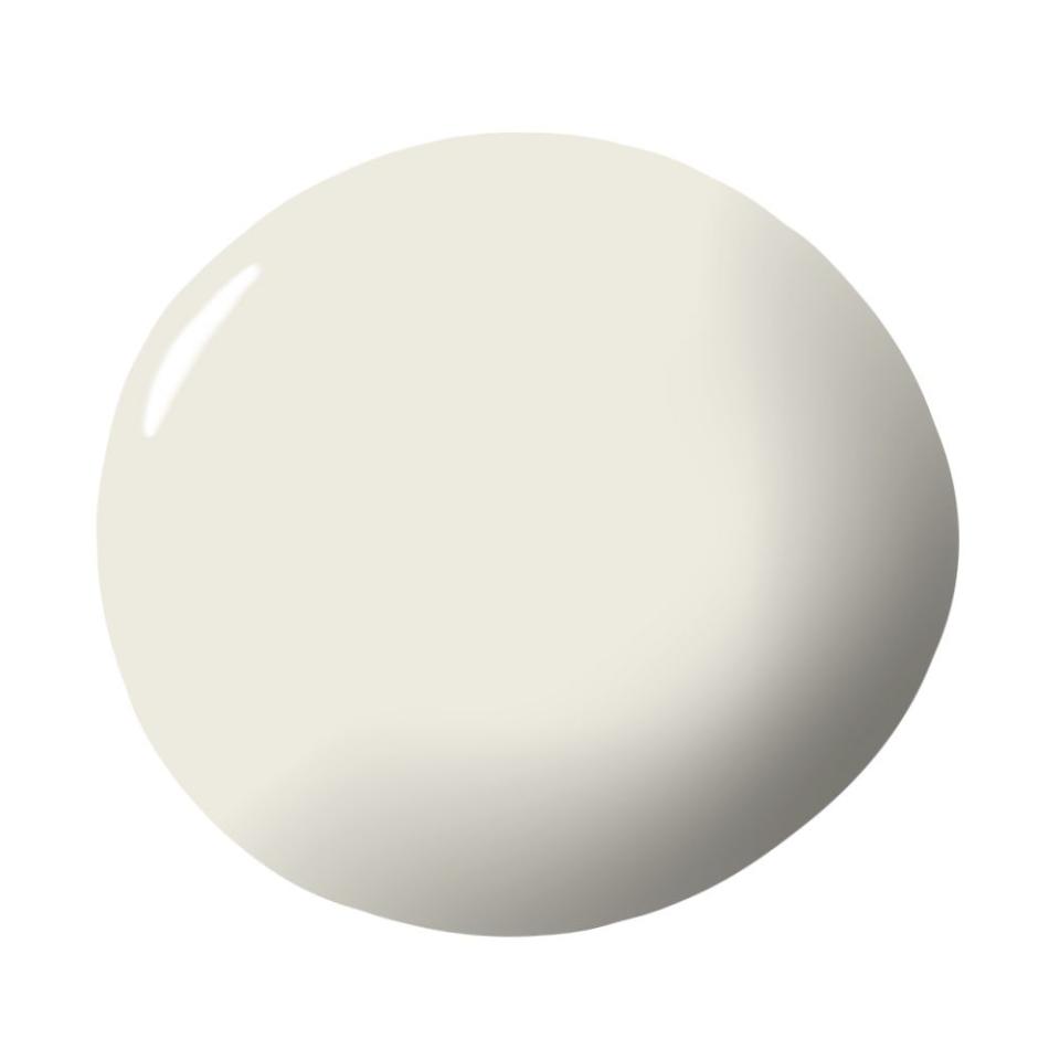
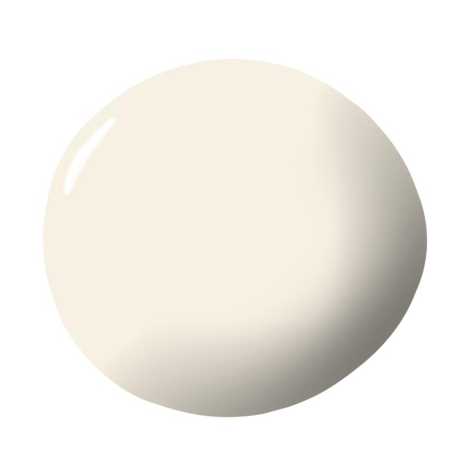
Wimborne White by Farrow & Ball
"This is such a soft and flattering tone. It has so much more depth than white and is a great base for really any decor." —Alyssa Kapito, Alyssa Kapito Interiors
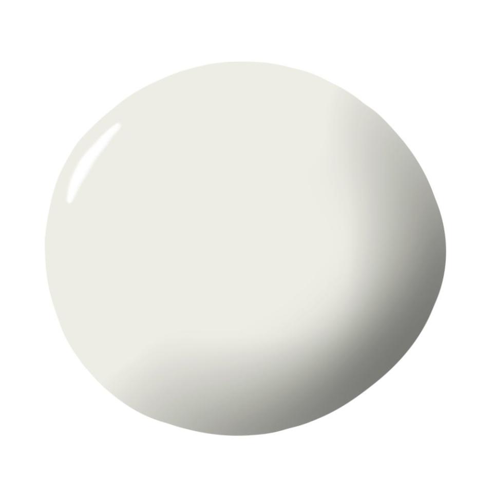
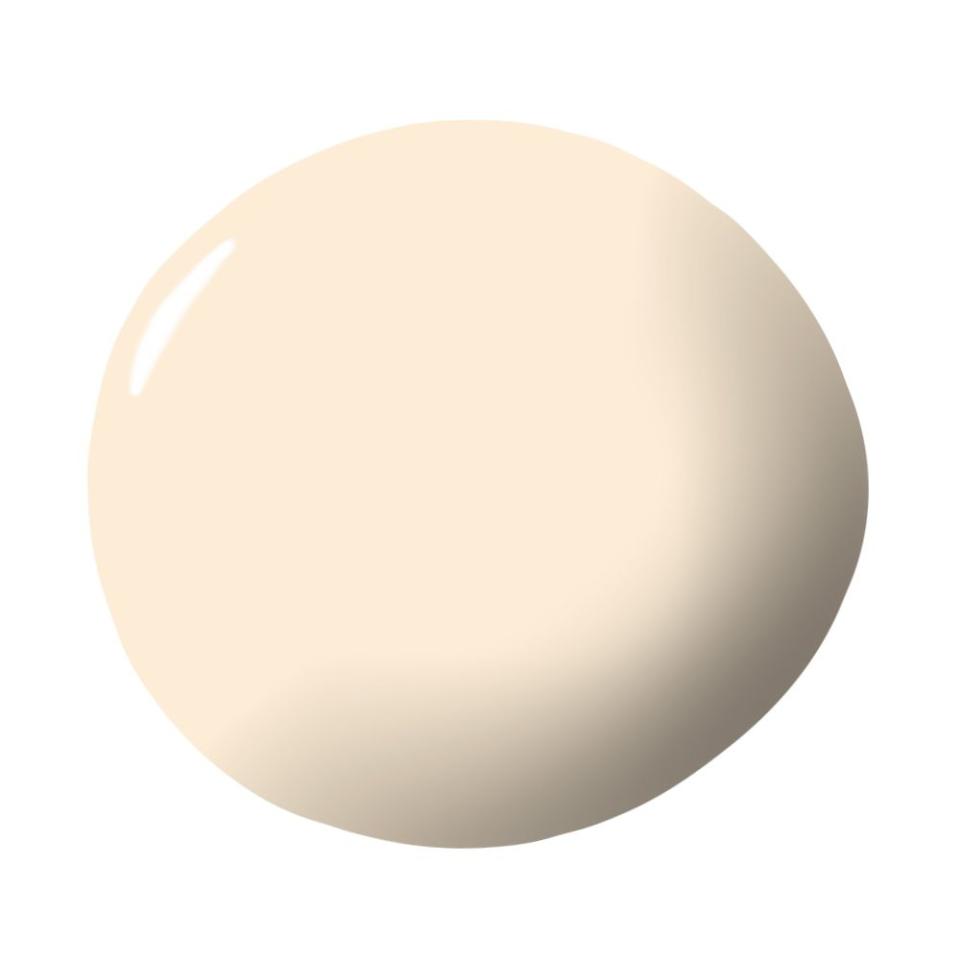
Calming Cream by Benjamin Moore
“It’s the color used throughout my house in New Orleans. When a white or neutral skews more cream than say tan or gray, I think it brings a sun-kissed glow to the room.” —Michelle R. Smith, Studio MRS
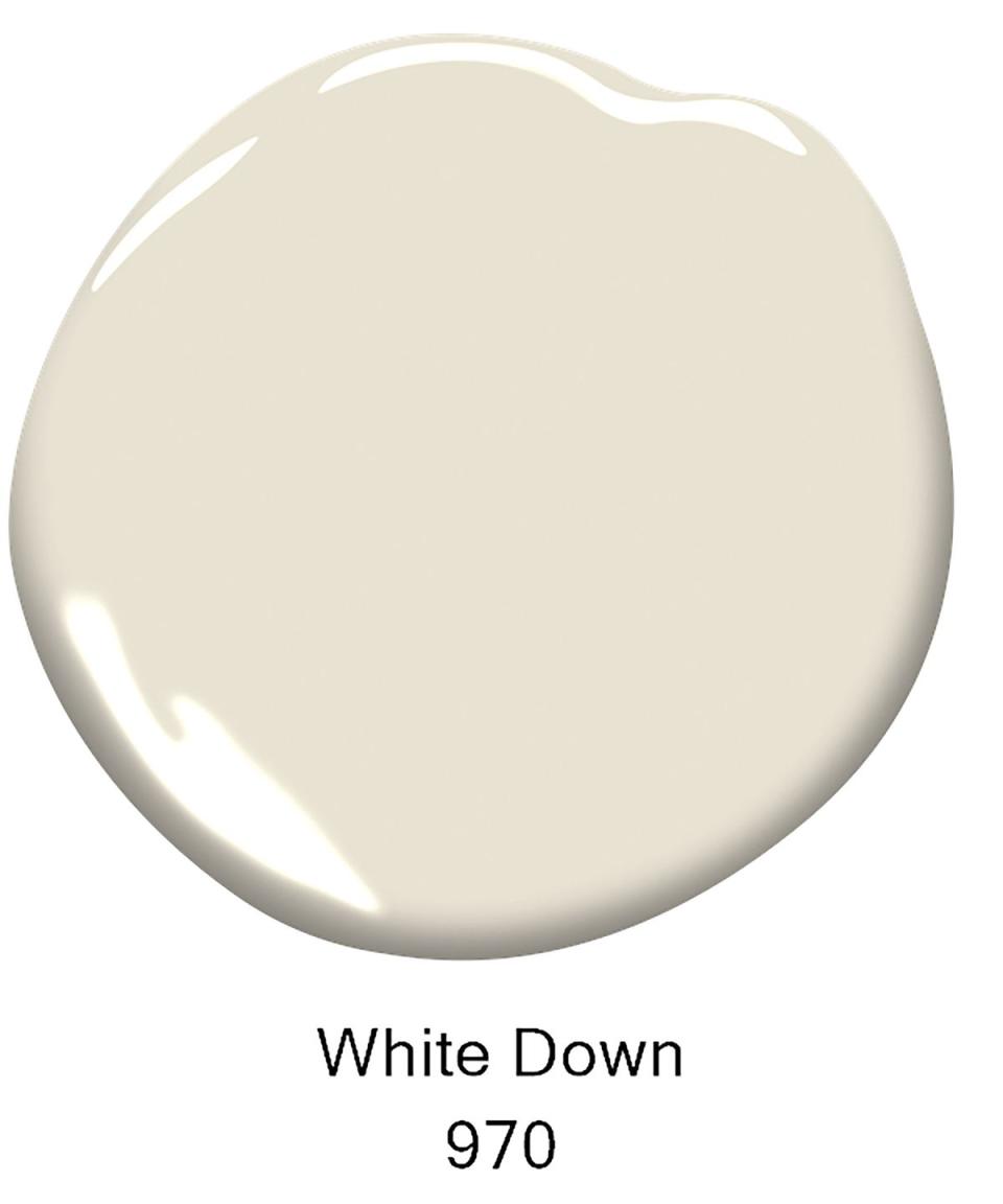
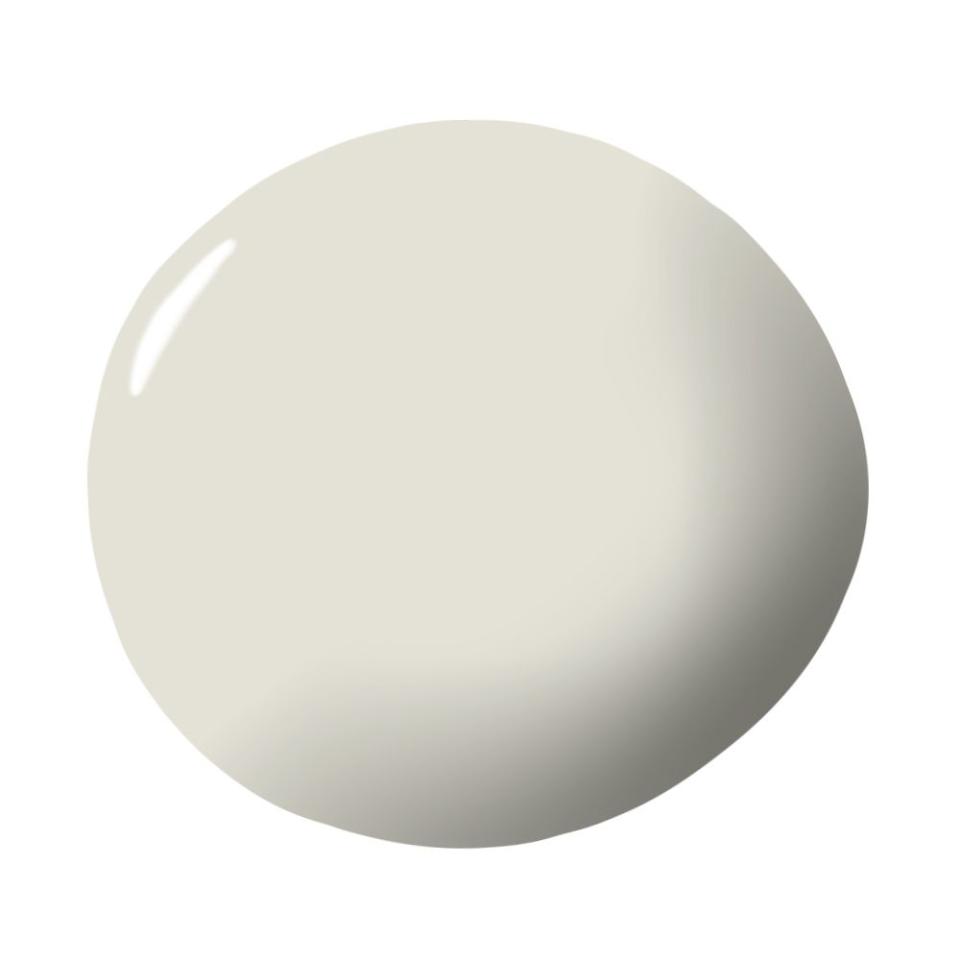
White Down by Benjamin Moore
“We love this shade and use it for a lot of our projects, especially in living rooms and primary bedrooms. It has warm undertones without feeling yellow and instantly makes a space feel inviting and elevated.” —Dara Donovan, Paloma Home Studio
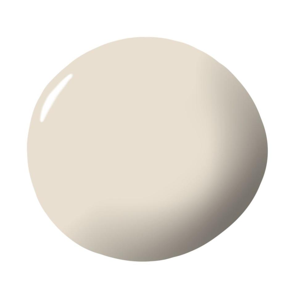
Pointing by Farrow & Ball
“This is a great, versatile paint color that works almost everywhere. It’s warm but still reads as predominantly white.” —Daniel Rabin and Annie Ritz, And And And Studio
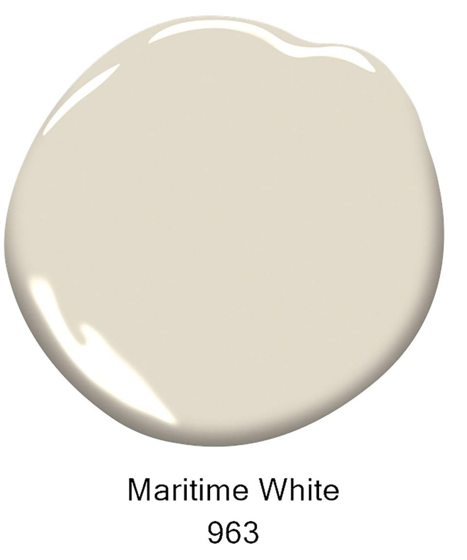
Maritime White by Benjamin Moore
“It’s sophisticated, warm, and inviting—the best elements your home should have.” —Hattie Sparks Collins, Hattie Sparks Interiors
Sand by Farrow & Ball
“Cream with cool undertones can pair well with decor in black, navy, chrome, and marble. On the other hand, warm undertones give off a cozy, inviting glow, especially in natural light. Warm creams pair better with the brick reds and denim blues omnipresent in American ceramic and textile antiques, as well as natural materials like linen, wool, and wood.” —Marie Joh, The Six Bells
White Dove by Benjamin Moore
“It adds just enough warmth to a white base to give a soft and understated feel that perfectly complements any color palette.” —Julia King, Studio Roene

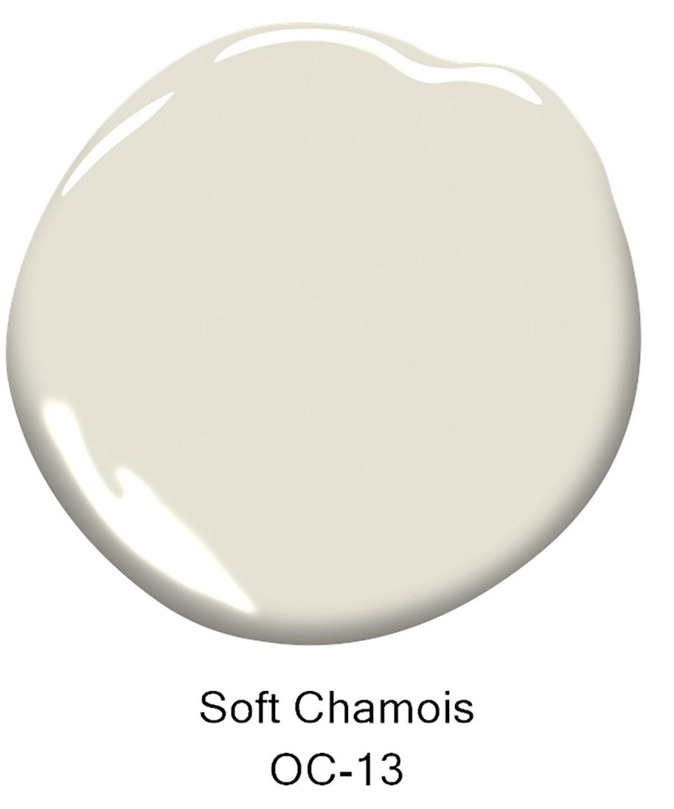
Soft Chamois by Benjamin Moore
“This is a versatile cream. Whites will pick up on what’s being reflected in the light, so if, for example, you have a lot of greenery next to the window of a room, the color could start looking green inside too.” —Chango & Co.
White Snow by Sherwin Williams
“This shade brings a modern yet natural and organic appeal to any room that can be hard with cool whites that feel too sterile.” —Taniya Nayak
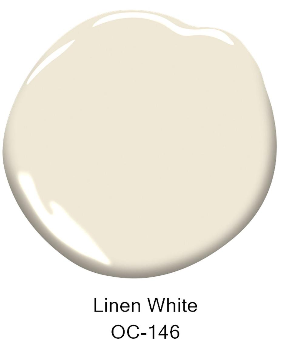
Linen White by Benjamin Moore
“In rooms that I paint this shade, especially with warm undertones, I always advise clients to paint the trim and ceiling the same color as the walls but change the finish to give added interest. Cream colors with warm undertones offer flexibility because they remain quiet and neutral.” —Todd Prince, Todd Prince Design
School House White by Farrow & Ball
“This shade is a beautiful creamy white that creates a warm, soft glow in the rooms it lives in. It’s a beautiful juxtaposition to more industrial elements, like concrete floors, that we love to pair it with.” —Katie Labourdette, Hearth Homes Interiors
Irish Linen Limewash by Sydney Harbour Paints
“Not only is it a gorgeous warm white, it is also the perfect amount of texture and depth that takes it to a whole other level. It takes a few steps to get the finish, but it’s totally worth it.” —Tami Ramsay, Cloth & Kind
Pale Oak by Benjamin Moore
“This shade is warm without feeling too yellow and pairs nicely with both warm and cool fabrics or accents, which is rare for a true cream paint.” —Laura Pankonien, The Pankonien Group

Cloud White by Benjamin Moore
“It’s neutral with warmth and coordinates equally well with warm and cool adjacent colors and seems to look great regardless of the light temperature in the rooms. Our group chat keeps joking it should be called White Arrow White.” —White Arrow

Calm by Benjamin Moore
“It is a soft warm white, but with lavender undertones, which allows it to work well with cool and warm tones alike.” —Studio DB

Chantilly Lace by Benjamin Moore
“This color is the perfect balance of crisp white with the slightest cream undertone for warmth. It’s always a winner, whether a city apartment or a beachside residence. Chantilly Lace is my favorite background color and a champion in both matte and satin finish. It’s a classic color that allows art and upholstery to take center stage.” —Nathan Thomas, Pembrooke & Ives

Alabaster by Sherwin-Williams
“This warm shade with taupe undertones brings a velvety depth to walls and millwork. It works wonderfully with crisp white trim, and while it’s right at home in more traditional spaces, it’s bright enough to feel modern and fresh when paired with medium wood tones and clean lines.” —Regan Baker, Regan Baker Design
Vanilla Milkshake by Benjamin Moore
“We love Benjamin Moore’s Vanilla Milkshake and its blend of gray with a strong cream undertone for the walls, especially in a bedroom. It’s super soft and soothing on the eye. The walls should be a softer tone to let the patterns on curtains and upholstery and textures in pillows show.” —Meghan Hackett-Cassidy, Hackett Interiors
Belgravia by Myland
“I like Belgravia by Myland for wall and trim. The ground marble powder in their Marble Matt finish offers depth to complement the bones of classical architecture and show off the curvatures of fine woodwork.” —Carolyn Pressly, Carolyn Pressly Interiors
White Tie by Farrow & Ball
“I love this pale cream, as it serves as a warm neutral and brightens any space. It’s also a great backdrop for art and pops of color. I like to use it in hallways, on kitchen cabinets, and for moldings and trims in contrast to a vibrant wallpaper.” —Ritika Bhasin, Ritika Bhasin Design

Swiss Coffee by Benjamin Moore
“My favorite cream paint is Benjamin Moore OC-45 Swiss Coffee. It’s the perfect creamy white, with a touch of beige and gray. I have it all over my home and have used it in many other homes. It’s warm and inviting while still modern and clean.” —Danielle Fennoy, Revamp Interior Design

Slipper Satin by Farrow & Ball
“I love this soft neutral. It warms up a space more than white but doesn’t carry heavy pink or yellow undertones.” —MA Allen, MA Allen Interiors
Natural Linen by Sherwin-Williams
“Sometimes creams can either have too much of a yellow undertone or resemble white and read cold, but this one’s just right and creates a calming understated elegance, allowing furnishings and art to be the real statement makers in the room.” —Saudah Saleem, Saudah Saleem Interiors

Pointing by Farrow & Ball
“I love Farrow & Ball’s Pointing for its ability to simultaneously invoke light and air as well as depth and warmth. It’s just as welcome in a historic estate as in a contemporary home. I especially love to use this color on the trim, walls, and ceiling in slightly different finishes for a cozy space with a subtle play on light.” —Mel Bean, Mel Bean Interiors
Tallow by Farrow & Ball
“I love this cream color for a space. It has a very subtle peachy undertone that warms a room but also has a clean feel, so it can be in a modern home or a more traditional setting.” — Jess Cooney, Jess Cooney Interiors
You Might Also Like

