27 Secrets And Details About Loki That Will Change The Way You Look At Him
If you're a fan of Loki — and let's just assume that you are, since ya know, you clicked on this — then you're probably super familiar with the iconic looks the God of Mischief has sported over the years.
Marvel / Via giphy.com
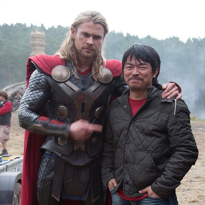
And now that Loki season 1 has come to an end (who else is READY for season 2, like...now?!), we were curious about the history and development of Loki's ~looks~ leading up to the series. So we chatted with Co-Founder and former Co-Head of Visual Development at Marvel Studios Charlie Wen and Marvel Studios Senior Visual Development Artist Anthony Francisco, who worked on his designs over the years, to find out more!
Here's what we learned...
1.Wen was already working on designs for Thor before director Kenneth Branagh was even hired, and this “crazy Loki” design was one of the very first Lokis he created at Marvel.
Wen explained, "The goal was to set some boundaries or perimeters for design. This was based on some of my initial designs for Asgard. For you to know that you’ve pushed a design as far as it needs to go, you sometimes have to go until it breaks. This version reminded me of Dustin Hoffman, although it’s not based on any actual person at this point, since there were no actors in mind for the role this early in development."
2.And it was actually Kenneth Branagh who was responsible for bringing Tom Hiddleston on board as Loki, and here's where the design we're more familiar with started to take shape.
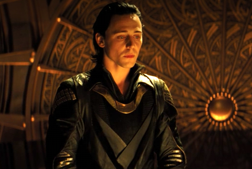
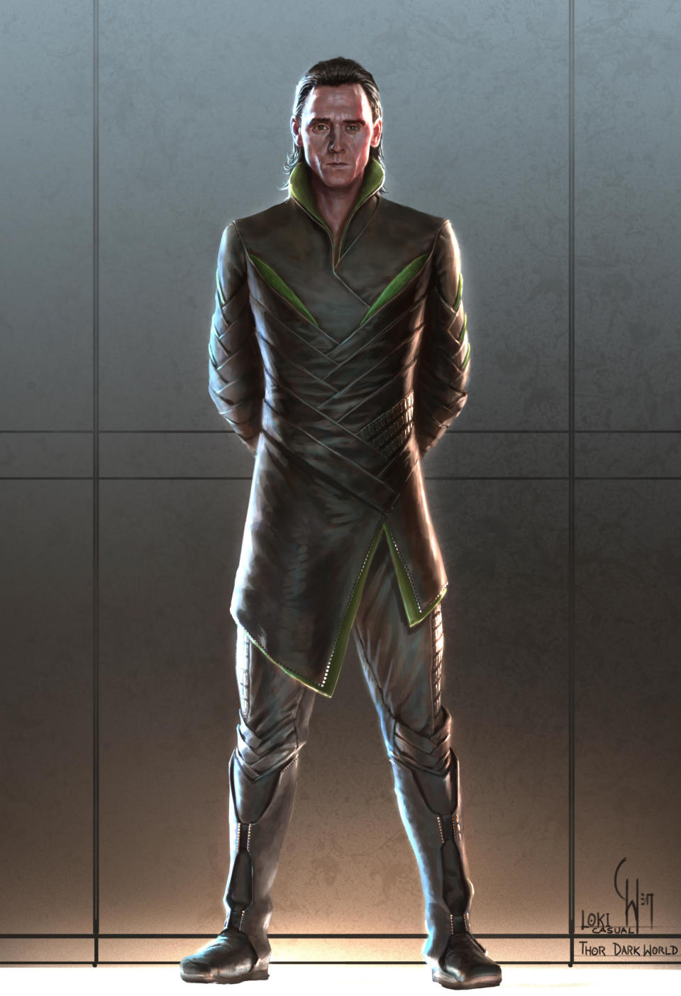
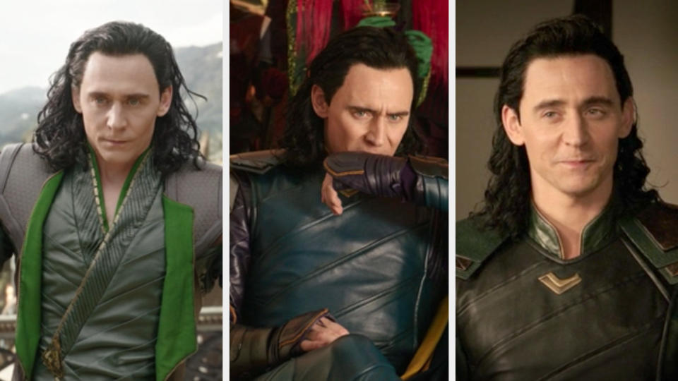
3.And you can see many differences between Loki's armored look vs. his ~casual~ look even in the first film alone.
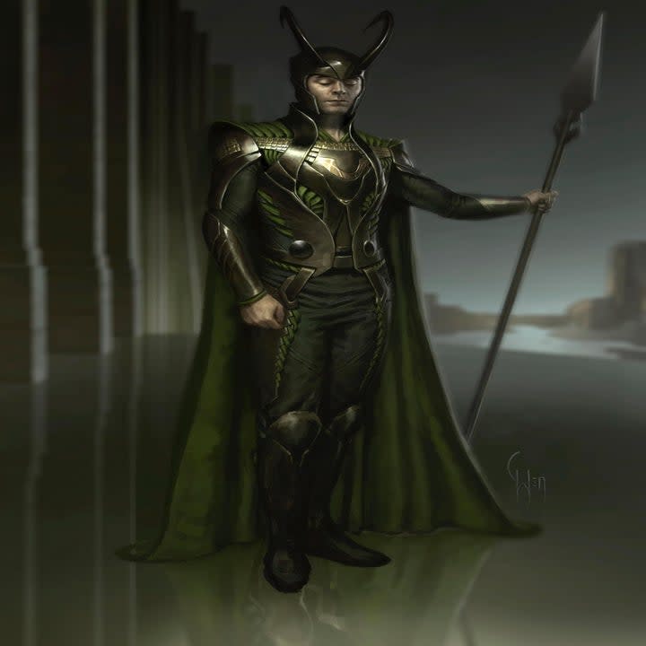
For the armored look, Wen said, "As mentioned previously, most of the lines here stayed from my previous version. The biggest change was in his lower half." As for Loki's casual look, Wen continued, "Here, I was implying much softer leathers for his casual wear. The lines are more angular, almost architectural in its repeating angles. The purpose was to contrast the soft interior greens (Loki’s primary color) with the rigid blocky exterior (symbolizing Loki trapped inside the rigid walls of Asgard)."
4.Loki's collar was inspired by the flower faux calla lily, and it had a particularly deep meaning.
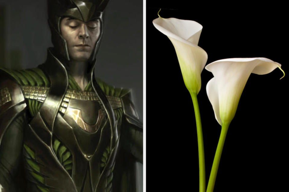
"The meaning (of the lily) is often symbolic of sacrifice and is a resurrection motif. For me, I felt like something's going to be coming about for Loki. I knew this was a character that was going to be going through a large arc," said Wen.
5.And you probably didn't know this, but if you put Loki and Thor's helmets together, you get Odin's helmet.
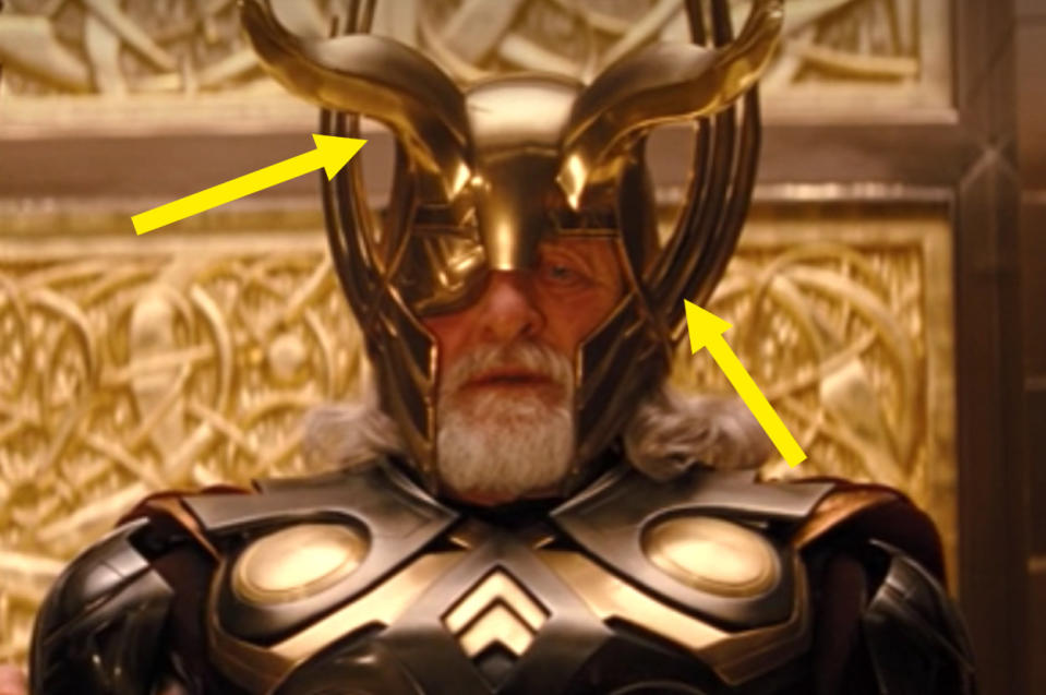
"Odin's helmet has the wings and the horns, so each brother sort of got half of that," explained Wen.
6.Tom Hiddleston actually hated wearing Loki's helmet in the first Thor film.
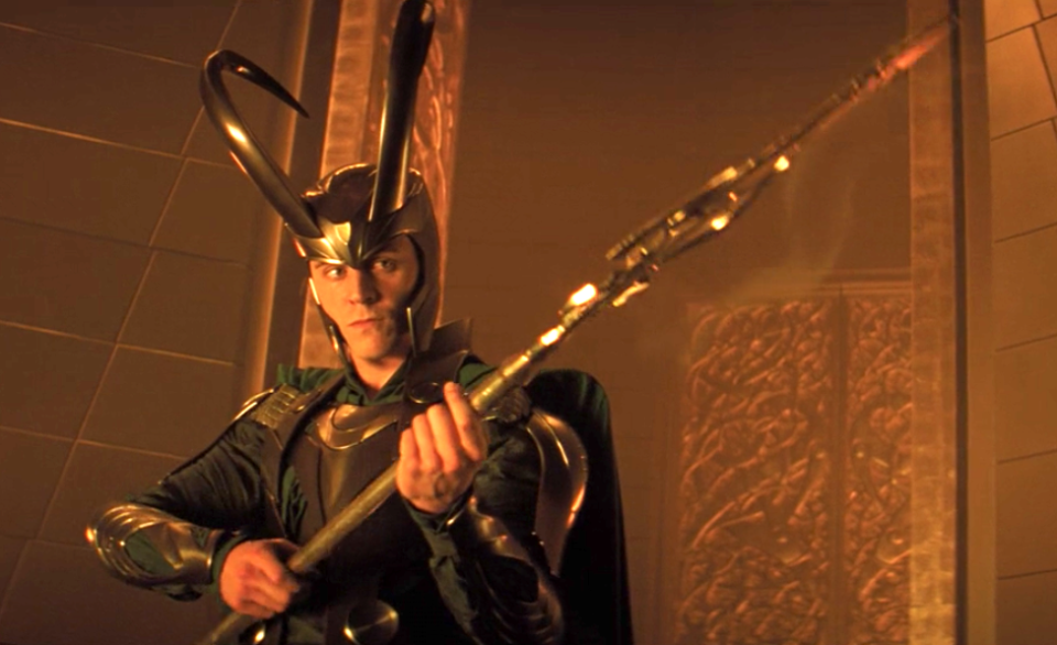
"It was probably the largest helmet he would have to wear. I kept hearing that Tom hated to wear it," laughed Wen. "Materials were a lot thicker at the time, so it really made it hard for him to move. So I tried to rectify a lot of that for the next film," continued Wen.
7.The horns of Loki's helmet in the first film were very vertical, which was intentional to match the upward shapes and design of Asgard.
8.As you go toward the later films, though, Wen started to move toward a more aggressive horn design, one that is thinner and shoots out first.
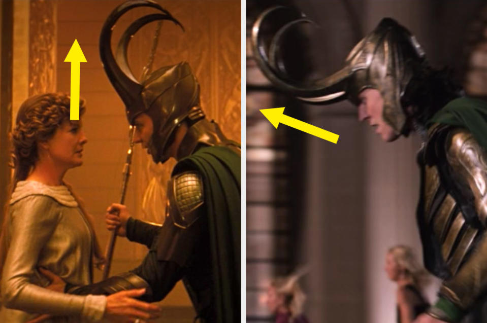
"It's more intrusive; it comes out at you first. It's a little less about being regal, and a little bit more about, 'I'm going to come into your space,'" said Wen.
9.For Thor: Ragnarok, Francisco introduced the open-topped helmet for Loki.
10.And the design on the sides of Loki's helmet in Ragnarok links to the designs on Hulk's armor.
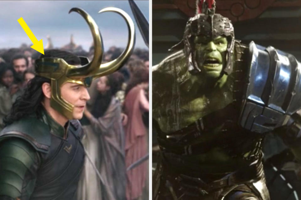
And the specific "layering" look to that design on the side is meant to show that Loki is a character with, literally, many layers. "He's not one dimensional; he's a layered character. I wanted to show layering in all of his stuff," said Francisco.
11.Wen found inspiration for Loki's design from three major places. First, of course, was Jack Kirby...
"It started with Kirby. That was iconic Marvel. He had such iconic, geometric, sometimes even crude (when necessary) shapes that he used. They were very bold, but they worked for the medium. So part of it was trying to find a way to translate that into a different medium," said Wen.
12....second was all the variants of Loki through the comics...
"A lot of people didn't even really know the Kirby designs anymore, so from that we had to do a lot of studying on variations of Loki that people might have seen more recently. You tried to see which ones were more accepted by the fans," said Wen.
13....and finally, mythological Loki.
Wen said he "learned more about the mythology" and tried to fit in as much mythology as possible during the development phase.
14.According to Wen, the very first screenplay for Thor was actually a lot more about mythology than the comic books.
"It was a very good screenplay, but it wasn't as much comic-book Thor; there was a lot more mythology in it. It was a very different kind of Thor," said Wen.
15.And mythology was something that Wen actually wanted to bring into the Marvel designs anyway.
16.In fact, Wen felt a lot of Norse design naturally lended itself to Loki's complex personality.
"What I really loved about a lot of Norse runes and symbols is the interweaving shapes. Shapes go in and out, and then they come back around... A lot of those interlocking shapes feel like Loki," said Wen.
17.And you'll see even more of that "serpentine-like" design in Dark World.
"That design was carried through with Loki, Thor, Odin... I felt like it was something that really tied it together. You could even physically feel the tautness. If you just tightened one part of the costume, the whole thing would tighten like a knot," said Wen.
18.And for Dark World the colors were meant to look more "worn in" and "used."
"I was just pushing the colors to be earthier, warmer tones. It's like Loki at that point has already experienced travel and loss," said Wen.
19.When tackling new looks for Ragnarok, Francisco was excited to hear from Taika Waititi, who told him, "I want a brand-new look. I don't want it to look like Asgard at all."
20.But there are still elements from the "old" Asgardian designs of Dark World like in Loki's shoulder armor...
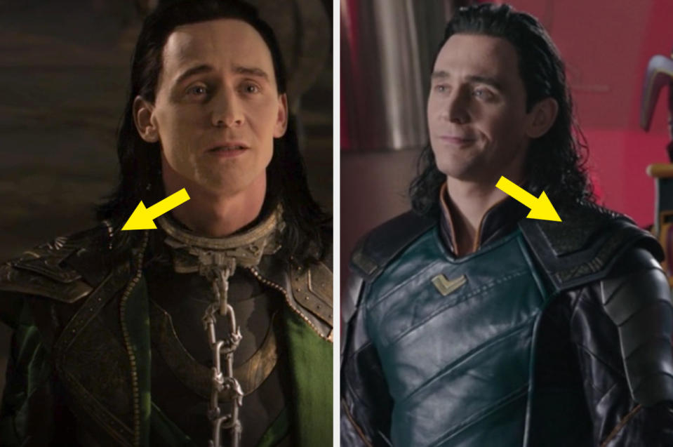
"That design, to me, was really sophisticated. I used the base of how it was built — like here's the T-shirt shape; here's the shoulder pads — but I took out one shoulder pad to make it unbalanced... I wanted to bring elements from Loki's memory of who he was (in Asgard)," said Francisco.
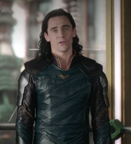
21....and also this necklace piece.
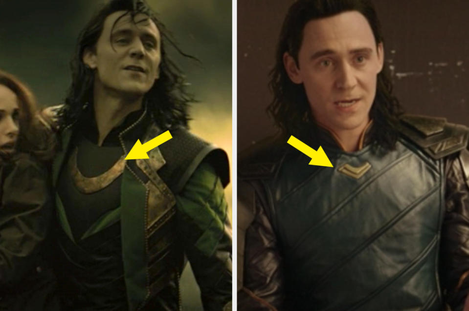
"He had this big necklace/center piece (in Dark World), and I kept that because I felt like that was almost like his 'mother's crest,' but I made it smaller. He still has a little bit of it, a little symbol of his mother," said Francisco.
22.For Ragnarok, Francisco wanted to make Loki's design look more imbalanced by using a lot of asymmetrical, diagonal cutlines.
"With Thor: Ragnarok, I was thinking, How do I design his inner turmoil? His mom died, his dad died, his sister's after him...so what does that feel like inside him? There's an unbalance in the whole costume design to kind of make the viewer feel like there's something a little off with him," said Francisco.
23.And the blue in Loki's Sakaar look is meant to symbolize a more "sad" Loki.
"It's kind of like a nice arc for him. In the beginning of the movie he's green, then he's blue, then he's green again...by the end of the movie, he finds who he is," said Francisco.
24.The blue is also meant to liken Loki to a peacock who is showing off for the Grandmaster.
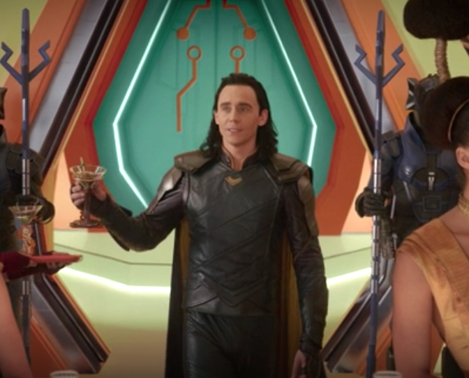
"He wants the Grandmaster to notice who he is, so he has to be very flashy," said Francisco.
25.And the touch of yellow on his cape is meant to symbolize a little silver lining that Loki will be OK later on.
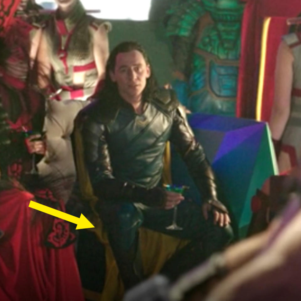
Francisco explained, "When we design, I love trying to put in more story."
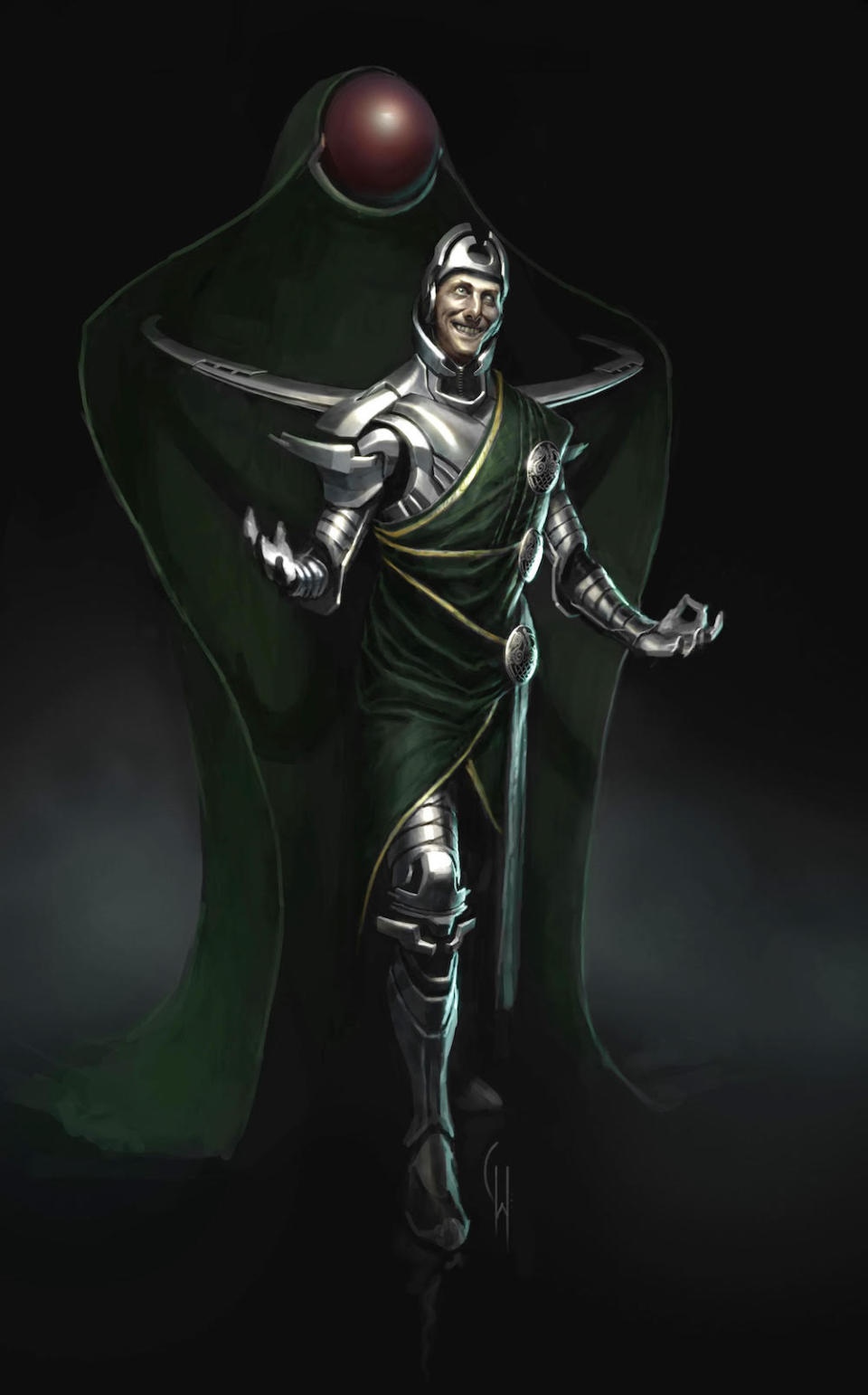
26.And finally, Visual Development artists go through many, many designs for their characters, sometimes ones that are WAY out there; and Francisco did one wild concept where Loki was actually all yellow with green on the inside.
Marvel Studios

