Billie Eilish To Sing Theme Song For New James Bond Film 'No Time To Die'
Billie Eilish might seem to have no time on her hands, but she does have “No Time To Die.”
The multi-Grammy nominee announced on Tuesday that she and her older brother, the producer Finneas, have written and recorded the theme song for “No Time To Die,” the upcoming James Bond film.
With that, Eilish, who turned 18 last month, has become the youngest artist in history to write and record a theme song for the long-running Bond film series, according to the official James Bond Twitter account.
Eilish said she’s very happy to join a musical pantheon of luminaries who’ve recorded Bond songs for previous movies, including Paul McCartney, Tom Jones, Duran Duran, Madonna and Sheryl Crow. The last two Bond themes, Adele’s “Skyfall” and Sam Smith’s “Writing’s On The Wall” from “Spectre,” both won Oscars for Best Original Song.
“It feels crazy to be a part of this in every way. To be able to score the theme song to a film that is part of such a legendary series is a huge honor,” Eilish said in a quote shared by the James Bond Twitter account. “James Bond is the coolest film franchise ever to exist. I’m still in shock.”
Finneas, who helped his sister create the Grammy-nominated album “When We Fall Asleep, Where Do We Go?” said “writing the theme song for a Bond film is something we’ve been dreaming about doing our entire lives.”
He added:
“There is no more iconic pairing of music and cinema than the likes of ′Goldfinger’ and ′Live And Let Die.′ We feel so so lucky to play a small role in such a legendary franchise, long live 007.”
Of course, people had strong reactions to the selection. Some figured Eilish could just adapt her big hit, “Bad Guy.”
She could just use the Bad Guy Lyrics and put some Big Band music behind it. The lyrics would suit Bond anyway. Except he might seduce your Mom type
— Gerry Rushe (@gerry_rushe) January 14, 2020
Sample Bond theme lyric:
'Rami Malek is a baaaaaaad guy, duh'#BillieEilish #Bond— Courtney Theriault (@cspotweet) January 14, 2020
Others wished someone else had been picked.
You guys have Harry styles and you didn’t choose him.
— maria (@shedaylights) January 14, 2020
We love to see it, but why Lana Del Rey doesnt get any chance yet? She is PERFECT for it
— Lana Del Rey Addiction (@LDRaddic) January 14, 2020
Eilish fans suggested everyone should give her a chance.
I think people should stop bitching about everything until the song is out. It may be better than you all expect. Personally I think it'll be pretty good. She suits it.
— A mess (@Lewicity) January 14, 2020
i don't know who she is but she can't do a worse job than Sam Smith, that song was pure trash.
— The Tall Gaming Man (@tallgamingman) January 14, 2020
Until now, Sheena Easton was the youngest artist to sing over a Bond movie’s opening credits, according to the BBC. The Scottish singer was 22 when she recorded “For Your Eyes Only” in 1981.
“No Time To Die,” which stars Daniel Craig, Rami Malek and Lashana Lynch, will be released April 10 in the U.S.
Love HuffPost? Become a founding member of HuffPost Plus today.
Also on HuffPost
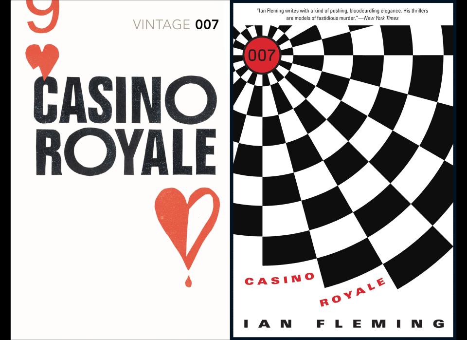
Casino Royale
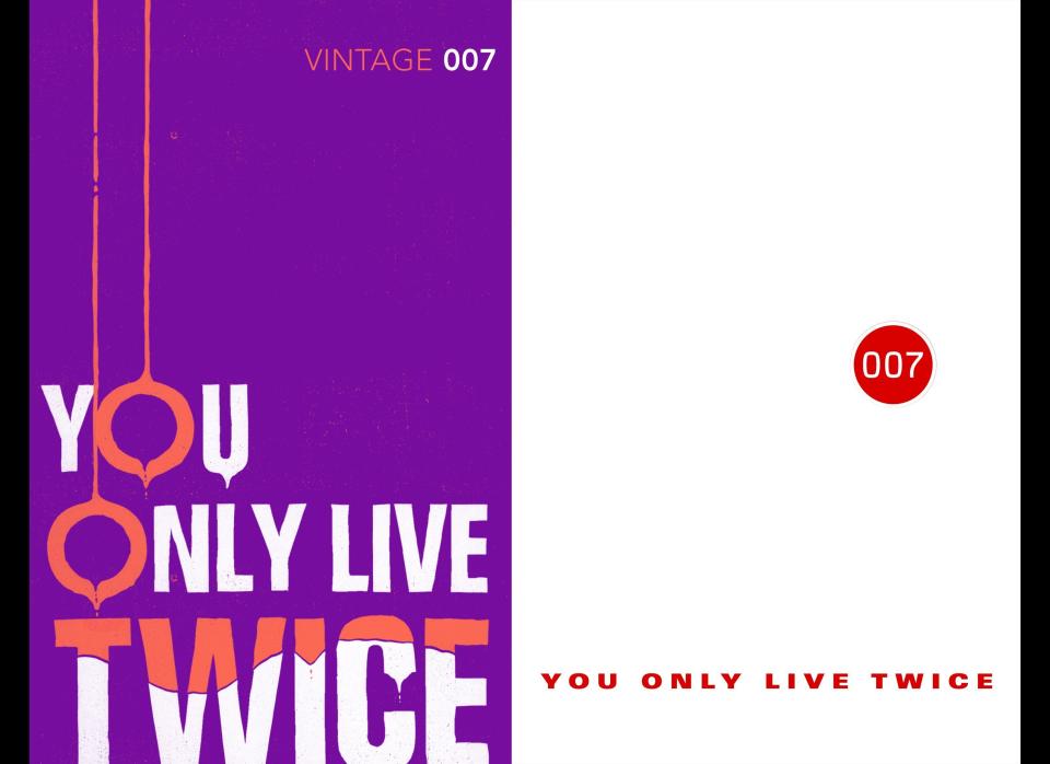
You Only Live Twice
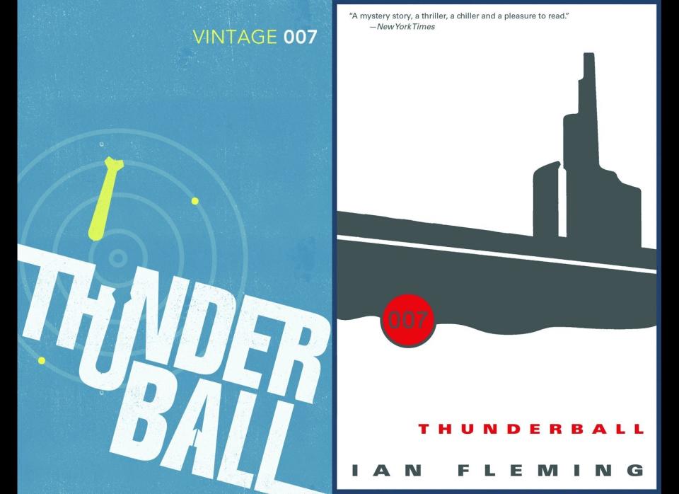
Thunderball
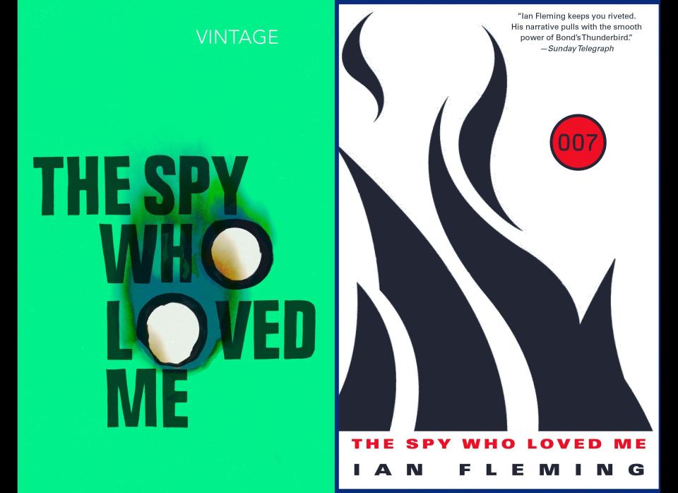
The Spy Who Loved Me
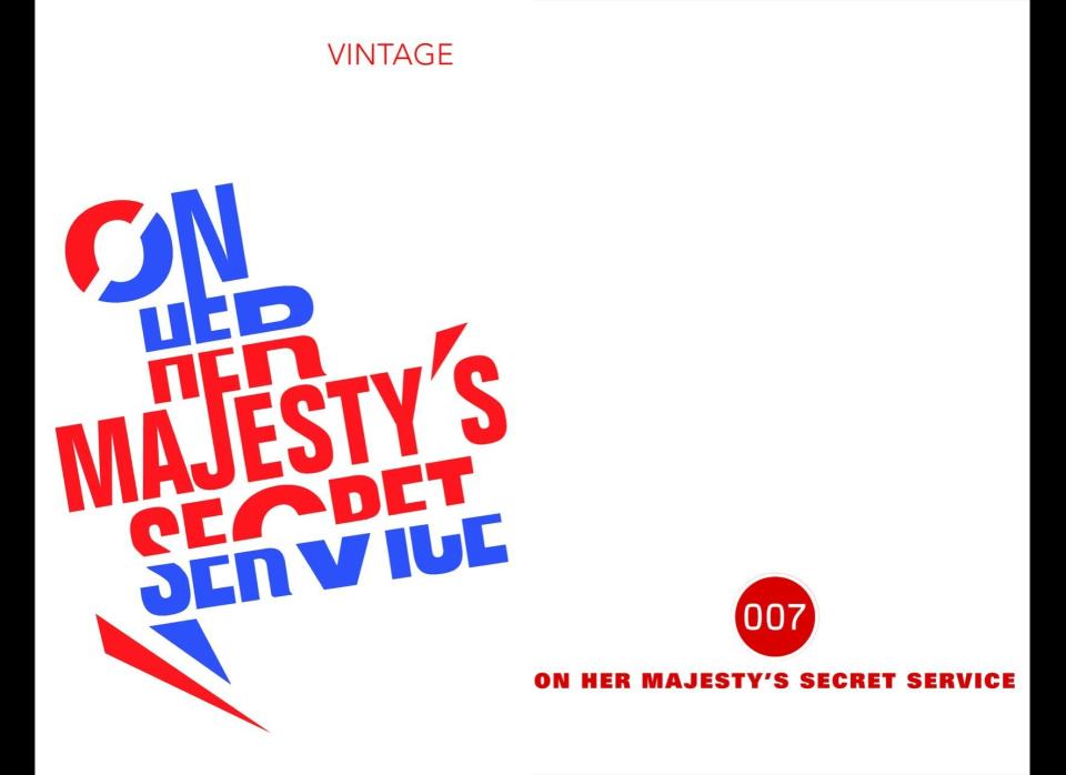
On Her Majesty's Secret Service
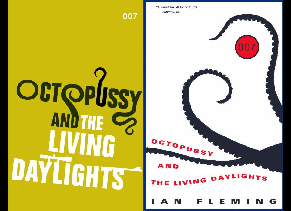
Octopussy and The Living Daylights
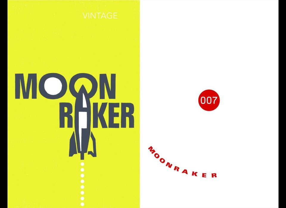
Moonraker
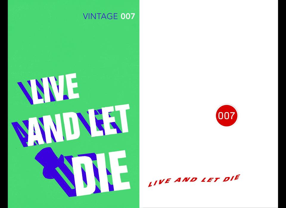
Live and Let Die
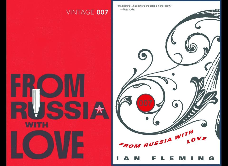
From Russia With Love
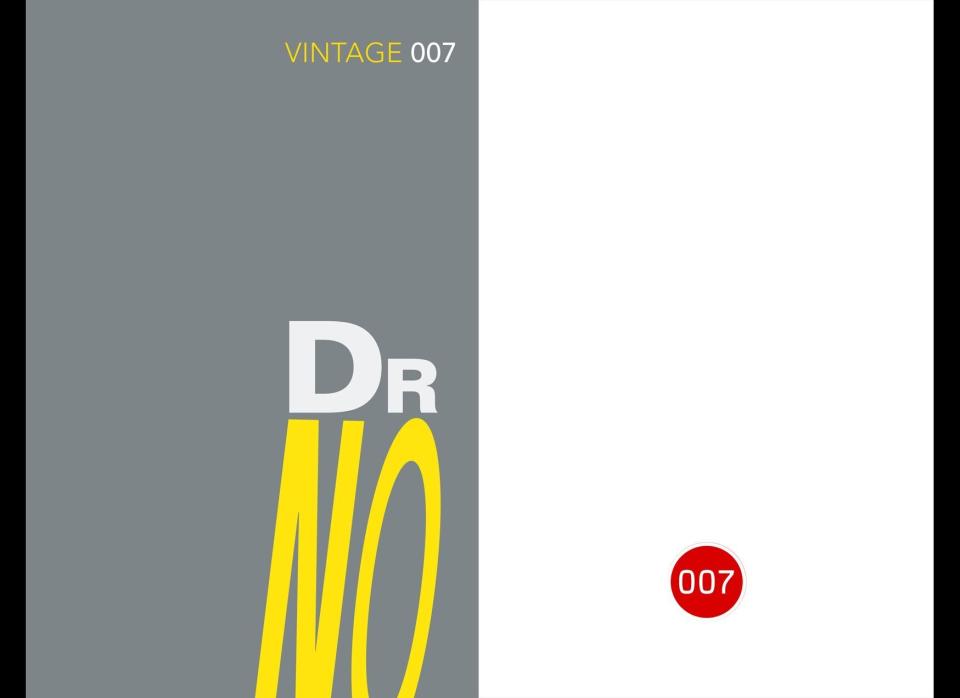
Dr No
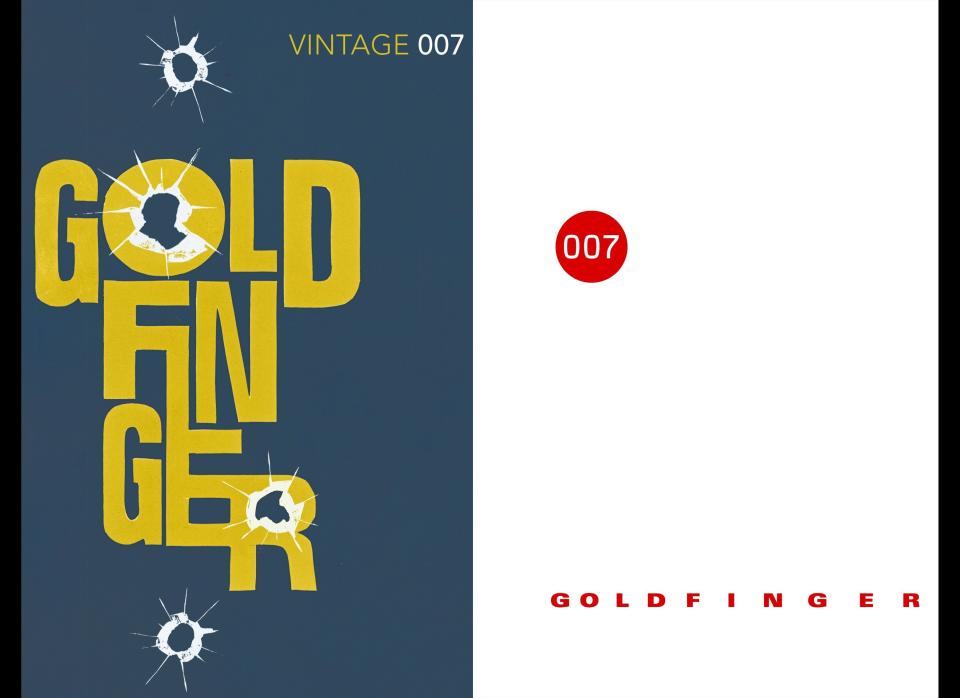
Goldfinger
The Man With The Golden Gun

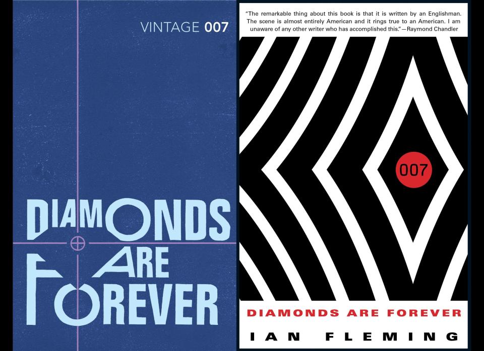
Diamonds Are Forever
This article originally appeared on HuffPost.

