The untold story of the artist who created the shrieking Pet Sematary book cover
She’s the hand behind one of the most frightening book covers in history, but until now she’s never talked about it.
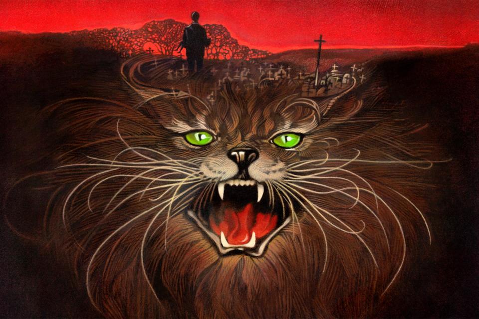
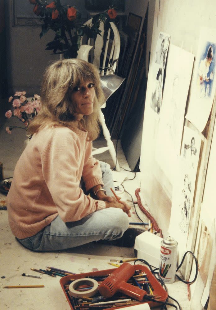
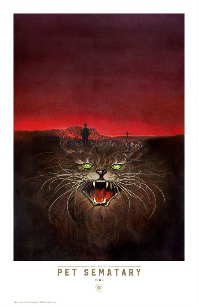
Linda Fennimore was the artist who illustrated the original cover for Stephen King’s Pet Sematary back in 1983, and for every emotional scar left by his grief-ravaged story of the dead returning from beyond, that image on the book jacket left a few scratches on the psyche, too.
Fennimore was a Julliard-trained pianist who developed a talent for drawing and painting that led to work creating book jackets, album covers, and Broadway posters, like Billy Ocean’s Suddenly, Patti LuPone’s Gypsy, and Laurence Fishburne’s Thurgood. She also created one of the original one-sheets for Grease, featuring the cast dancing atop Greased Lightning.
King, who was on hostile terms with his publisher Doubleday at the time, tells EW he never weighed in on the cover for Pet Sematary but was pleased with Fennimore’s work.
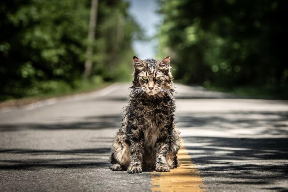
Her art lives on today. The directors of the new Pet Sematary movie, Kevin Kolsch and Dennis Widymer, say they modeled their version of the resurrected cat on her cover.
For the first time, the artist herself tells the story of its creation — and how difficult it was back then to find photos of cats that weren’t cute.
ENTERTAINMENT WEEKLY: How much did you know about Pet Sematary when you began work on the cover?
LINDA FENNIMORE: I was aware of [Stephen King] at the time, but frankly I don’t read horror fiction. It was an assignment, and it was really only later that I recognized what a book it was!
What kind of input did Doubleday give you to get started?
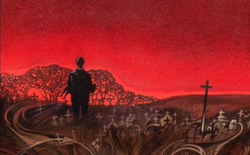
In this case, the art director said, “Well, we want this screaming cat’s face. And sort of montage behind it with this very dimmed scene of silhouetted cemetery, and very dark red sky.” Oh, and then they wanted a figure. A man carrying a small child walking towards the cemetery.
What were the first steps in actually drawing it?
The first thing I do, because I work pretty realistically, is I look for photo reference. So I get an idea of what the cat looks like, snarling like that. There were no Google Images or anything, so I’d go to the New York City public picture library and go through all the pictures of cats. Of course, they don’t show snarling cats!
No? [Laughs]
Cat photography is of cute little kittens and things! So finally, finally, I ended up looking at pictures of tigers and lions that were catlike.
Or roaring?
Yes, because I couldn’t find any cats that were looking like that! And then I made that look like a cat. It was just the expression, and how the nose gets.
And the tongue, all curled.
Right, right.
Did you draw on any particular place for the cemetery imagery?
I think at that point I was renting a house in the Catskills, maybe with my boyfriend. And I remember taking pictures of those little graveyards in a field kind of thing. I don’t know if the trees came with it.
And what about the human figures in the background?
As I was working on it, I was up against my deadline, and I hadn’t yet put in the figure of the father and the child. Again, I don’t tend to make stuff up, I like to have a photograph of some kind to work from. I had this Polaroid camera, and I called up my brother, who lived a block away. I’m in New York City. And I said, “Hey, Tony, can I get you to pose and hold one of the kids in this pose? Just to take a few pictures, so I get some reference?”
Oh, wow.
The only one of his kids there was his youngest, and was a girl. But she had short hair. I mean, it doesn’t really show, it’s so tiny. But that’s my niece, who’s now around [38]. She was 2 then, maybe.
How did you come to select the type of cat? It looks like a Maine coon cat…
It was certainly not supposed to be a friendly cat. I’m sure they told me the colors.
I don’t know that they ever necessarily describe what the cat is, the breed of it. In the ’89 movie, it’s a gray British shorthair.
You know, maybe they did say gray. I can’t remember.
What’s interesting is, when I visited the set of the new film, the two directors said they were looking for ways to differentiate from the earlier adaption, and one way they did it is the cat. They made the cat look more look like the cat from your book cover.
Really?
Yeah, they said they wanted to match the cat you had.
Oh, how flattering!
It was in tribute to your cover.
Well, I do remember that because [the image] was pretty dark and indistinct that it was very helpful to have cat markings, so that it was clear what it was, rather than just a solid color. So much of it faded out that you wanted that. My sense of doing this thing was, “My God, this is going to be so boring unless I can pop out teeth, and mouth, and the eyes.”
How large is the original illustration?
It was fairly large, like a 20-by-30-inch board, most of that being background. You have to give them loads of sky.
Room for the title.
Yeah, because they want to be able to manipulate it on various size books. And the art director says, “Oh, more sky. More sky.” It’s boring having to fill in lots of dull colors. So, when I got to the mouth, and the teeth, I was like, “Fun!”
What technique did you use to create the image? I notice so much crosshatch texture on the cat.
I would use colored pencils, and also I use India ink with a brush, and wash it on over to get it solid. The colored pencil will never look very solid. But I like to be able to define stuff first. I have to draw it first with detail, and then I can add the color.
There are these gorgeous Suntup Edition prints of your cover, is that a recreation? I notice slight differences in the detail.
No, it wasn’t recreated, but since that original cover it’s been reprinted a number of times. Calendars and stuff. And every time it was reprinted, I would touch it up a little bit. For one thing, the India ink fades. I mean, I didn’t know at the time, or didn’t care. I was just using whatever was quickest. So, yes, there is more detail there than in the original. Also the printing is much better.
The crosshatching with pencils works great for fur, doesn’t it?
I think that’s one of the reasons they chose me. My style was quite realistic, and then they knew that I could add that texture to it.
Had you ever had a chance to meet or talk to Stephen King?
No, no, I have… no. I have never met any of the authors. I used to do some Broadway play stuff too, and never meet the author. Never. I’m sure some illustrators do. But also, I’m just rather shy. I wouldn’t know what to say.
This Q&A has been edited and condensed from a longer conversation.
Related content:
• Take EW’s tour of the burial grounds in the new Pet Sematary
• Pet Sematary filmmakers explain their big change to Stephen King’s story
• Stephen King discusses Pet Sematary — and the two movies that rose from it

