How Ti West Brought Horror Back Into Technicolor

- Oops!Something went wrong.Please try again later.
- Oops!Something went wrong.Please try again later.
“X” and “Pearl,” the first two entries in a surprise horror trilogy that concludes with the recently announced “MaXXXine,” couldn’t look more different from one another. “X” is inspired by the gonzo, rough-and-ready filmmaking of the 1970s. “Pearl” looks like it could’ve been shot by the Freed unit, mimicking the three-strip Technicolor process that’s inextricably tied to old Hollywood grandeur. Both films, however, are united by director Ti West’s love for filmmaking, and the pull that movies have on people for better and/or worse.
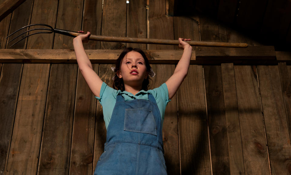
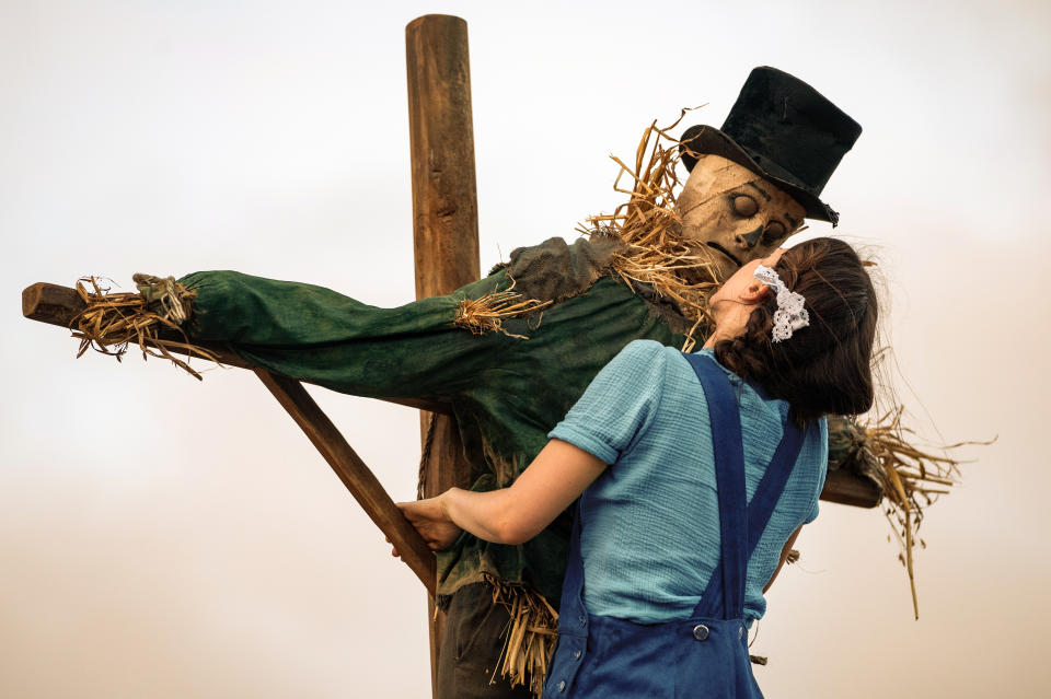
“Pearl” is a prequel set in 1919, starring Mia Goth in one of the two roles she originated in “X” — but the form of the film changes to suit its titular character’s origin story. It’s one that’s much more tied to old styles of shooting, where composition, framing, and lighting can tell us everything about how Pearl finds herself trapped on her parents’ farm without the camera having to move an inch. But when it does move, the audience sure feels it.
More from IndieWire
West joins the Filmmaker Toolkit podcast to discuss the deliberate stylistic and formal choices he used to make “Pearl” such a compelling dive into his heroine’s haunted subjectivity, the different kind of emotional payoff required in this psychological horror story, and many swatches of red paint.
Listen to the full episode below, or read on for excerpts from our interview.
You can listen to the full discussion above, or via subscribing to the Toolkit podcast via Apple Podcasts, Pocket Casts, Spotify, or Overcast.
Partial Transcript Below:
West on the Film’s Old Hollywood Aesthetic
I was thinking about, well, what cinema — when I picture Pearl’s story — do I picture? And I just thought of that sort of Golden Age of Hollywood and the sort of traditional like glitz and glamor of showbiz and the way that formal movies were made. That aesthetic is appealing to me, aside from just a story, but that’s what kind of kicked it off.
I think the contrast was a big part of [the appeal]. I think for me, knowing that this story was gonna be a psychological story, but it was also gonna be quite demented at times and, having this sort of wholesome imagery or this like childlike imagery and this Disney-like, pristine imagery, it felt like a way to take something that could be very retro feeling and have it feel modern again, because it would just felt fresh because I certainly very rarely have seen anything where an aesthetic like this is applied to a story like this. And that just seemed like inspiring. And that seemed like a good reason to sort of get up in the morning and be excited to do it. That just added another layer to the film.
Otherwise, we thought about doing it in this sort of black and white German Expressionism kind of thing.The main driver of that was it would’ve been cheaper because we would’ve not had to paint anything any color — everything would’ve been gray. We would’ve been halfway there already. We wouldn’t have had to spruce everything up as much. It was cost effective to do it that way. And at the time I was looking for anything that would make the movie cost-effective because it just made the idea of doing it even more appealing because it was like, the movie’s really on sale, so it’d be foolish not to do it. But credit to A24 that they quite liked the movie as it was.
Christopher Moss/A24
West on Achieving the Film’s Technicolor Look
The three-strip color process is a very unique thing. You really can’t recreate it without sort of using it — and we weren’t using it. So you can get only so close. There’s only so much you can do in the color correction. Like you can turn up the saturation and you can do things like that. And it helps, but it’s never gonna get you there. What’s gonna get you there is like what’s in front of the camera. And so we just made a huge effort with the costumes and the production design and everything to be really mindful of the palette and to be mindful of how all the colors went together and in the contrast ratio of the lighting and how we were doing it. We just had to be very particular that what we were photographing looked like [Technicolor], no matter what. Then you can embellish it in the color correct. But that’s basically what we did. I mean, we did build in a color correction a three-strip kind of thing that sort of mimicked the separation but it only does so much. I mean, if you looked at the dailies and you looked at the final version, the final version is more vibrant, but it’s not that much more vibrant.
It was such a unique thing to be doing even just 1918. That’s a weird [time period] to make a movie. So every prop felt a little strange. And to come off of “X,” like three weeks earlier, and be sort of very entrenched in the 1970s. It was a real lucid dream type thing to switch gears like that. But I think once you really commit to the era, I mean, the era goes a long way. You know, it wasn’t like they were in front of computers [and the film looked] like that. Once you put people in costumes and hairstyles and things like that, it starts to become that world. But yeah, it’s a very tedious, esoteric process of things that you’re like, “Ah, that’s just not quite right.” You know? And so you’re always trying to get it just a little [more perfect] — like, is that red red enough?
Even like the barn, for instance, if you looked at our office and you saw all the paint swatches on the wall for the barn, it was probably like 10 of the exact same red swatch, but like we would sit there in front of it, like pondering, like, “Hmm. I don’t know.” It was like that scene in “American Psycho” with the business card. You know, [we] were obsessing over these very idiosyncratic things, but it made a difference because you really did have to get it just right for it to feel a certain way. We certainly had a lot of stills from movies on the wall in the office, so that way when people would walk in the office – and we did the same thing for “X” – you could look at a big wall of imagery and kind of get the world you were in. And that could have been everything from “Wizard of Oz” to “The Red Shoes.”
Christopher Moss/A24
West on How The Film Tells Pearl’s Story
“X” had a more avant garde approach to the way it was put together, and the camera direction was more modern and was more like effective in the sense that it was trying to tell you the story by the camera moving and the camera showing you certain things. And “Pearl” was more of, like, within the blocking, we’ll tell you everything. So within the blocking of where the camera is and how the actors are moving in the space, we will add to the story — versus in “X” it’s very much like, you see, Jenna Ortega run down the stairs. You don’t know the room. She turns on the light, the camera goes to the light bulb and then reveals something else. That’s just a different way of using the camera to tell the story. In this more traditional sense, it’s more like the camera is sat in one place, but Pearl’s mother is chopping wood and she’s putting wood on the [block] and it’s blocking Pearl, and then when she hits it with the accent, [the chop] reveals Pearl.
Doing more formalistic things like that was just fun. I mean, as like someone who likes making movies theoretically, it’s appealing to get to do that because that wouldn’t necessarily work in every movie, but it does lend itself to this type of storytelling. [The movie] was very much set up to tell the story within the frame and how the characters are moving and placed within there. So, you know, it’s relatively like basic the way it’s photographed. They’re sitting at a table and the way they sit at the table tells you who’s who in that story and maybe outside the window is a fake tree-type background and the color palette gives you a vibe of the atmosphere of what’s going on in this house, and the music is setting the tone for you of like the melancholy of what it feels like to be in this house. In any movie, but particularly with this movie, you’re always trying to, within the frame, tell as much of the story as you possibly can.
The Filmmaker Toolkit podcast is available on Apple Podcasts, Spotify, Overcast, and Stitcher.
Best of IndieWire
New Movies: Release Calendar for September 23, Plus Where to Watch the Latest Films
Martin Scorsese's Favorite Movies: 50 Films the Director Wants You to See
Sign up for Indiewire's Newsletter. For the latest news, follow us on Facebook, Twitter, and Instagram.

