This Syrup Company Held the Record for Oldest Unchanged Logo — But It Just Got a Makeover
- Oops!Something went wrong.Please try again later.
The beloved Lyle's Golden Syrup brand is changing its logo for the first time since 1883
After more than 140 years, Lyle’s Golden Syrup is changing its logo.
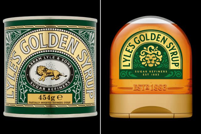
The sugar syrup is a beloved baking ingredient in the United Kingdom. It was first produced at Abram Lyle’s London-based sugar refinery in 1881. From the brand’s inception, the Victorian-style tin containers have been branded with a religious yet morbid design: a dead lion surrounded by bees.
Lyle was a religious man, according to Lyle’s Golden Syrup’s website, and the image is derived from the Old Testament story of Samson and the lion. In the Bible, Samson kills a lion and when he sees the carcass later, it is full of bees who have made honey in the carcass. Part of the verse, “out of the strong came forth sweetness,” is included on the 1883 logo.
Tate and Lyle
Lyle's new logo (right).The tin received the Guinness World Record for oldest, unchanged brand packaging back in 2007. The design remained the same — until now.
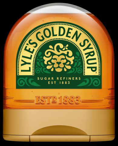
The new packaging design takes a simpler approach than the century-old logo. The new illustration features a golden lion's head.
Tate and Lyle
Lyle's Golden Syrup's new logoThe update packaging will roll out this month and continue throughout the year across its full-sized bottles, breakfast bottles, dessert toppings and golden syrup portions, according to BBC. The original lion logo will remain on the tin containers.
Related: Aunt Jemima to Undergo Rebrand in Step to 'Make Progress Toward Racial Equality'
Last summer, Jell-O underwent a similar packaging revitalization. In June, the snack brand revealed a new logo design meant to “honor the brand’s legacy” (the Kraft Heinz desserts have been around since 1845!) but bring in a “modern aesthetic,” according to a press release.
The “loud, proud and simple” branding now showcases a more vibrantly colored box and cartoonish designs representing each flavor. For example, the new lemon-lime Jell-O box shows the citruses made out of the gelatinous snack whereas the older version shows more realistic images of lemons and limes.
For more People news, make sure to sign up for our newsletter!
Read the original article on People.

