The Surprising Disney Influence on the Darker, Seedier ‘Schmigadoon!’ Season 2

If Season 1 of “Schmigadoon!” needed to nail the candy-colored vibes of an MGM musical, Season 2 does the same dance — but backwards and in heels and probably stockings with a run or two. The second season of the Apple TV+ series set an equally ambitious production task for itself by turning to the messier, sharp-elbowed, darkly funny musicals of the ’70s.
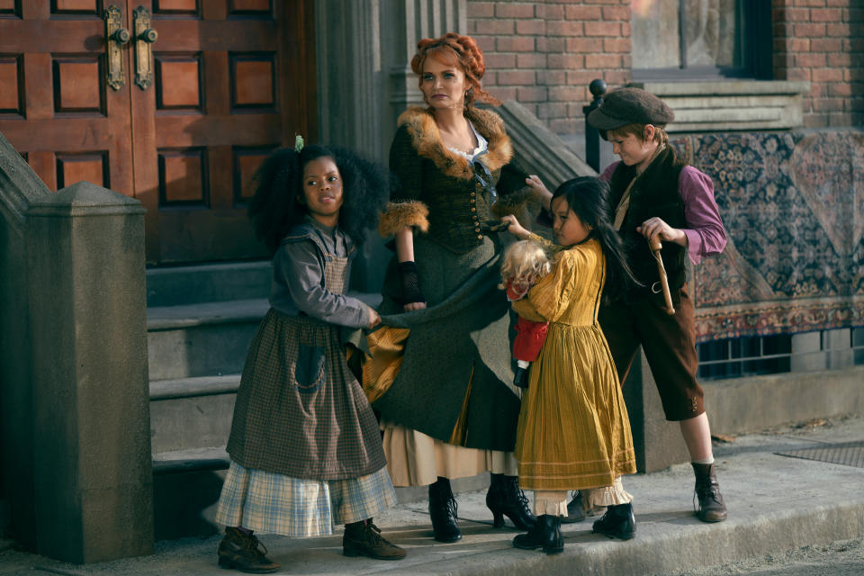
The cast had to contend with the compositional whiplash of Kander and Ebb and Sondheim (to say nothing of Aaron Tveit’s hippie commune). But production designer Jamie Walker McCall’s brief was to create a musical version of Chicago – canonically, a Schmicago – that would look as grimy and gross as a Kristin Chenoweth-run orphanage that also still reflected the fun and theatricality of the series. As McCall conceptualized the show’s Schmicago, she looked beyond the “Cabaret,” “Chicago,” and “Sweeney Todd” references embedded in the script to something more surprising: “Mary Poppins.”
More from IndieWire
“In ‘Mary Poppins’ there’s this very foggy scene through the trees, with [Mr. Banks] walking away. That moment for me was what I remembered from my childhood when I was reading [the script.] And that’s where the inspiration for the black trees in the town square comes from,” McCall told IndieWire. The London-fog moments within “Mary Poppins” were also a good guide for McCall in terms of the color and the feeling the “Schmigadoon” sets needed to evoke. Whether it’s the wood-paneled and gold-gilded pomposity of the courtroom where Bobbie (Jane Krakowski) splits the jury, so to speak, or Kratt’s (Patrick Page) office complete with model ship, there’s more than a little posh pretension tucked into the world of Schmicago; and there’s also that same sense of the world being dark and imposing without being gloomy or drab.

Screenshot/Disney+ and Apple TV+
McCall paid homage to the seductive, seedy worlds of “Chicago” and “Cabaret,” often in line with the way that the scripts and score utilize reference points from the era as groundwork for something much more ridiculous. But the element that informed the sets most was, fittingly, Christopher Gattelli’s choreography. “[The choreography] brought a lot of things together and that also influences the costumes and how the DP is gonna shoot something and [how the director moves], all of that. It was really great once I started to get the choreography. Then it was like, ‘OK, so with this set, they’re gonna have a moment here, so I just need to make sure that there’s room for that there.’ It really is a collaborative effort all the time on a TV show, but especially in a musical.”
The other element that a musical world freed up McCall to play with was color. “Schmigadoon!” pushes well beyond the sort of neutral naturalism of contemporary taste. But it also mostly eschews full-on black and neon, instead landing in something closer to that “Mary Poppins” dusk. The bold color contrasts that McCall uses makes Season 2’s flop house seem all the seedier, the cabaret feel all the cooler, and the hippie commune look all the more absurd, but they all hold a level of artifice that makes them great comedic stages too. “The show gave me a lot of freedom. I wanted it to be based in reality but still have a theatrical flair. So I got to play more with colors and things that I normally wouldn’t do,” McCall said.
Apple TV+
Nowhere is that play with color more apparent than at the commune, which McCall shaped to be exactly as vibrant as any of the sets from Season 1, but with a level of chaos and lack of symmetry that express exactly how free-flowing the love is in the group, to put it kindly. “The commune was something that I really had to wrap my head around because there’s so many different elements and places and it was outdoors. That was one of the more challenging sets for me to figure out,” McCall said. “But because the script was so well-written and really painted a beautiful picture for me to imagine these sets, when I started designing them and collaborating with Cinco, they all came together.”
Best of IndieWire
Sign up for Indiewire's Newsletter. For the latest news, follow us on Facebook, Twitter, and Instagram.

