‘Spider-Man: Across The Spider-Verse’, ‘Nimona’ & ‘Teenage Mutant Ninja Turtles: Mutant Mayhem’ VFX Supervisors On Layering Visuals To Create New Styles Of Animation
- Oops!Something went wrong.Please try again later.
- Oops!Something went wrong.Please try again later.

Since the first Academy Award for Best Animated Feature was awarded in 2002 to DreamWorks’ Shrek, the animation industry has made incredible strides. This awards season, such films are pushing the boundaries of what animation can be, and VFX plays a huge part in infusing new artistic styles into every frame.
Spider-Man: Across the Spider-Verse pushed the animated comic book style of the 2018 film even further with six new, distinct worlds and a visually complex villain. Nimona eschews depth of field for “depth of detail” to give a graphic-novel quality to its medieval future. Teenage Mutant Ninja Turtles: Mutant Mayhem integrates 2D elements in a 3D space to fight against the clean CG look.
More from Deadline
Spider-Man: Across the Spider-Verse
Spider-Man: Into the Spider-Verse amazed everyone in 2018 with an interpretation of animated comics, and set a bar for what animation could look like. Spider-Man: Across the Spider-Verse exceeded expectations with the introduction of six new worlds, each with a new style of animation. While these were all challenging in their own way, VFX supervisor Mike Lasker says the most challenging aspect of the film was the new villain, the Spot.
“This was the culmination of every tool in our toolbox we had created over the course of production,” he says. “We had a lot of great reference paintings of him, and there were all these different, dark and evil sorts of purples and ink splattering off of him as he moved his limbs.” Using 2D tools integrated into the 3D animation software, Lasker’s team was able to add hand-drawn ink lines, paint strokes, distortion, and more to create the final look. “We ended up using the stroke system, ink splatter coming off the layers, heavy compositing, lighting, paint strokes—every area of the pipeline was involved.”
Lasker says look supervisor Craig Feifarek was an essential part of creating the final look of the Spot. “Craig actually lit and composited all of these shots,” he says. “He did a great job, but also the animation department did an amazing job prototyping how the Spot acts in the last shots of the film. They were able to create all these crazy flash frames… I look at this now and I’m still in awe of what they’ve done.”
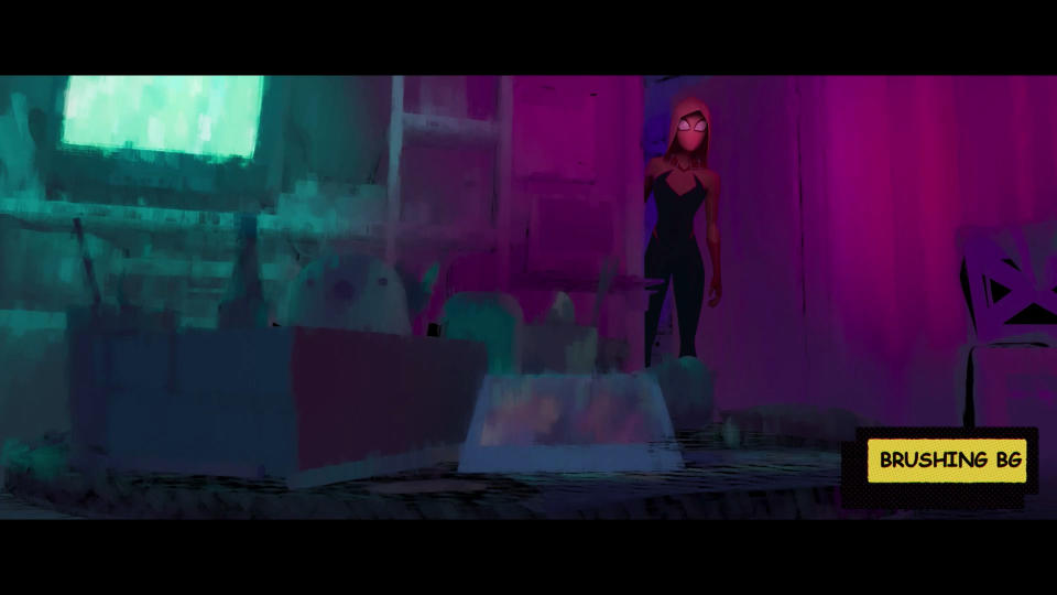
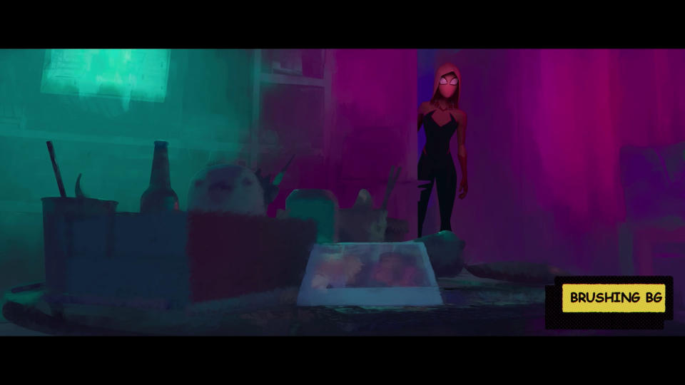
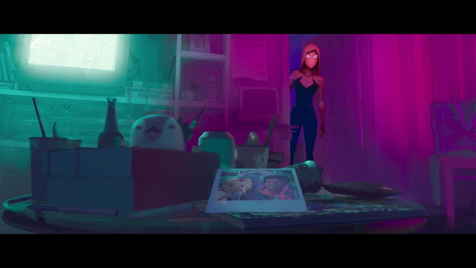
Before creating the Spot, Lasker and their team dealt with the challenge of creating each universe, the most difficult being Gwen’s world. “It was the first one we developed,” he says, “and very early on they gave us the reference for watercolor.” Since they wanted an everchanging world with a watercolor aesthetic, some scenes in that universe would be more graphic, some would fall off into white space and others would become abstract as the camera moved further away.
“Before we did any brushing, we set up all the colors,” Lasker says. “You have very graphic elements, very specific colors, so we blocked that out and went back in with our brushing tools.” Most of the tools used in Spider-Verse were new tools for the production, including the stroke system which was the main brushing tool for watercolors, as well as the atmospheric paint strokes used for the Spot. “We wanted the watercolor to feel natural, feel like it was hand painted, so we had a lot of different techniques that would all combine and add up to the final look.”
Nimona
In adapting N.D. Stephenson’s 2015 graphic novel, VFX supervisor Archie Donato says that a lot of time was spent on finding the right look for its high-tech medieval world. “The difficulty right from the start was this mixture of historical architecture with a super modern-day Tokyo style,” he says. “We spent an enormous amount of time to give the sense of a massive city, without losing the medieval part of it.” To that effect, medieval versions of skyscrapers and motion graphics were added in certain places.
To keep a graphic style, the traditional depth of field used in animation, where objects further away from the camera get softer and give your eye the feeling that you can’t see detail, wouldn’t work. “Instead of depth of field, we coined the term ‘depth of detail’,” says Donato. “Because this film is based on a graphic novel, we wanted to maintain that field, so we started to drop off detail the farther we went from the camera.” In doing so, the geometry and details disappear, but the shapes on the screen maintain a sharper graphical quality. “At some point, the billboards, the buildings, the windows, et cetera, become smaller squares and boxes in the distance.”
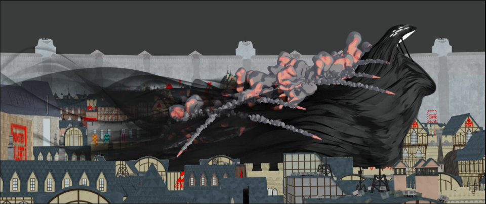
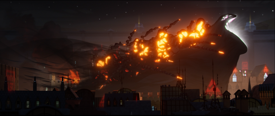
Towards the end of the film, a large creature made of smoke and dark matter attacks the city, which was a difficult challenge to create in CG. “The brief from the creatives was that this creature is entirely made of a smoke-like dark matter, and it doesn’t have any kind of hard physical boundary,” says Donato. To start, the team built a simple geometric version of the creature and added the effects on top. “The difficulty is that if you’re doing a shot like this and you want the missile to hit the character, it’s a lot simpler when you’ve got hard boundaries on the character.” As the missile hits the creature, the explosion couldn’t lay on top of the body, since, narratively, the body is not made of a solid mass.
The solution was compositing, bringing different digital elements together to create a single image. “We had to break it down into multiple elements, where we would take the smoke ribbons of the creature, and start mixing them into various missile trails or the hotspots of the explosion,” says Donato. Compositing the image in this way was a complex process, but it allowed the effects to keep a stylized look that seamlessly integrated into the creature. “Once we got the system working, it pretty much applied to every single shot.”
Teenage Mutant Ninja Turtles: Mutant Mayhem
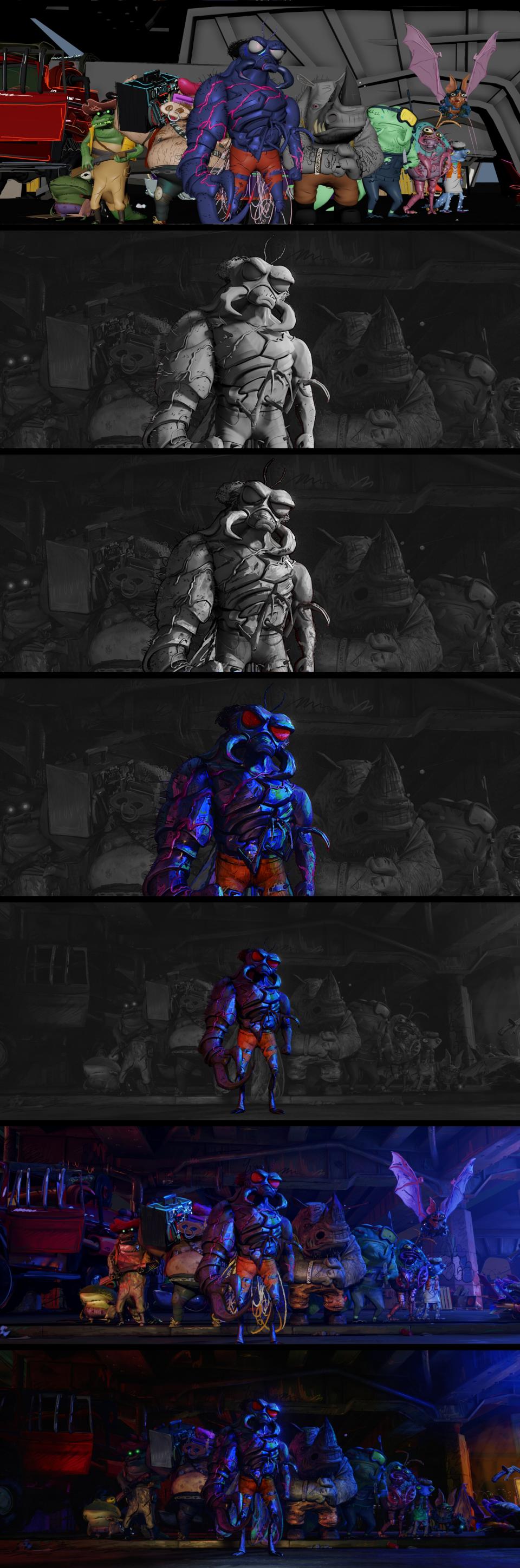
For Teenage Mutant Ninja Turtles: Mutant Mayhem, the filmmakers wanted to focus on the teenage aspect of the characters, in both the story and artistic style. Mikros Animation was the main animation studio for the film, and VFX supervisor Matthieu Rouxel began working with director Jeff Rowe on creating a unique style. “From the beginning, Jeff had really great ambitions for the visuals of the movie,” says Rouxel. “One of the first references we had was a sheet of drawings made by actual teenagers. It was cool, not super artistic, master drawings, and that was the spirit they wanted to have.” In addition to those drawings, Rouxel says they had more sophisticated references as well, like the approach to light and color in Alex Webb’s photography of New York City. “For me, it was a mix of those two things that really make this movie unique.”
Although 2D elements play a large part in the artistic style of the film, CG was still crucial to the animation. “I’ve been working in CG movies for years, and I was always trying to break that nice, clean 3D aspect, and try to get back the vibe of something more 2D-driven and more artistic.” Rouxel says that about 95 percent of the film is made in 3D, even the pencil lines that create shading and details were made in CG as part of molding each character, though they appear to be 2D.
There was no easy solution to breaking the clean CG look, as Rowe didn’t want the stylization to be done through a final filter on the film. “From the very beginning, there are a few things you try to do,” says Rouxel. “First, you create asymmetry in the models—the eyes don’t have the same size, the shoulders are not the same, the cheeks are different.” In addition to the asymmetry, they created the models with a clay-like texture and created curving lines with the thickness of an actual pencil to give the feeling of 2D art.
Another strategy used was forbidding the use of real textures, which meant that the team creating textures had to start from scratch for every asset. “Then, the lighting would be applied normally, but there were a lot of features in the shader.” The shader would be used separately on each light source, to give the appearance of painted lights and shadows. “The compositors would also craft their own materials to put a texture on top of the picture, mixing it with texture projected in 3D, so it is not just smooth and clean.”
Best of Deadline
2023 Premiere Dates For New & Returning Series On Broadcast, Cable & Streaming
2024 Premiere Dates For New & Returning Series On Broadcast, Cable & Streaming
Sign up for Deadline's Newsletter. For the latest news, follow us on Facebook, Twitter, and Instagram.

