Pink Floyd Designer Aubrey Powell on ‘Dark Side,’ ‘Wish You Were Here’ and Classic Album Covers in New Exhibition
- Oops!Something went wrong.Please try again later.
- Oops!Something went wrong.Please try again later.

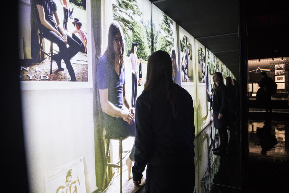
“The Pink Floyd Exhibition: Their Mortal Remains” has just opened at the Vogue Multicultural Museum, making its first U.S. stop on an international tour in the heart of Hollywood. Down on the corner, and in surrounding blocks, you can find tourist shops selling “Dark Side of the Moon” T-shirts (mostly unlicensed, probably) — but it’s not because they’re capitalizing on the Floyd exhibition being in the neighborhood; it’s that they sell them every day of every year, just like most other T-shirt shops in the world. That’s the power of the iconography being celebrated in “Their Mortal Remains.”
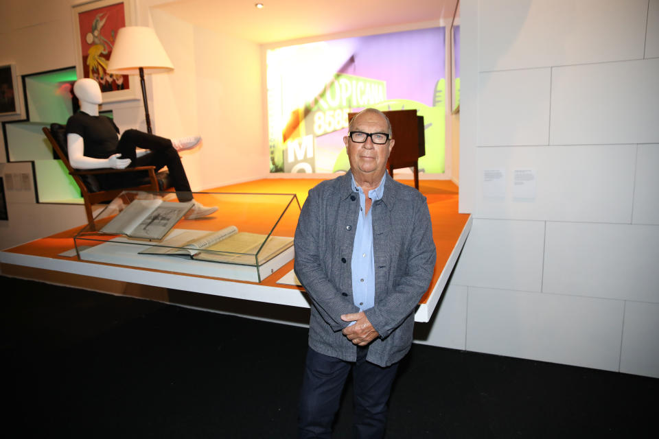
And it’s the power of the graphic and photographic work done in the ’60s and ’70s by Aubrey Powell and his late partner, Storm Thorgerson, who as the founders and creative principals of Hipgnosis defined much of what was great about album art in that era. The current exhibition is almost as much a testament to the power that they held over the public imagination during Hipgnosis’ glory days as it is to the band’s aural intrigue. Powell is one of the co-curators of the exhibition, which ensured it has deep insights into the imagery they created for Floyd from their second album on through to essential creations like “Ummagumma,” “Atom Heart Mother,” “The Dark Side of the Moon,” “Wish You Were Here” and, finally, “Animals.”
More from Variety
The exhibit also goes well into the covers Hipgnosis didn’t do, like “The Wall,” before Thorgerson rejoined the fold in the post-Roger Waters era. After he died in 2003, Powell (or “Po,” as he’s known) took the baton, and has served as art director on recent projects like the recent “Later Years” boxed set, a remix drawn from it of “A Momentary Lapse of Reason” coming out as a singular remix this fall, and an “Animals” boxed set due in 2022.
On the eve of the opening of the exhibition (itself covered in more detail in this previous story), Po spoke with Variety about some of the indelible Floyd images he and Thorgerson designed.
VARIETY: Can you talk about where the name Hipgnosis came from?
POWELL: Syd Barrett was a wordsmith. He made up the name Hipgnosis. And of course they got the name Pink Floyd from Syd. When he was asked “What’s the name of your band?,” he couldn’t think of anything… He saw this album cover [of bluesman Pink Anderson, juxtaposed with Floyd Council], and he said, “Oh, Pink Floyd,” and that was the name that stuck. It’s so bizarre. When Storm and I started out, we were all living together in this flat in South Kensington in London. One day Storm and I arrived back in the flat, and somebody written in on this pristine white door, h-i-p g-n-o-s-i-s, and Storm said, “What asshole did that?” We walked in and there was Syd standing with a pen, very sheepish. He was not very well at that point; he had taken too much acid. And Storm said, “You know what? That’s a great name for a company, if we join the two words together.” Hip meaning cool, and the gnostic meaning why. So that’s when we started Hipgnosis, and thank you, Syd Barrett.
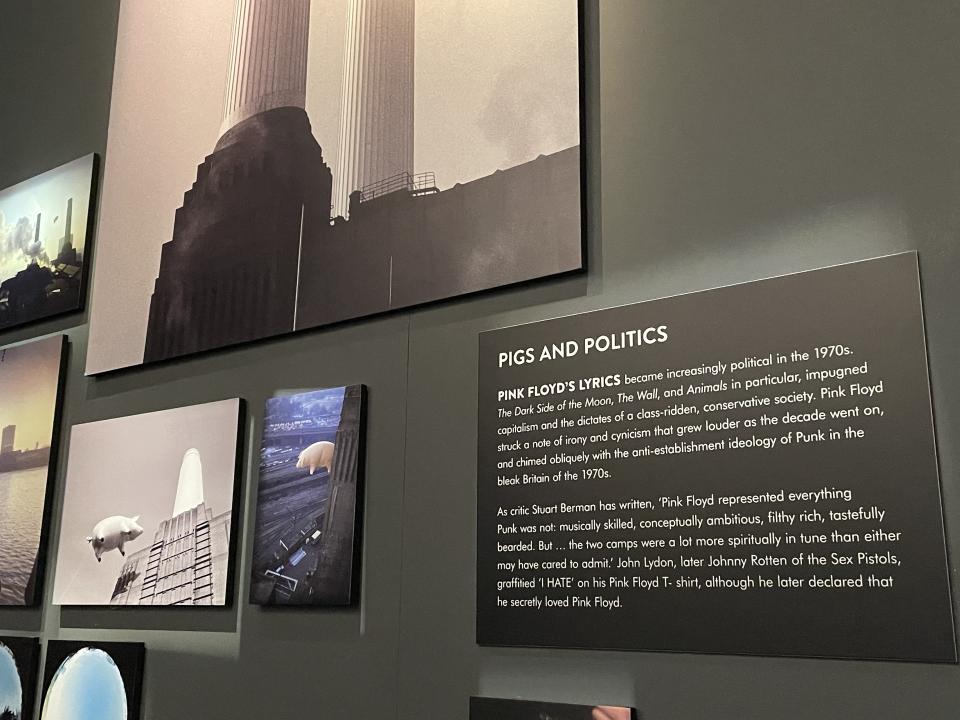
You’ve been involved with designing some of the group’s new reissues or boxed sets. There’s a photo in the exhibition here of a fresh shot you did at the site of the original “Animals” cover shoot.
I’ve just reshot the “Animals” cover, which was the pig over the power station. So although it’s not been released yet, we thought, well, okay, let’s put the new cover up there. We flew a pig over the power station again. They’re building blocks of flats there, and I wanted to get this picture before the power station was surrounded completely—which it is now – by apartments, you can barely see it, and do something with it.
Did you shoot it as what we see in the new photo, or did you augment it in any way?
No, that is exactly how it is. That’s shot from a bridge in Pimlico. I was driving over it one evening and I saw it and I thought this should be the next cover, for the remix. It’s not retouched in any way at all. I shot this picture five years ago before they started to redevelop it. Now it’s so surrounded by apartment blocs.
Roger came up with the original “Animals” cover concept, right?
“Animals” is almost like Pink Floyd’s punk album. It’s very aggressive. The lyrics are very different, it’s very Orwellian – dogs, pigs and sheep. Some are aggressive; some are passive. And when Roger wrote it, he wanted something that reflected the time. When he saw Battersea Power Station, he felt that this represented or was symbolic of quite a lot of things. One, there were four chimneys, and there were four members of the band. Two, they were quite phallic-like. Three, it was this industrial powerhouse, which was actually being scrapped because it was over and done; that kind of coal-fired energy-making in the ‘70s was being disbanded. And he felt it also represented something that was sort of almost science-fiction. When I went to see him, and he said, “You know what I want to do? I want to fly an inflatable pig between two chimneys. Can you do that?” I said, “Yeah, I can do that.” And we did. Of course, there’s the story of how the pig flew away, and it got into the air lanes going into Heathrow, and we closed down Heathrow Airport and all this stuff. It’s folklore that’s built into London history.
Chris Willman / Variety
The sky in the original “Animals” cover is very ominous, but aside from that and “The Dark Side of the Moon,” Hipgnosis had a lot of bright blue skies in the Floyd album covers, with these bizarre things going on beneath them, from “Atom Heart Mother” to “Wish You Were Here.” That mixture of naturalism and the surreal was a real trademark.
Yeah, it’s absolutely true. First of all, when Hipgnosis started and Storm and I had gotten together, there was an absolutely concerted effort not to go down the usual route of having band photographs on the front of record covers. We simply weren’t interested in doing that. That was left to the Beatles or the Stones or whoever. Pink Floyd were brave enough and clever to run their own destiny creatively with the record company. So when they asked us to come up with ideas, basically it was carte blanche. And Storm and I were always very influenced by Renee Magritte, Salvador Dali, the filmmaker Luis Bunuel, people like that, so surrealism was right at the forefront of the things that we were interested in. When you’re given the opportunity of a canvas which is a double gatefold, 24 inches by 12, which is a pretty decent shape, you don’t want to waste it on just having a picture of the band.
So we came up with concepts like “Wish You Were Here.” Primarily the album is about absence and insincerity, and of course there’s a track on there which is particularly potent to all of this about the music industry, about people getting burnt. So we thought, well, what better image to have than two businessmen shaking hands, and one’s getting burnt? And I remember, because I did all the photography, I said to Storm, once he told it to the band, “How the fuck are we gonna do that?” And he said, “Well, you’ll go to L.A. and set a man on fire.” So I did. [Laughs.] That’s Ronnie Rondell who’s on fire. He said to me, “You know, I did ‘Towering Inferno.’ I’ve done so many film stunts. And everybody remembers me from the Pink Floyd album, not for the movies I’ve made.” I said, “Well, it’s sold tens of millions of albums, and that’s probably why.”
Alex Kluft
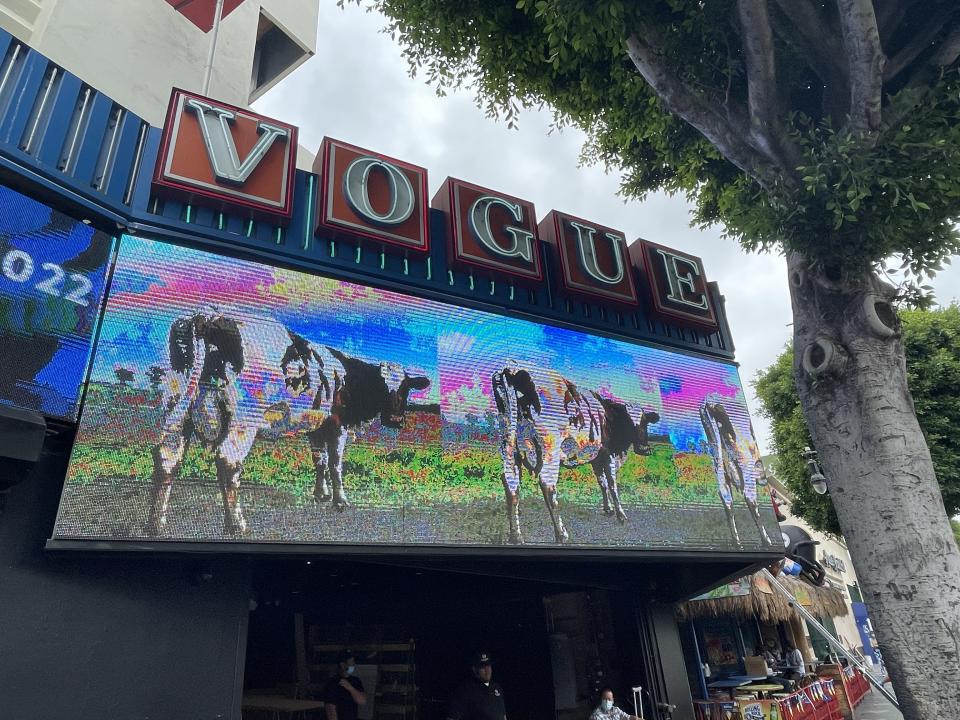
You guys would do these photo shoots in real settings that seem like you could walk into them, even though they’re surreal. You had done other great covers, like “Ummagumma,” but it seemed like “Atom Heart Mother,” with just the cow and blue sky, where it looks so real and not real at the same time, was a real start for this new aesthetic.
I should say that again that the influence of people like Renee Magritte and Salvador Dali (was responsible for) a lot of skies in there. We loved blue skies, and I always felt that it gave an otherworldliness to our pictures. And things like this cow came from a conversation with a friend, John Blake, who is a minimalist sculptor. We were talking about what we were going to do for this cover. And he said, “Well, why don’t you shoot an everyday object?” A teacup, you know, that sort of thing that Man Ray would do. And suddenly we thought, well, what about an animal? What about a cow? We literally jumped in the car, drove out of London, went to the nearest field where there were a bunch of freezing cows and took a photograph of this cow. And this cow’s name was Lulubelle III. Can you believe it? I took a photograph of the cow, and it’s such a perfect picture of the cow looking at you, like, “What the fuck do you want?” And I remember we took it up to Abbey Road, showed it to the guys, and they all went, “That’s it. That’s it.” And Storm said, “One condition: no name on the cover and no title.” They went, “Absolutely.” It was kind of lateral thinking in those days not to put a picture of the band or the title. It was anathema to the record companies. It was like, “What the fuck? You’re trying to destroy yourself commercially.” But actually we got and Pink Floyd got more publicity by just having that simple shot than any other cover we did, apart from “Dark Side.” Because basically, it was all about nothing.
It’s the same sort of thing as the Dada-ist idea that there was humor in everyday, normal objects or subjects I think it is a sort of an homage to the Dadaist movement, because it’s quite humorous, and it’s all about nothing. It’s whatever you want to think it is. And funnily enough, when Roger found the title “Atom Heart Mother,” which he got from this article in the Evening Standard, which was about this woman who had the first heart pacemaker transplant, somehow the two things went together. He just took that out of the newspaper and we just took this picture out there and put them together and it was synergy. And that’s how we worked with Pink Floyd.
The back cover was great, too, because you have the three cows lined up like they’re in formation, like they’re forming a chorus line or something. Nowadays you’d think, well, that has to be at least partly digitally superimposed.
No, that was real. I mean, we were crawling through these fields with a couple of cameras to shoot pictures of cows… What can you say? As a photographer, my life has been a series of magical moments — when you take a photograph of something and the hairs on your arms go up.
“The Dark Side of the Moon” was a departure.
“Dark Side of the Moon” is radically different because it’s not a photograph. The funny thing is that if you look at the original artwork [included in the exhibition], it’s very drab. It’s gray tracing paper, with some instructions for the printer to print the colors. But we didn’t sell it like that to the band. I actually sketched out on a piece of paper a thing that looked like that, but with crayons. We got the idea from a book, which was an American manual about lighting and about what light does when it goes through prisms. When we took it up to the band, it was literally a sketch like that when we showed it to them, and they all went, bar none, “That’s the one,” I think because it represented the band at the time. Their shows at that time were very dark. They had the circular screen where they projected images and movies, and you never saw the band. They were just shrouded in sort of a mist in darkness. And I think what they liked about it was this somehow represented them. It was like a single source coming out to these beautiful colored lights, and somehow they were almost hidden in it somewhere. I think it was just sort of very representative for them. And who would have known it would have become such an iconic symbol of Pink Floyd, which it still is to this day. If you’d asked me at the time, I’d guess it would probably sell 1500 copies instead of 45 million. But as a result, it’s on every T-shirt that’s out.
This was not our style at all, to do something graphic. We were much more about photographic images. We used to call them photo designs — quite pretentious, but nevertheless that’s what we called them. And I remember Rick Wright saying to me, “I’m fed up with your surreal ideas. Can’t we have something really simple, like the top of a chocolate box?” And Storm and I were really depressed. We left Abbey Road going, what the fuck — a fucking chocolate box? And we couldn’t think of anything for a couple of weeks. And one day I was thumbing through this book and Storm was looking at it and he suddenly went, “You know what? I got it.” And he made the triangular shape with his fingers and his two thumbs, and that was it. That’s how we worked together. We inspired each other — although it was quite volatile, our relationship. We argued… continuously. [Laughs.] But maybe that’s what makes the best work?
There did end up being photographic components for “Dark Side,” just not the front cover.
After had done the “Dark” design, which is of course very pyramid-shaped, Storm said, “I think we should go to Egypt and photograph the pyramids for the inside.” And in those days, you’ve got to remember that albums sold in tens of millions, and the music business was awash with money. So: “Yeah, okay, we’ll go off to Egypt and we’ll shoot the pyramids,” and it was like, “Yeah, okay, great, well, off you go.” You couldn’t do that now. And all the other bands we worked for were the Led Zeppelins, the Peter Gabriels, the Genesis-es, Yes and all these bands. Whatever you wanted to do, you could do. “I want to go to Hawaii and shoot the sheep on a couch for 10cc.” “Oh, okay. Off you go.” It just isn’t like that anymore.
You did some work for other groups that involved multiple photographs riffing on a similar thing — like the great cover art and ad campaign for Golden Earring’s “To the Hilt,” where you have a businessman in a series of threatening situations, tied to the railroad tracks or tied up in a shark tank, looking unperturbed.
Oh, you like that? It’s very unrecognized. I had such fun doing that, creating this guy who was in all these extraordinary situations. And it really comes from old sort of comedy films, like “The Road to Morocco,” these Bob Hope/Bing Crosby films with Dorothy Lamour. They were always finding themselves buried up to their necks in sand with turbans or something like that. The influence comes from all of that stuff; there’s a lot of humor in there. It’s funny you know about that cover.
Do you have a personal favorite of the Floyd covers you worked on?
Yeah, “Wish You Were Here” because I enjoyed photographing that more than anything. Interestingly enough, the man on fire was something I shot at the studios in Burbank. That evening, I went to a party up in Laurel Canyon, and I’d left there about 4 o’clock in the morning. As I was driving down the hill, I looked out the side window and it was clear, and out the front window it was very misty. I said to Peter Christopherson, who was with me, “That’s funny.” And he said, “You know what? The car’s on fire.” We stopped the car, and the whole thing blew up. And to have that happen on the evening after you’ve set a man on fire was rather unnerving. Just a weird coincidence. Nothing’s a coincidence.
That was around the time punk was beginning. It’s funny that Johnny Rotten’s famous animus toward Pink Floyd is included as part of this exhibition.
The thing I love about Johnny Rotten… Where Hipgnosis had its studio, the Sex Pistols rehearsed right behind us, and for about 18 months, I could hear all this music coming out of there after dark. They were sort of doing hashed-up jobs of the Beach Boys and all sorts of weird stuff — copying the Who. And they were always kind of rather innocent boys. We used to always open the door for each other. And then one day John Lydon walks down the corridor, and by this time he’s got pierced ears and he’s wearing safety pins and all the rest of it, and he’s got his T-shirt on saying, “I hate Pink Floyd.” I said, “What’s that?” And he said, “Well, I fucking do hate them.” But of course he didn’t, really. He was just making a statement. Two weeks later, they played their first gig, and they invited me to come along and see it, but I never did. But he deserves a place in here because of that.
How did your role in co-curating this exhibition develop?
We wanted it to have a real gravitas about Pink Floyd, not just a sort of series of cases that you might see in a normal museum setting. So I went away and came up with some designs. I just had a big roll of lining paper that you put on the wall, and I just got a black felt tip pen, and I drew what I wanted to do. And I said, we’re going to start at the very beginning, in Cambridge where I came from with Pink Floyd, and we’ll go right the way through the end. But I said you need to have state of the art technology with this, and you need rock ‘n’ roll lighting with this; we need the sophistication that represents Pink Floyd, and we have to have perfect sound. So I started off at that point. And after two or three years of working on that with architectural designers and conservators, and Paula (Webb Stainton) being a curator, we came up with a solution, and I went to the V&A in London.
It was the most prestigious place I could think of going to. And when they saw the plans for it all, they said we want it. They’d just done David Bowie, which had been hugely successful, so I thought, now’s my chance. They saw the potential of it. The exhibition at the V&A was 17,000 square feet — bigger than this, but basically the same content. And it ran there for five months, and we had 415,000 people, the most successful exhibition they’d ever had. At that point, it was decided: let’s take it on tour. Because it had been intended as a one-off. Then we went through Europe for a full year. Because of COVID, obviously, we put a halt to it and put everything in storage. And now here we are in L.A., and this is the first opportunity we’ve had to celebrate this exhibition in America. We’re planning to go to Mexico City next, then Toronto, and then in spring of 2023, which is the 50th anniversary of “Dark Side of the Moon,” open in New York.
To read more about the current exhibition in Hollywood and its development and contents, click here.
Joel Ryan/Invision/AP
Chris Willman/Variety
Best of Variety
These Celebrity Memoirs Were All Instant Best-Sellers: From Seth Rogen to Cicely Tyson
The Best Labor Day Sales to Shop This Weekend: Le Creuset, Nespresso, North Face and More
Sign up for Variety’s Newsletter. For the latest news, follow us on Facebook, Twitter, and Instagram.

