Pete Townshend dissects six classic Who album covers
Under the Cover is a column that reveals the stories behind album art.
Before he became an instrument-smashing, windmilling rock star, Pete Townshend was a student at Ealing Art College in London, studying kinetic sculpture. Around the same time, he developed an interest in the work of Sir Peter Blake, a British Pop artist who, most famously, designed the cover of the Beatles’ Sgt. Pepper’s Lonely Hearts Club Band, along with albums for Oasis, Paul Weller, and Eric Clapton.
“I was a huge fan,” Townshend tells EW of the young painter, who went on to design the cover of the Who’s 1981 LP Face Dances, as well as this year’s WHO, the band’s first album of original material in 13 years. “I found him in a book at first and then subsequently met him at an Institute of Contemporary Art exhibition [in 1964]. I’d always had a crush on [his art]. I was thrilled to meet him. He’s very gentle.”
Art and design have always been a major factor in the Who’s work. Over the band’s 55-year career, they have produced a variety of legendary covers, logos, and iconography — some of which were influenced by Blake himself. As Blake tells EW, “[Townshend] borrowed a lot of imagery that I used, like the [Royal Air Force] target, the Union Jack flag, and a black-and-white diagonal stripe.” To create the cover of the band’s new album, the 87-year-old artist worked in tandem with graphic designer and frequent collaborator Simon Halfon. Their concept was based around Blake’s series the Sources of Pop Art, which uses imagery once employed by fellow Pop artists Andy Warhol and Roy Lichtenstein.
“We decided to go very pointedly for something that was Pop art and was referring back to some of the symbolism I’ve used over the years,” Blake says. The cover is also a direct callback to the band’s history, featuring images of a pinball machine (signifying the band’s 1969 hit “Pinball Wizard”), baked beans (a reference to the group’s cover of The Who Sell Out), and Eel Pie Island (a small stretch of land in London where Townshend briefly lived and the Who played a few gigs early on).
Timed to the release of WHO, Townshend walked through some of the Who’s most iconic album covers, their various influences, and which ones he absolutely loathes.
My Generation (1964)
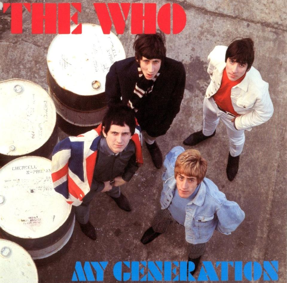
“I think the cover is just pathetic. You know, it’s an example of a new band that’s being guided by a record company of what, to us at the time, would have been an old man who didn’t know what the hell we were about. I mean, it’s just a s—y little polite record sleeve. The photographer was a nice guy and he took some good pictures of us. But it’s nuts. I hate it. The whole picture does seem to be about the size of Keith Moon’s penis, to be honest, which, in the tradition of the day, was quite possibly a sock.”
The Who Sell Out (1967)
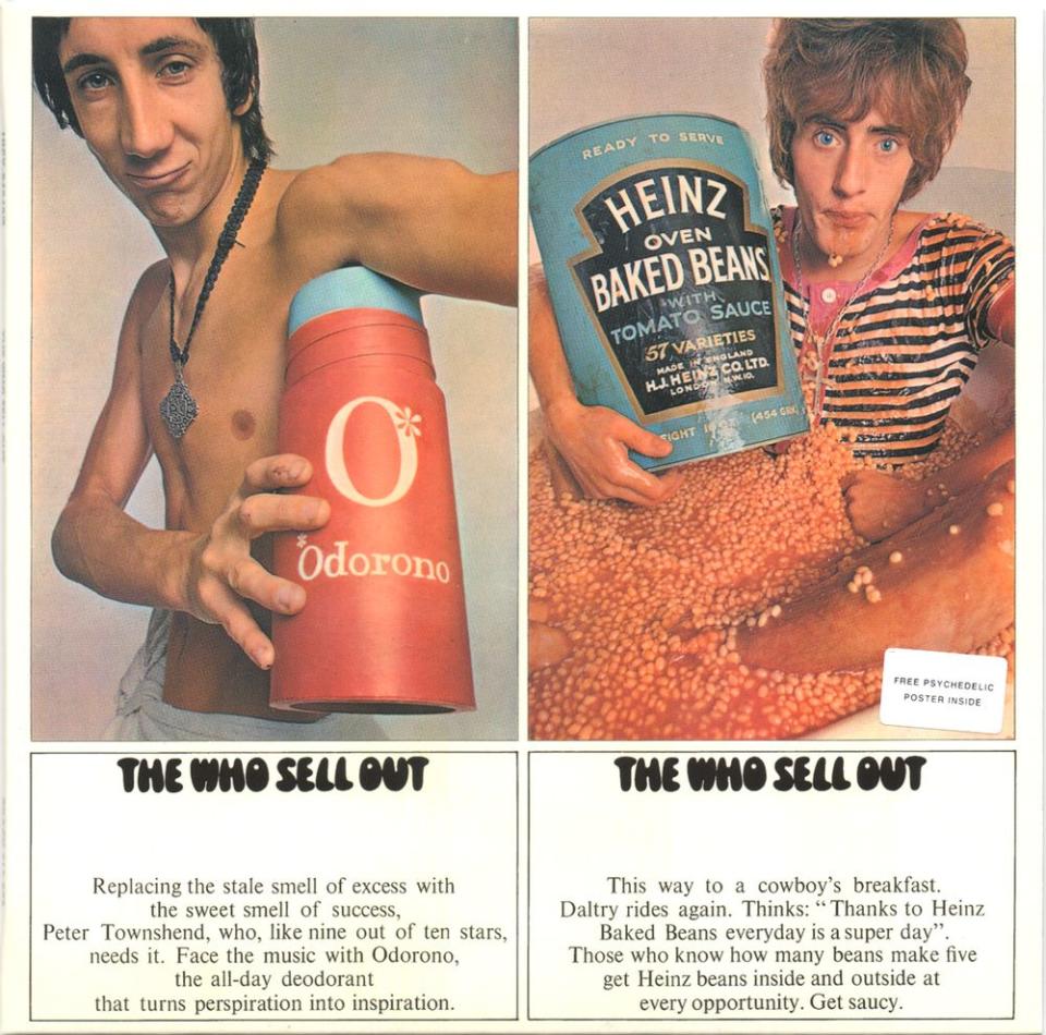
“I had this, I’m not going to call it an idea, I was just having fun knocking around the thought that one day we might be famous enough to sell the space in between our tracks on the album for commercials. So we came up with the idea to write jingles [for The Who Sell Out]. One was “Odorono,” about deodorant… And then we did the [album cover] session and there were two people involved: Dave Montgomery, who was the art director and photographer, and Roger Law, the guy that’s responsible for the Spitting Image puppets on TV in the U.K. They made us very, very welcome, and they had each of us take a different photograph. We had a lot of fun. I think the only person that didn’t was Roger [Daltrey] because those baked beans were straight out of the fridge. So it was a bit like having an ice bath. I very much doubt [Daltrey] got pneumonia [as he said in a 2009 interview with the BBC], but I don’t think it was much fun. The funniest stories attached to it are really the fact that we did try to get Heinz Baked Beans to give us some money and they just sent us some beans.”
Tommy (1969)
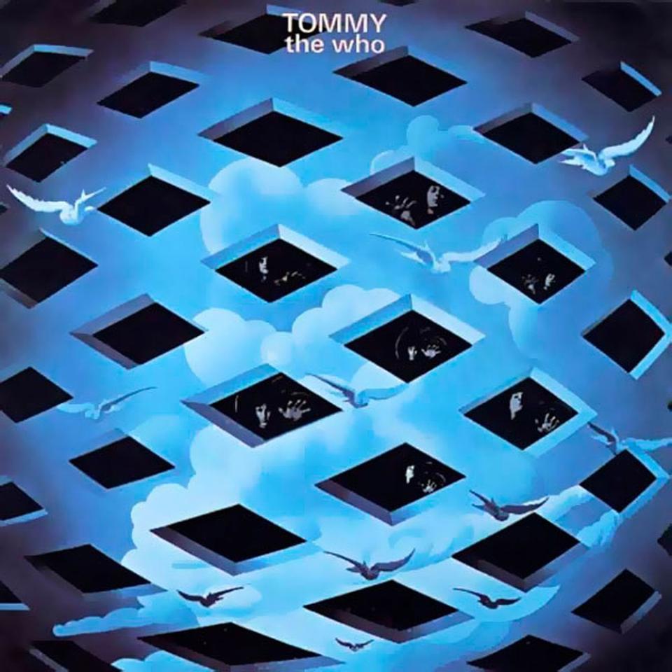
“There’s a book that’s just been published in celebration of the 50th anniversary by [Tommy cover artist] Mike McInnerney in which, lo and behold, my ex-wife, Karen [Astley], did an interview about the period in which this album and the artwork [were] conceived. It was the birth of the hippie era. It was LSD, Haight Ashbury, and in London, it was Pink Floyd at the UFO Club and International Times magazine.
“We had just played at Monterey [Pop Festival], and Karen came with me. We had a really bad acid trip on the way back. We both swore to never use LSD again, even though we had loved it, and we loved the colorful hippie scene. We came back to London and got interested in some of the big questions that taking the acid had raised: Who am I, what am I, what am I doing here? And we went to a small gathering at which Mike McInnerney was doing some artwork. I started to talk to him and he introduced me to the Indian teacher Meher Baba and I was immediately hooked. I felt a real deep connection. We had a long conversation and I told him about my project, which was to write this rock opera. Mike McInnerney’s input was really part of what made [Tommy] work so well. [After asking to do the artwork] — that lattice thing with our images in between — he didn’t do it straight away. He started to take each song and tried to do a piece about it. And I’d go and see him every couple of days and had conversations with him about how it was unfolding. And he, like me, had to make last-minute changes. He worked under a single light bulb. He used gouache. It’s very detailed. The quality of the artwork is very, very refined. Also the way that he approached it, it’s Magritte-like. It’s the kind of thing that’s great to look at when you’re looking at the music.”
Who’s Next (1971)
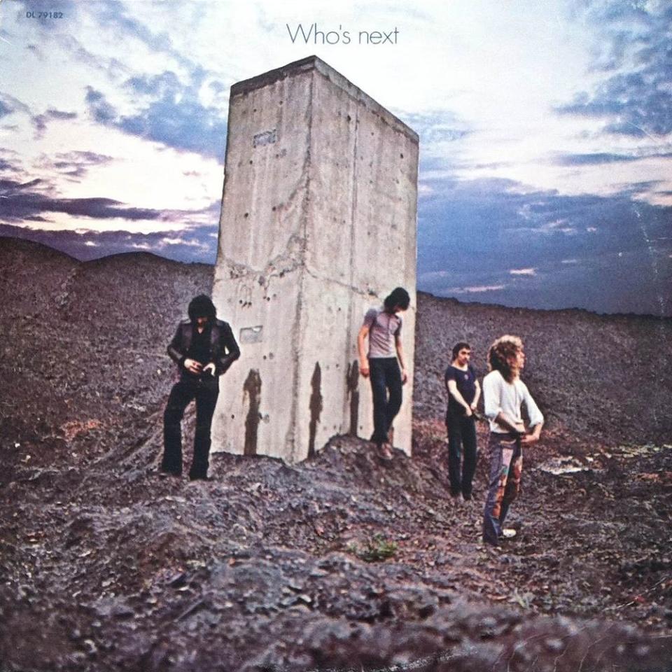
“It’s another piece of s—. I hate it. It’s a horrible thing. Just horrible. Of course I don’t like it. It’s got no artistic consequence whatsoever. No link to the music. It’s meaningless. It’s four guys stopping in a car and pissing up against a chunk of concrete. It was photographed by a very fine photographer in Ethan Russell, who, thank God, I really liked and used again for Quadrophenia, but I hate the front cover, I hate the back cover, I think it’s disgusting. I suppose the notion was that 2001: A Space Odyssey was the film of the moment [and we’re] pissing over this 2001 monolith — which is even stupider because I think we all thought the film was fabulous. There’s no irony in it, there’s no truth in it. Anyway, can we move on?”
Quadrophenia (1973)
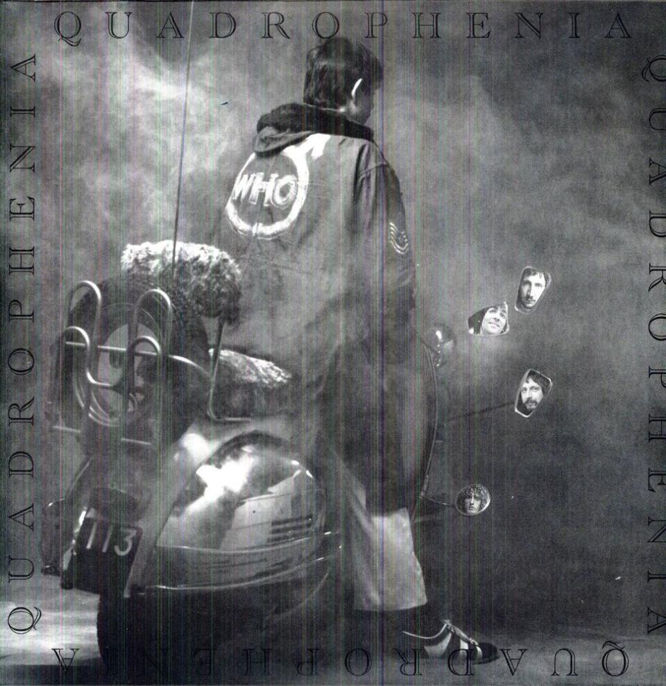
“[The artwork] arose out [of an] argument with Roger. The original cover was going to be the image on the inside sleeve, which was a Battersea power station with [the main character] Jimmy riding his scooter… The whole point of the record was to try to refocus the members of the band, including myself, on its roots. To reconnect us with where we’d come from and the humility and the modesty of turning to our original mod audience and saying, ‘You had a great adventure, you were our inspiration, and it’s not that you want to be like us, it’s that we want to be like you.’ And I think Roger saw it the other way around, [that] Jimmy was somebody who would really want to be like all of us. I think that’s perfectly okay, but it’s not the way that I saw it. And he wanted the members of the band on the cover and suggested having a photo of a scooter with the faces in the mirror, which was very much the same trip that Mike McInnerney had done on the cover of Tommy. Graham Hughes who did the [cover], took a really great picture, but I think the weird thing about Quadrophenia is the grayness of it. It’s kind of sad. The photos inside are high-contrast, they’re really beautifully printed. They’re evocative, so again, I’m kind of sad about this album cover. I don’t think it’s great. I think the idea is great.”
Face Dances (1981)
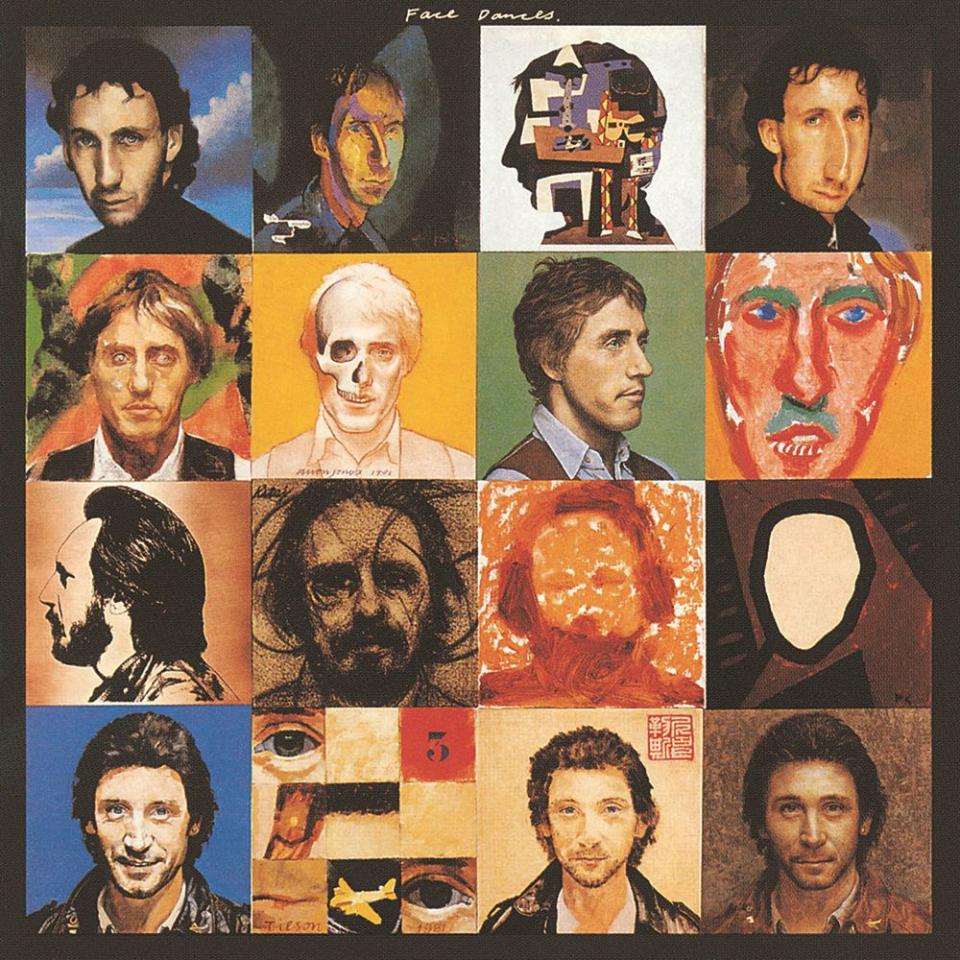
“The band was really busy at the time. It was immediately after Keith Moon’s death, and we were very, very active, and we were operating during the decline of the punk movement. Punk had made a lot of noise, and then immediately declined. So we were left in this kind of weird wasteland of energy and a lot was expected of us as a band — and, to be brutal, we really couldn’t rise to it. I think I had the most difficulty, because I was finding it really hard to write songs. I couldn’t work out who the Who were, what it was they represented, where they were going to go next… [So this] record was kind of dull. The idea to go to Peter Blake, it probably came from a desire to get some color, but I remember meeting Peter at the Ivy restaurant in London, both of us getting completely smashed, somebody being punched by Omar Sharif, and going home. Peter[‘s idea for the cover was to] commission all these incredible British artists to produce panels. They did it fantastically quickly, and it was entirely his idea. I think it’s wonderful, absolutely wonderful. The cover is much, much, much better than the music.”
Related content:

