Michael Cieply: In A Color-Coded World, Films Claim Their Place On The Palette
- Oops!Something went wrong.Please try again later.

The late film executive Bingham Ray, God bless him, once (over lunch at Orso, in 2009) pointed out something so obvious I had completely missed it. The wiliest movie marketers, explained Ray, try to own a color scheme.
Juno, for instance, had orange stripes with distinctive green highlights. Little Miss Sunshine was bright yellow. The first Austin Powers chose a velvety wine red against gold, surprisingly subtle for an outrageous comedy. The colors lit your fuse. The rest was up to the picture.
More from Deadline
Who knew that by a dozen years later, our entire post-literate, increasingly tribal, identity-obsessed culture would be similarly color-coded? A branding device that had once been consigned to sports teams, street gangs (cf. Colors) and the St. Patrick’s Day parade became our dominant means of nonverbal communication.
Blue or red wasn’t just for Crips or Bloods any more. Whole states became red for Republican, blue for Democrat or grapey purple for an unhappy swing condition in between. Green became code for all who love the planet. Black came to stand for Black Lives Matter. Blue and yellow for the Ukraine. The rainbow for Pride, and the modified black-white-brown-pastel-plus rainbow for super-inclusive Pride.
In 2023, you are your palette. Your palette is you.
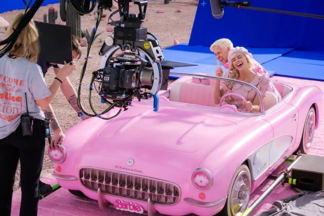
Which, coming back around to movies, underscores the brilliance of Warner Bros. in taking complete possession of pink, and with it, The Eternal Feminine. I mean, search “Barbie” on Google and you’re hit with a blinding flash of pink stars. Granted, a nuclear pink social media meme prompted apologies in the last week; but it only made the phenomenon bigger. At this point, you can’t even look at Pepto-Bismol without thinking of Margot Robbie. And the color campaign has moved far beyond the Astroturf phase. A few days ago, I spotted a young women’s volleyball camp having fun with a pink day. The guy coaching wore bright pink shorts.
Movie marketing doesn’t get better than that.
Fortunately, the promoters over at Universal are no slouches when it comes to selling movies by color. Remember, this is the studio that actually used earth-tones to make a hit of The Sting, way, way back in the color-muted Seventies. For Oppenheimer, the marketers shrewdly grabbed hold of flaming tangerine, even hotter than flame red, and wild enough to hold its own against all that pink.
(For the record, as an aspiring producer I sat through marketing meetings that resulted in a virtually color-free campaign for Columbia’s 1992 youth boxing film Gladiator. The posters were two-tone, a kind of faded lavender-gray against white. Very slick, cool, magazine-y. Bloodless. The picture bombed.)
But with so many colors now spoken for, is anything left to the rest of the film calendar? Napoleon, I suppose, might work with the Tricolor, or maybe those old French social stand-bys, the Red and the Black. Ferrari could probably make something of its namesake’s black stallion on a golden shield, or there’s always the checkered flag. Killers of the Flower Moon will have to find its palette on the spring green and burnt gold prairie.
Aquaman and the Lost Kingdom has already locked in deep blue. The Color Purple has dibs for the season on royal purple. Blue Beetle has indigo-ultraviolet.
As for me, I’ll take seafoam, if it’s still available. Because with nothing to sell, every day is pretty much a walk at the beach.
Best of Deadline
2023 Premiere Dates For New & Returning Series On Broadcast, Cable & Streaming
SAG-AFTRA Interim Agreements: List Of Movies And Series Granted Waivers
Hollywood & Media Deaths In 2023: Photo Gallery & Obituaries
Sign up for Deadline's Newsletter. For the latest news, follow us on Facebook, Twitter, and Instagram.

