Inside 5 Mind-Blowing Dimensions in ‘Spider-Man: Across the Spider-Verse’
- Oops!Something went wrong.Please try again later.
- Oops!Something went wrong.Please try again later.
[Editor’s note: The following interview contains spoilers for “Spider-Man: Across the Spider-Verse.”]
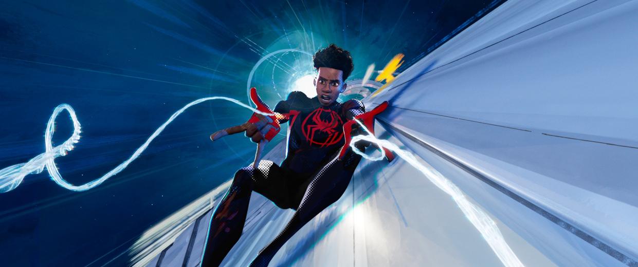
It’s a brave new multiverse for Miles Morales (Shameik Moore) and Gwen Stacy (Hailee Steinfeld) in “Spider-Man: Across the Spider-Verse.” It was the same for Sony Pictures Imageworks, which introduced several new dimensions and characters inspired by a multitude of trippy-looking Marvel comic book designs. And for that, Imageworks created innovative tools for translating more elaborate 2D stylization into 3D with new systems for using pencil, pen and ink, markers, and paintbrushes.
More from IndieWire
Bradley Cooper Sets Next Movie to Direct After 'Maestro' - a Team-Up with Buddy Will Arnett
Wes Anderson Movies, Ranked: 'Bottle Rocket' to 'Asteroid City'
In “Across the Spider-Verse,” we travel to the watercolor-inspired Earth-65, from which Gwen’s Spider-Woman hails; Earth-50101, a mashup of Mumbai and Manhattan called Mumbattan, home to Spider-Man India (Karan Soni); Earth-928, the futuristic brutalism of Nueva York, where Spider-Man 2099 (Oscar Isaac) runs Spider-Society HQ; and Earth-42, the noirish world where the spider that bit Miles originated. Plus, we get a glimpse of Earth 138B’s New London through Hobie Brown/Spider-Punk (Daniel Kaluuya). He embodies the look of rock posters from the ’70s, with photocopied paper textures cut and pasted together and constantly moving at different frame rates.
In addition, we’re introduced to two baddies: The Vulture, a bird villain (Jorma Taccone) from the Italian Renaissance who lands at the Guggenheim Museum in Earth-65, and Spot (Jason Schwartzman), the bizarre-looking nemesis of Miles, who’s all white with black spots that serve as inter-dimensional portals.
“This movie was so heavily painterly and stylized,” returning VFX supervisor Michael Lasker told IndieWire. “And we had to control dry brushes, wet brushes, control it in depth, making brushes move and repaint. We didn’t have any of that before. So all of it had to be developed on this film, and it’s a testament to the creativity and ingenuity of the group [at ImageWorks].”
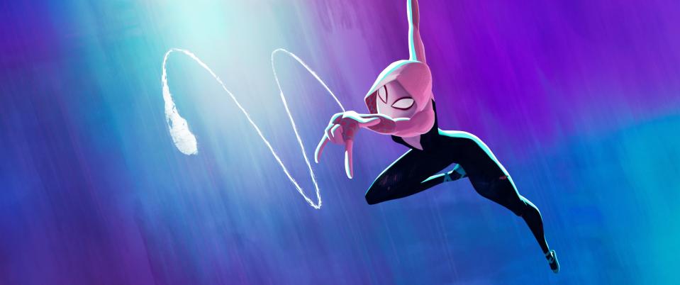
Gwen’s Watercolor World of Mood Rings
The look of Gwen’s world was partly inspired by Robbi Rodriguez’s covers for Jason Latour’s comics, with their vertical striation and striping of paint. However, the idea of it being a wet-on-wet watercolor world was original. The idea was that it changes in every shot like a mood ring keyed to Gwen’s emotional state. This was achieved with a tool called Rebelle and new brush stroking systems.
“A lot of the Gwen’s world frames looked almost like a flat painting,” Lasker said. And a lot of it comes down to the composition and the lenses. And if you’re shooting it very flat, it lends itself well to being more graphic.
“The opening sequence was very tricky ’cause we had to have it timed out to music with her drumming. It was actually one of the last sequences that we finished. But we did a lot of 2D shapes. It was very graphic-inspired. And then we mixed that in with renders of Gwen and drumming to create this hybrid look. It’s not as washy, it’s not as wet; it’s just a little bit cleaner. And then we bring in a lot more of that wet look, more painterly at times, depending on her emotion.”
The Vulture Invades the Guggenheim
The Vulture was worlds apart from Spot, which was treated as a painting built up from nothing with spots that were animated and ink smeared in effects. The first challenge was figuring out the Da Vinci-style parchment for this crazy vulture creature. And then they had to make him stand out in Gwen’s world amidst all the saturated blues, purples, and greens.
The Vulture was fully rigged, inked with multiple layers of lines that were interpolated and then meshed with other materials and effects. “Not only did his rig, his modeling, and his linework have to be on paper, but there were markings that he drew in the air as he rebuilt his wing,” said Lasker. “We had a splotchy paper texture on him. And, in some shots, we worked in a little bit of that sort of nickelodeon-style flickering, almost like a flip book effect with a little bit of light flickering behind him. He was always a little bit different in every shot.”
Bringing India to Mumbattan
This world was distinctive to its India comic book style, where the ink wasn’t always perfectly on form, the printing was a little bit offset, and there were a lot of overlapping colors and forms outside the lines. They created an action-packed, 2D-looking tapestry, sometimes working in half-tones and making it look like it wasn’t printed properly. It took new tools for simulation, linework, and non-photorealistic compositing to pull it off.
“They really wanted it to feel like the city was dense with wires, with people, with traffic,” Lasker added. “So we wanted almost a rougher look and it was like the juxtaposition of those two ideas, which was interesting. We used our line tool and we did a lot of early tests where we took a car and drew lines around it, but we made it really messy and we made the shadows messy. You wanted it to feel busy, to have enough of the graphic looks in every shot that you feel the style, but also read the characters’ emotion in their performance.”
Nueva York in 2099
There is beauty and coldness in the Syd Mead and John Berkey-inspired brutalism of Neuva York in 2099, where a clean, futuristic world stands high above the Spider-Society HQ underworld, where it’s dark and neon-lit. This aesthetic required its very own brushstroking tool, which was first tested on Mumbattan.
“We used that brushstroking tool, but we actually used real marker strokes and brought them into the tool,” Lasker said. “And the trick with markers was how you layered them, blended them together, but with their own feel. So markers had their own look. And it’s a very powerful tool where you can use lines for shadows, for edges. It can be messy, it can be sketchy, it can be tight to the form, but not messy like the India style.
The Far Side of Earth-42
This is a nightmarish world for Miles stylistically based on Sean Gordon Murphy’s “Batman: White Knight” comic series: dark, gritty, hard-edged, and scary. “So we did a lot of experiments to convey light without using light,” Lasker said. “We would use line work to reveal light, and we did a lot of ink splatter techniques: very sharp, unforgiving lines, a little bit of dry brush, but there’s no gradient anywhere.”
They also used very saturated red, black, and green in Miles’ apartment. “This very green, gritty, spindly stairwell, we built out from there,” added Lasker. “And how we treated lens flares and lights and our offsetting and our line work was really an interesting look.”
Best of IndieWire
Wes Anderson Movies, Ranked: 'Bottle Rocket' to 'Asteroid City'
Where to Watch This Week's New Movies, from 'Blue Jean' to 'Transformers: Rise of the Beasts'
Sign up for Indiewire's Newsletter. For the latest news, follow us on Facebook, Twitter, and Instagram.

