The History and Evolution of the Pepsi Logo Over the Years

There's a lot of major anniversaries happening this year, including the celebration of Pepsi 125th year of being on this planet we call Earth. You may have already heard the news about Pepsi's plans to unveil a brand new logo this fall to commemorate the event, which is set to replace the previous one that has been in effect since 2008., and if you're curious like us, then you're probably wondering what new changes are going to come along with this fresh logo. We'll have more later on all of that along with what we currently know about the events Pepsi has planned this year to add to the festivities, but in the meantime we thought it would be fun to take a look back at the history of the Pepsi brand, and the different iterations of it's logo.
Consider this you're ONE37pm history lesson. We don't do it very often, but this certainly won't be the last time we try our hands at it. We personally find the early beginnings of monumental corporations, companies, brands, people, etc. to be very interesting, and the creation of a soda (or pop if you prefer to call it that) is a wildly fascinating topic that will have you doing what the TikTok community calls a "deep dive."
With that said, let's deep dive into the Pepsi logo history shall we?
A Brief History of Pepsi

Image credit: Getty Images
Let's start by taking it all the way back to 1893 with a young fella named Caleb—Caleb Bradham to be exact, who is the original inventor of Pepsi. Then known as "Brad's Drink," the very early versions of Pepsi were sold at Bradham's drugstore in Newbern, North Carolina. The carbonation of the drink was known to help with dyspepsia (indigestion), and alas the word Pepsi was used as the drink's new name from 1898 on. The recipe for the drink contained two very simple elements—sugar and vanilla, with the goal of energy boosting being the main purpose for its creation (along with the fact that it of course tasted great).
By 1903, the bottling, packaging, and distribution of Pepsi was moved from Bradham's drugstore to a warehouse, which is always an indicator of a company on the verge of taking the next step. Below is a cool video where you can see rare clips of what the Pepsi creation process looked like in the early 1900s.
From there, Pepsi began being sold in 6oz bottles, and by 1989 Pepsi had its first endorser in automobile race pioneer and expert Barney Oldfield. The advertising theme for the next two decades would be as follows: "Delicious and Healthful." Not exactly sure we agree with the "healthful" description from an actual health perspective as sugar and syrup isn't exactly listed on the food pyramid, but if we're talking healthful as in the drink hitting the spot—then yes, Pepsi was and still is "healthful."
After brutal 1920s and 30s that was plagued by financial losses due to World War II, things began to turn around for the company after the start of The Great Depression. The reason for the major turnaround is very simple once you break it all down—a can of Pepsi was only $0.05, and it's not uncommon to crave sugary food and beverages when you're going through stressful situations (and The Great Depression was definitely that).
As the decades progressed, Pepsi's marketing got better with commercials that have since gone on to be memorable, television and film placements which included appearances in Home Alone, Back to the Future Part II, Flight Club, World War Z, and plenty more. The brand has also had many legendary ambassadors among the like of Joan Crawford, Michael Jackson, Madonna, Beyoncé, Britney Spears, David Beckham, and more. That leads us to modern day Pepsi. As we mentioned at the start of this article, the last major rebrand from the company was back in 2008/early 2009 when it changed Pepsi, Diet Pepsi, and Pepsi Max to all lowercase fonts, along with the blue and red trademark turning into a series of smiles.
So now that we've covered the overall history of Pepsi as a whole, let's take a look at how the logo evolved over the decades.
The Evolution of the Pepsi Logo

Image credit: Getty Images
As you can imagine, the Pepsi logo has undergone quite a bit of changes over the years that aligns both with advancement of technology, and the evolution of the brand as a whole. We're going to break down each logo era and give you some info about the inspiration behind it. Ready? Let's get into it (and grab a Pepsi while you're at it).
1893 - 1898

Image credit: Pepsi
The illustrious days of "Brad's Drink," which as a reminder, Pepsi was first known as. We gave a rundown of the "Brad's Drink" era a little earlier, but just as a quick refresher—Pepsi was invented by American entrepreneur Caleb Bradshaw who was the owner of a pharmacy in New Bern, North Carolina. Bradshaw sold the drink in his pharmacy for five years under the name "Brad's Drink," before switching to the name Pepsi (taken from dyspepsia), and eventually moving to a warehouse.
As you can see, the font was designed in a solid blue color in a classic style that was very popular in the late nineteenth century.
1898 – 1903

Image credit: Pepsi
Enter the "Pepsi-Cola" era, which featured the words Pepsi-Cola in a bright red curved and slanted font that was almost hard to read. During this time the production of Pepsi products moved from Bradshaw's small town pharmacy to a warehouse where they would handle the bottle making and distribution. New name, new logo.
1903 – 1904
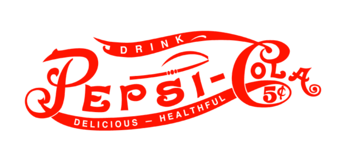
Image credit: Pepsi
Speaking of a new logo, the previous design only lasted for a year (which was probably because it was hard to make out). The version that you see above made its debut in 1903, which showed the words Pepsi-Cola in a bright red all-caps font with the P, C, and A in cursive. The word drink was placed above Pepsi-Cola, with their new motto "Delicious - Healthful" being put underneath. This go-round the words were more spaced out from another as opposed to the previous logo, but despite all the changes it still didn't last.
1904 - 1905

Image credit: Pepsi
The 1904-1905 font wasn't too much different from the one displayed the previous year as many of the elements stayed the same. This one, however, did see the letters slightly more closed in and just a tad bit bigger. The bright red color of the font was unchanged as well.
1905 – 1907

Image credit: Pepsi
And yet the following year the logo would change again. It should be noted that the Pepsi brand as a whole was going through a lot of changes during that time period with the move to the warehouse, a demand in sales, and some tinkering with the recipe and how Pepsi wanted to be known in general. So it's possible that the logo changes were just another part of that experimentation.
The 1905 version saw the word design and the motto "Delicious-Healthful" taken out along with the 5 cent placement. The bright red font and tightened spacing remained, with the letters P and C joining together a double loop underline.
1907 – 1934

Image credit: Pepsi
Okay we've finally got the first logo that had longevity. Created in 1907, the red font and tight spacing remained, but the letters were much thicker and bolder than the previous version. The word drink was brought back and placed above the Pepsi-Cola like before, and so was the "Delicious-Healthful" motto. Again, it should also be noted that during this time, the Pepsi brand went through a lot of changes such as getting their very first endorser in Barney Oldfield, and a tough financial period in the 1920s due to World War II. Perhaps the funds just simply weren't there to play around with the logo.
1934 – 1950

Image credit: Pepsi
After 27 years of having the same logo, Pepsi decided it was time for another logo change, and it's no coincidence that it was right around the period where business began to boom for the company. As we mentioned earlier, Pepsi experienced a huge rise in sales and popularity during The Great Depression due to their five cent price and delicious taste. By 1934, Pepsi was no longer using the "Delicious-Healthful" motto, so that was taken out of the advertising, while the "Drink" placement on top of the Pepsi-Cola remained, along with the thick bold red lettering. This logo would stay put until 1950.
1950 – 1962

Image credit: Pepsi
In 1950, Pepsi said " You know what? We're going to start playing around a little bit again." And they did. The "Drink" placement was removed...again, and there was no longer a double loop connecting the P and C, but instead just single loop underneath the C. The thick red font was still present, and this would be the logo for the next twelve years, but since Pepsi was back in an experimentation mode...
1951 – 1962

Image credit: Pepsi
Sort of got a brand new logo. Pepsi Generation, introduced in 1963, is an advertising campaign for Pepsi which was essentially a slogan contest. As you can see, we finally got a little bit of the blue back from the original Bradshaw Logo, contributing to an American flag looking bottle cap design with the standard Pepsi logo in the middle.
1962 – 1969

Image credit: Pepsi
That leads us to the 1962-1969 logo which kept the red, white, and blue bottle cap design, but changed the Pepsi-Cola font up completely. The bright red color font that had been around for over sixty years at that point was changed into a simple black color, and while the thick lettering remained, the cursive and loops were taken out. This would be the new Pepsi logo for until 1969.
1965 – 1969

Image credit: Pepsi
During that same time period, a different version of that same logo was floating around with the Cola taken out. This logo would be the first time we would officially see the word Pepsi without Cola right next to it, though it's unclear exactly how it was used as the logo above was the main one used from 1962 to 1969.
1969 – 1971

Image credit: Pepsi
Ultimately a merge of the previous two logos would be the final result of the logo used from 1969 to 1971, which looks a little closer to the one most of us have been used to seeing. The rough edges of the bottle cap were removed to create a nice circular red, white, and blue contour. The color of the Pepsi font was changed from black to dark blue, and minimized for a cleaner look. Pepsi would roll with this version for two years.
1971 – 1987

Image credit: Pepsi
In 1971, Pepsi decided to add a thick white circle outline to the previous version while darkening the Pepsi font to a blue black color. A red and blue rectangle was placed underneath the bottle cap, with a solid black rectangular frame being placed above the red and blue rectangle. Pepsi would keep this logo for sixteen years.
1987 – 1991

Image credit: Pepsi
After sixteen years, Pepsi played around with the logo a little bit more, removing the black rectangular frame and making the colors more lively and vivid.
1991 – 1996

Image credit: Pepsi
Then in 1991, we got the ultimate switch up. The Pepsi nameplate was removed from the circle, and placed on top of the circle and a red rectangle to the left of the circle. This logo would remain until 1996.
1996 – 2003

Image credit: Pepsi
Much cleaner. In 1996, Pepsi decided it was time to go the 3D route. The red rectangle was removed, the circle was made three dimensional, and the blue font coloring was removed instead turning into a white nameplate with a blue outline.
2003 – 2006

Image credit: Pepsi
The 2003-2006 version wasn't too much different from the previous one—just a light blue outline added to the circle, and a slightly gradient touch to the Pepsi nameplate.
2006 – 2008

Image credit: Pepsi
The logo from 2006 to 2008 was actually really sick. The Pepsi nameplate moved from on top of the gradient circle to the bottom, and the font was once again changed to a dark blue color, but this time there was a white outline underneath. Additionally, the gradient ball had slight water droplets splattered on it, which was a cool touch. Pepsi should have kept this for longer in our opinion.
2008 – 2014

Image credit: Pepsi
But they didn't. Instead they decided to role with this logo in 2008 which seemed a combination of some of the older models. In 2014, they would make a slight update to the Pepsi font (which we'll show you below), but not much has changed since then.
2014 - Present

Image credit: Pepsi
This has been the Pepsi logo for almost 10 years.
The future and a new Pepsi logo
As for the future of the Pepsi logo, it's slated to look a little something like this:
From what we can see, this new logo celebrating the 125th anniversary appears to be a slightly updated version of the one that ran during the mid-1990s. So in short, Pepsi is going back to its vintage roots. Pepsi will begin using the logo this fall, and the updates will take place globally in 2024.

