‘Harriet’ Costume Designer Paul Tazewell on How He Crafted Harriet Tubman’s Look

Click here to read the full article.
For many, Harriet Tubman’s journey is one we’re taught about in school. We know she’s a heroine, an abolitionist who led slaves to their freedom via the underground railroad. Unless you’ve read the books by Kate Clifford Larson or Beverly Lowry, “We didn’t receive the whole story,” says costume designer Paul Tazewell.
Until now. Kasi Lemmon’s film “Harriet” takes us on Tubman’s journey — the emotion, the faith and the willpower Tubman had, to free not just herself but others from slavery. In the film, Tazewell created the look based on historic daguerreotype photos he found. From there, he built the costumes around the narrative arc as Harriet Tubman goes from slave to Union Army officer.
More from Variety
Cynthia Erivo Almost Gave Up Singing to Become a Spinal Surgeon
How Cynthia Erivo and Alfre Woodard Found Deeper Meaning in 'Harriet' and 'Clemency'
'Dolemite Is My Name' Writer Larry Karaszewski Recalls 10-Year Journey to Make Rudy Ray Moore Biopic
In this Framing the Scene, Tazewell breaks down key looks of Harriet’s journey.
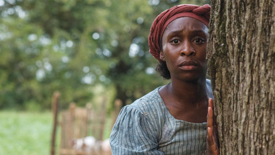
Harriet Tubman’s first look:
:
With the original look, it’s how I always begin a design, I immersed myself with research. It was original research from the period. What I was finding were daguerreotypes of the period. At the time, that had just become very popular — documenting the slaves on plantations and life on plantations. Mostly, it was portraiture of many different economic different levels and races. After looking at the daguerreotypes of the neutral tone, some had been tinted after they had been taken. You had these strong dyes and very strong moments of color, in amongst a field of neutrals.
I made the decision that’s really how we should represent Harriet that we have this very neutral world, and as we move through, the other characters, we should show her in this blue tone. We start with that with a red headwrap and that pop of color.
The fabrics I chose were about function. Plantations were growing cotton. The slaves were picking the cotton, spinning it and weaving it. They were sewing their own clothes. The plantation where Harriet was owned wasn’t big enough for them to have that manufacturing system. They could have purchased the fabric from a neighboring plantation. The pattern and that ticking stripe were informed by the possibility that this was a fabric that came from another plantation.
They would use blue or some significant color that would hold the plantation together within the same fabric world. That way, you could identify that the slave was from that plantation if they ended up running away. That’s where we started. Some of that was because we needed to have the amount of yardage that we were able to get because there were so many duplicates of that dress. We built about 12 dresses, and we had it at different levels so we could tell the story of her escaping and going through everything that she went through.
It was a linen fabric that had the stripe going through it. I chose linen because it would show the wrinkles and holds wrinkles very well. I chose a fabric that would read distress and show what her daily life was. Viscerally, it felt right for the period and how I saw Harriet.
What became very important, and this came from Kasi (Lemmons) was she wanted to render Harriet as a superhero.
Harriet’s Green Dress:
With the green dress, we tried to establish this growth and it’s also connected to the forest and nature. The first time we see her running through the forest, there’s this great connection to the environment that she’s in and that she’s making her way through. It starts to build to the red coat and dress that we see her in towards the end.
The last thing we see her in is in the uniform when she was an officer with the Union Army. Before that, it’s really her power costume. It’s the pinnacle of her realizing herself, having gone through a period of being a shapeshifter and master of disguise. We see her armor up in the dress and the coat and with the gun. She’s able to confront her nemesis — the grand antagonist of her life.
It was chosen because it resonated with all of the elements; the superhero quality and the fact that she is at her power peak. It becomes more poetic and emotional.
The Poster:

I really love what’s on the poster, it’s what we call her “bandit” look. She’s a woman who is pulling elements that are both female and male and suitable for doing the deed at hand.
She’s able to weave through the woods and the river. She has on knee-high boots, a sturdy skirt, a blouse and a man’s coat. The hat is broad-rimmed. All those things together, she would have been able to find. They were all period pieces. When you put it together, it looks really powerful and stylish. From a modern eye, it needs to be part of the appeal.
The coat is an olive-brown. It goes back to that idea of neutral with pops of color. It was being consistent with how we were painting the clothes.
I knew about Harriet Tubman in Junior High, but we didn’t pick her life apart and what it took for her to do what she did. We didn’t receive the whole story. The same is true for the photographs; it’s a very limited view of who this woman was. With the film, we’re trying to crack that open and give her a more in-depth feel. While we’re doing that, we’re trying to imbue it with the poetry for an audience. We’re also embracing her as a mythic figure and a powerful woman.
Best of Variety
Sign up for Variety’s Newsletter. For the latest news, follow us on Facebook, Twitter, and Instagram.

