How the makers of Pixar's 'Soul' envisioned a before-life place that kids can grasp
Like his most recent film, "Inside Out," Pete Docter's "Soul" follows in the director and Pixar chief creative officer's tradition of expressing intangible concepts and ideas within a palatable, kid-friendly story.
The film, which he co-wrote with playwright Kemp Powers and Mike Jones, tells the story of Joe Gardner, a middle school band teacher in the midst of an existential crisis. After he dies unexpectedly, Joe enters a metaphysical realm where he struggles to find meaning in his time on Earth and becomes a mentor to a precocious young soul looking to find her life's purpose.
The brightly colored, highly stylized, PG-rated film poses big questions about personal fulfillment, where we go after we die and whether or not we are sent to Earth with a purpose. In the writing process, Docter delved into research on essentialism, nihilism and existentialism to better articulate the plight of his characters. "You have all this deep, heady stuff, which is not going to be appealing to kids unless you can make it fun," he said. "The key to that is making the design colorful and fun to look at."
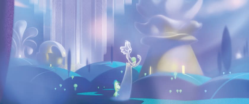
Much of the film takes place in the Great Before, the realm where unborn souls prepare to come to Earth. The Great Beyond, where souls go after death, is briefly hinted at but ultimately kept a mystery. "The Great Beyond was just this bright light, and it's often been described that way," said production designer Steve Pilcher. "Which is very hopeful in a sense because it's like sunlight, like an open door of light — almost like the opposite of a black hole in the universe but more positive. We didn't want to answer that question [because] it's a matter of perception."
As for the Great Before (also referred to in the film as the You Seminar), Pilcher envisioned the realm as being "in a constant state of pre-dawn light."
"It's like morning, but it never changes," he said. "It's kind of like when a baby wakes up in their crib in the morning, everything about it should feel childlike and soft and pastel. All the forms are blurred, there's a certain amount of translucency and a lot of softness. It was very important that it feel very inviting, like a pillow."
When the team set out to design the structures and buildings of the Great Before, they looked to ancient Greece. "In Western culture, we're taught that that's the seat of civilization and philosophy," Docter said. "But then we realized pretty quickly, 'Well, we don't want this to seem rooted in any particular culture because we're saying everybody came from the same place."
"We looked up research on Elysian fields, which had Greek temples and structures," Pilcher said. "But the problem with that was it felt too specific and also everybody does that. We wanted something more universally friendly and something a little bit fresher."
They wound up seeking inspiration from the architecture of World Fairs spanning the 1930s through the 1960s. "It seemed like a lot of the architecture was meant to inspire, to create a sense of awe and importance," Docter said.
Designing the look of the personality pavilions, where souls go to get programmed with personality traits, was somewhat interpretive, Pilcher says. "Some of them are really hard to figure out." Because while a trait like "abrasive" easily calls to mind an association ("something that grinds against you, maybe it's rough, maybe it's jagged"), others are harder to translate. "One of our buildings was aloof," Pilcher said. "Someone who feels aloof feels like they're above it all or they're floating. So how do you do that?
"They're abstract ideas, which is why we designed them to be abstract-looking shapes," he added. "You just do something that you associate with the word. When you're creating something abstract, you're reinterpreting the feeling but [in simple terms]."
The counselors known as Jerry, who serve as vessels through which the universe expresses itself and guide new souls through the process of incarnating on Earth, are illustrated in the film as two-dimensional line figures. The directors say that was a lot harder to animate than it looks.
"The Jerrys are actually the most complex characters in the entire film because they're supposed to be the universe dumbing itself down so that people can understand them," said Powers, who also served as co-director. "A great comparison is like when human beings make a scarecrow thinking, 'This is going to scare crows away because it looks like a human being.' I'm sure to crows a scarecrow looks nothing like a human being. So by creating these 2-D line designs to exist in the 3-D space, we had no idea how complicated it was going to be to animate. But as with everything that Pixar does, we rise to the challenge of new animation technology."
As for the design of the souls themselves, "I think the final [idea] we settled on for the new souls was one of the first designs that Pete had scribbled on a napkin," Powers said. "We spoke to a lot of experts early on about the idea of souls and what souls might look like, and regardless of culture you often hear terms like 'vaporous' and 'ethereal,' but we also wanted to come up with designs that were fun and engaging. Honestly, it just looked like a bunch of ghosts running around. So a lot of credit goes to Pixar's art and production departments."
In fact, making sure the souls didn't look like ghosts was of major concern for the design team. "The color palette was really one of the toughest things because if you make them all bluish, or just gray, they just look like ghosts. And if you make them all white, they're going to look like ghosts too and then you can even bring in the sociocultural association of skin color, which we wanted to avoid. But if you take warm spectral light, like light through a prism, and shine it through a soft little form, you'll get warm lights going through one side and blues and violets where they exit. We actually had to develop technology, which we called the ethereal helmet, [to accomplish it]."
The designs also had to serve the dual purpose of fitting a surreal narrative, while remaining inviting to audiences of all ages.
"I think what I was banking on was that the souls themselves, especially the new souls, would be attractive to kids," Docter said. "They're cute and they act innocent and funny."
Pilcher added: "Our characters are quite simple in the soul world and almost childlike, which I think is a really important way to go because we're dealing with something that hasn't experienced life on Earth yet. The souls are all quite similar looking. ... Anything in the soul world is very unearthly in color. It's not all pink or blue, which we associate with male and female, but if you mix [those colors] together you get this beautiful violet and these subtle greens. We wanted to make sure it spoke in a universal way."
This story originally appeared in Los Angeles Times.

