6 Dos and Don’ts for Using White Paint, According to Interior Designers
As any DIY’er knows, few things impact the feel of a room more than a fresh coat of white paint. “Paint, even from the more expensive brands, is still a great way to change your space on a budget,” says New York–based interior designer and color consultant Martin Kesselman.
White paint, perhaps more than any other color, can set the tone for a space’s design direction with subtlety. Together with lighting, accents, furniture, and artwork, it can make a space read as anything from charming and cozy to brilliantly minimalist.
Of course, things can get complicated when it comes to sifting through tones, tints, and dozens of chips to find “the one.” Keep reading for the do’s and don’ts of working with white paint, and what you need to know before popping open a can at home.
Don’t: Be afraid to talk to the person behind the counter at the paint or hardware store
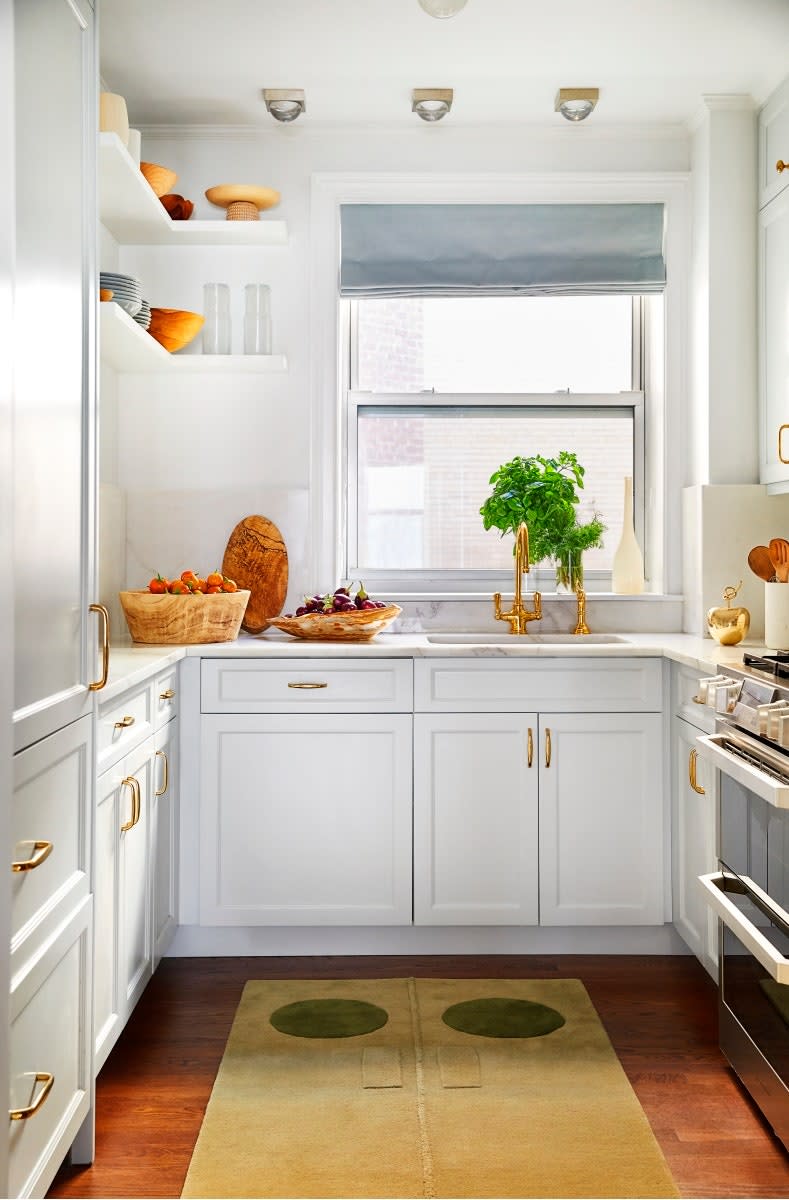
“I like to start off with a simple but important question: Are you after a true white or are you after an off-white?” says Kesselman, who counsels visitors and design clients at INCOLOUR, his New York City color showroom where he stocks paints from Benjamin Moore and Farrow & Ball (including Martin Kesselman White, a true white he developed with the British paint company). Not sure which is which? An off-white will have a visible undertone, whether it’s gray, yellow, pink, or blue, while a true white will have none.
The one caveat with a true white, crisp and clean as it may seem, is that it’s entirely unforgiving if your walls have any imperfections, according to Mikel Welch, interior designer and HGTV star. “Having [the store] add some tint to your paint so that it’s not stark white will help you hide those blemishes,” he explains. An expert can help make sure you get what you’re really looking for.
Do: Sample your options at home on the walls you’ll be painting
If you like how a shade of white looks on a color card at the store or in a photo in a catalog, that can be a great starting point. But “you need to sample the color on the wall,” Welch insists. “The biggest thing is to look at it in the daylight and in the evening because the tones of the color are going to be different in direct sunlight compared to at dusk. Those little paint chips that they give you at the store are not going to cut it.”
Shops that sell paints should also be able to sell you a sample pot—that is, a six- to eight-ounce tester of the actual color you’re considering. From there, you can take it home and paint it onto anything from construction paper to Bristol paper to hard panels of painter’s canvas.
“A visual is worth a thousand words,” says Kesselman, who will typically paint an entire wall in a client’s residence so they can get an accurate picture of how the color will look. But he acknowledges that the approach may not fit into the time and budget constraints of DIY’ers. “Most paint brands now sell 12-inch-by-12-inch samples done with the actual paint,” he says. “They are finished beautifully with primer and at least a couple coats of paint.”
Don’t: Expect to use one paint from floor to ceiling
In many traditional spaces, you’ll notice a familiar pattern: an off-white on the walls, paired with bright white trim, molding, ceilings, and doors. But that doesn’t mean you have to do that too. Kesselman often uses the same shade for a room’s walls, trim, and ceilings, relying on a combination of slight variations in sheen and other architectural elements in the room to create contrast points and visual interest.
Whether you’re sticking with the more traditional approach or considering going monochromatic, keep in mind that the ceiling, walls, and trim are often painted in different finishes.
“Flat finishes are most common on the walls. I think that’s the most aesthetically pleasing, but it’s also the most forgiving because the flatter the paint, the more imperfections it hides on the wall itself,” Kesselman explains. From there, he recommends a flat finish for ceilings, and a satin or semigloss for any trim features. “It’s very subtle; these are slight touches so things don’t look too plain,” he says.
Do: Invest in your rollers and brushes
Purchase quality paint tools for the best application. “Don’t waste your time on inexpensive rollers because those are the ones that typically shed fuzz and lint,” says Welch. This means that as you apply paint to the wall, fibers from the roller will stick to the wall, ruining your application. “Spend a little extra on, perhaps, a Purdy roller. You definitely get what you pay for,” says Welch. For good measure, wash your rollers and brushes (and allow them to dry) before dipping into your primer to make sure they’re free of dust and loose fibers.
Don’t: Skip out on cleaning and dusting the surfaces you plan to paint
Wipe down the surface you’re painting, and any adjacent surfaces where you plan to apply painter’s tape. “Most of the time, contractors aren’t paying attention to cleaning or wiping things down,” cautions Welch. Drywall dust, sawdust, and run-of-the-mill house dust all spread easily and far in a home and keep tape from fully sealing, thus creating unsightly texture under paint.
Do: Apply one coat of primer and two coats of paint, if you can
After all the research on which white will strike the right tone in your space, those trips to the store, and more, it can be tempting to look for ways to speed the process along when it comes to painting itself. The verdict on priming, according to Kesselman and Welch, is that just because you can skip it, doesn’t mean you should, especially considering how unforgiving white paint is.
“You can end up with high and low points in the sheen, and you can end up with an uneven color as well,” Kesselman says of the possible consequences of not priming. “You have to do it the right way,” confirms Welch. “If not, you’re going to see the imperfections: nicks, bubbles, ripples. If you don’t go over it with two coats of paint, you’re going to see it. Especially with white.”
Originally Appeared on Architectural Digest

