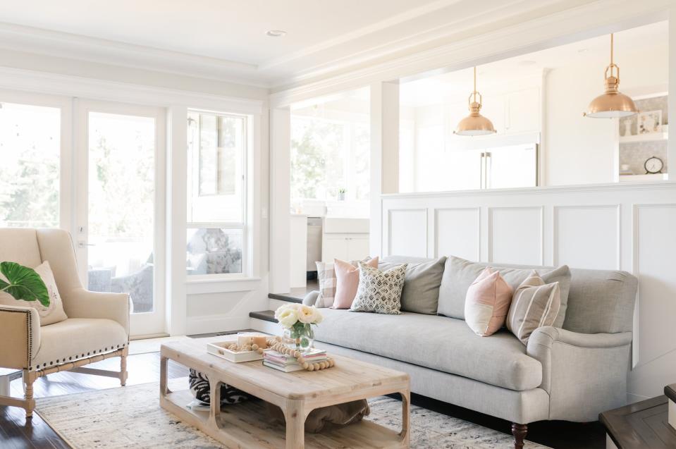
5 Outdated Paint Color Trends to Retire Faster Than a Quick-Dry Primer

Cavan Images / Getty Images
Paint has always been one of the easiest and most impactful design tricks in the book—and for good reason. A few fresh coats of paint can transform everything, from a ho-hum door to a drab, claustrophobic room. But just because paint is a reliable part of any designer's arsenal doesn't mean that anything goes. Whether you're keeping tabs on the latest color of the year or getting more creative with a pigment-packed arch or mural, you know that paint trends come and go—and some have seriously overstayed their welcome.
To help you identify the paint colors and trends to skip during your next renovation project, we tapped four designers—and asked them what to replace them with, instead. These professionals are no strangers to using paint strategically on their projects, so it's safe to say they have a paintbrush on the pulse of home trend landscape. Now, all you need to do is pick out the perfect timely hue, crack open a can of primer, and get started.
Related: 4 Kitchen Trends That Need to Be Retired ASAP, According to Designers
Related video: The paint color trends we're ready to ditch in 2022
Skip All-White Paint Palettes
For a time, crisp, cool white was often the only paint color used throughout entire homes. And while white should and will always be a reliable neutral, 2LG Studio's Jordan Cluroe and Russell Whitehead think it's time to reconsider coating wall after wall in the same cream hue. "As lovers of bold color and pattern, we would love to see the back of dull, boring white rooms with white ceilings," say the British designers. "Of course, white paint has a place—a huge place; however, we love to see color injected in as well."
Try: An Accent Ceiling
Not ready to part ways with the fail-safe shade? Cluroe and Whitehead advise taking baby steps. In a recent project, the design duo painted their walls a warm white—but made a splash with a colorful wine-hued ceiling. This solution works particularly well in small spaces. "[The] one-bedroom studio apartment in Central London [was] compact and jammed full of clever storage, [so] we wanted to keep it light and bright," they say. "The deep, bold burgundy [added] huge impact in a small space."
Don't Use Paint to Downplay Wallpaper
Why decide between paint or wallpaper when you can have both? Instead of downplaying the color of your trim and ceilings in favor of a lively repeat, designer Noz Nozawa says it's time to treat both elements like equal entities. "[We need] to unshackle ourselves from the standard assumption that if you use a bold wallpaper in a room, it needs to be paired with white trim and a white ceiling," the San Francisco-based designer explains.
Try: Matching Your Trim Shade to Your Wallpaper
The good news is that many paint and wallpaper companies—such as Backdrop and Schumacher, respectively—are joining forces to offer curated, cohesive collections. "If the idea of color matching might have been intimidating before, it's now so much easier to choose an accent trim color that makes the wallpaper in a room a 'complete thought'—and [creates a] total transformation," says Nozawa adds. Bold wallpaper and paint? That's a power couple we can get behind.
Related: How to Pick the Perfect Paint Color for Any Space
Say Goodbye to Gray
White isn't the only shade that deserves a sabbatical. According to Lisa Gilmore, the principal of her eponymous design firm based in Florida, it's time to think beyond gray. "Don't get me wrong, gray is a nice color and does its job, however, it have been so oversaturated over the years," she says. "I'm ready for less-muddy tones."
Try: Pale Pastels or Earth Tones
Gilmore notes that most of her projects' current color palettes are filled with smile-inducing shades—so consider this a sign to try something new. With the right undertones, a dusty shade of pale pink or a muted, earthy green can be a welcome alternative to the overplayed neutral.
No More Navy
Navy might teeter nicely between subtle and statement, but Gilmore says this power pigment's days are numbered—for now, at least. "Yes, it's a beautiful color, and sure, it can be timeless," she says. "[With that said], I'm leaning towards blues with more oomph and vibrancy."
Try: Lighter Shades of Blue
From sky blue to bold cobalt, you're in no shortage of beautiful cool hues in this color family.
Curb the Contrast
The latest paint trend to retire, according to designer Zoe Feldman, is high-contrast paint pairings . "I'm not a fan of dark walls with white trim," she explains. "The contrast is way too harsh—even jarring." Feldman is partial to a subtler approach: "I prefer a smoother shade transition. It looks more thoughtful," she says.
Try: Tonal for Trim
For a natural approach that has plenty of visual impact, consider giving your room the tonal treatment. For example, sage green walls and a deep, emerald trim can be an eye-catching, but unexpected way to rack up the compliments.

